This post reviews research we have been doing recently, into how we can improve the experience for mobile users in the museum when they first make contact with Wi-Fi. Over the last two years at the V&A, the Digital Media department has worked hard to improve the remote mobile experience, by making our web pages responsive to the small screens of mobile phones. The research here is to help us make the experience just as good for mobile users in the museum when they connect to our digital services delivered over Wi-Fi.

Why consider Wi-Fi for mobile users?
- Around 70% of visitors to the V&A own a smartphone and as many as 95% bring it with them.
- About 40% also own a tablet but only 20% bring it with them.
- 30% of UK visitors and a huge 65% of overseas visitors turn their data connection off to avoid risking a big bill.
Why splash screens?
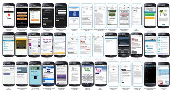
The familiar Wi-Fi splash screen (or click-thru screen in the US) is often taken for granted, but is a crucial point of contact with visitors accessing museum digital services. We wanted to see how other people have designed them, now mobile phone web use is an everyday behaviour for the majority of visitors. We were surprised to find virtually no information on this subject at all. So we gathered examples and looked at their features. Here’s what we found. This is practitioner-research to tease out the big questions that need asking. It is not a comprehensive survey of the state of museum Wi-Fi provision. It’s a baseline user-experience review.
Twitter crowdsourced by you – thanks!
The collection of enough Wi-Fi screens needed to provide a broad review was made possible by the enthusiastic help of fellow museum digital people internationally, responding to a call to upload pics using the Twitter hashtag #mobilewifisplash.  We are grateful for the input of the many museum professionals working in digital who contributed and allowed us to collect sufficient examples from museums around the world that would have been impossible otherwise. We have more than thirty examples from three continents thanks to you – the museum digital community rocks! There’s a Storify summary of the original tweets sent here too storify.com/rosemarybeetle/mobile-splash-screens/ By looking at a wide range of implementations, we have been able to more easily see what works and what doesn’t. If you are designing Wi-Fi services, here is a summary of what we found from our research. We hope it is as useful to you as it has been eye-opening to us.
What we found, in a simple checklist
The source images and detailed look at screens is below so you can judge for yourselves. Before that though, here’s a compact checklist of how we have translated what they tell us into some general guidance.
- Less is more…
- Make it welcoming
- Make it look good
- Make clear at a glance what the basic Wi-Fi offer is (commitment, cost, etc)
- Make the connection option itself really obvious and big
- Let people know what else they can get
BUT
- Don’t spam them or trick them into things they weren’t expecting
- Don’t make them jump them though silly hoops
- Don’t spoil the service with detailed terms and conditions. Provide in the background for reference.
And of course…
- Design for a small screen, test on a small screen
When audiences connect to our Wi-Fi, they are in effect coming to our digital front door via their mobile. It’s just it is a very small door. It is important to explicitly design for, and test on a small-sized mobile screen.
The splash screen as a welcome
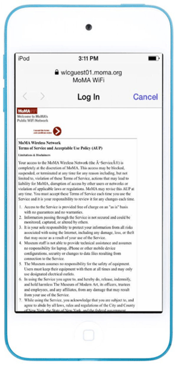
This commercial Wi-Fi service from Heathrow Airport (below, left) states its welcome first then follows it up immediately with the unmissably bold text Wi-Fi Access. No mistaking what this screen is for. It follows that up with three distinct options, each of which is clear. In contrast, although this screen from MoMA New York also features a welcome message quite high up the screen, the lack of optimisation shows how dense text will obscure any message on a small screen 
Make it look good
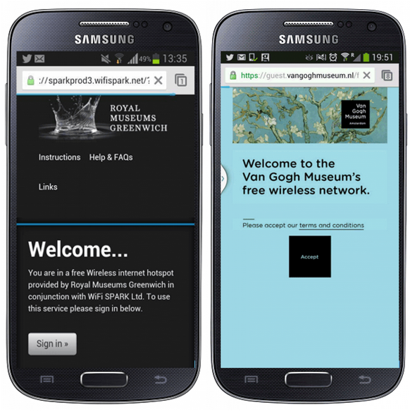
This is probably the most obvious piece of advice ever, and arguably applies to all design not just mobile screen design. However, looking good on a small scren means making choices about what to include and what not to. Looking at the examples above, while they are all welcoming, the first three are much better looking than the last (sorry MoMA, we don’t spare ourselves later). Having said that, the meaning “good” depends on the context. . The Greenwich and Van Gogh examples get the key messages across and also look beautiful. This is just right for visitor attractions that offer a delightful cultural experience. The Heathrow example is just as good, but the look is much more streamlined and business-like. Branded yes, but discretely so and not in a way that gets in the way of the visitor in a hurry to get online. The MoMA screen is not as good to look at simply because it does not highlight the key messages and actions from the clutter of the terms and conditions. This is not to single out MoMA. It is presumably because they are attempting to configure a Wi-Fi system that is just not designed for small screens. There are plenty of other examples below that are also obviously limited by the constrictions of existing systems, including our own V&A screen. To their credit, MoMA have reduced most of the screen clutter before the important button that the visitor is looking for. For example it is at least above the terms and conditions. Here are a number of other variations on this. 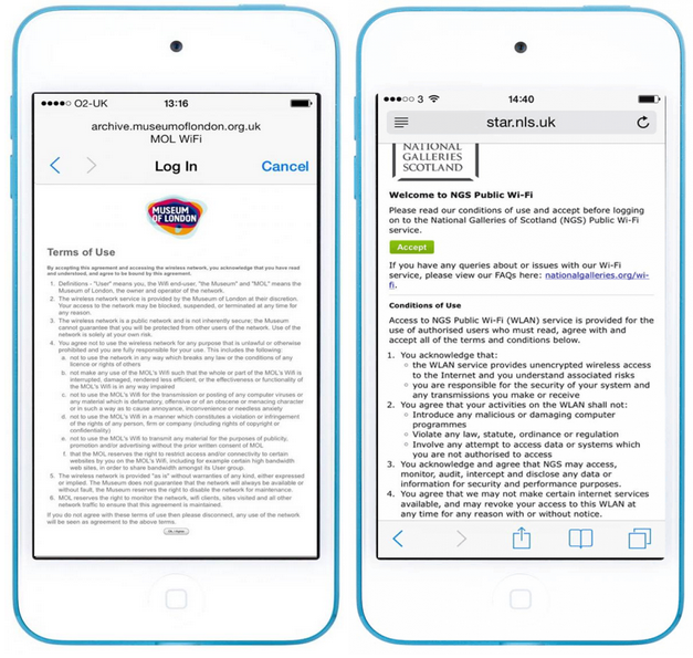
Tell visitors what to expect
There is nothing more off-putting than a business/service trying to trick you into something without letting you know what you are letting yourself in for. This is a real trust-killer. In most cases the screens did not appear to be deliberately set up to trick people. However, there were lots of examples of screens where it was pretty hard to know what the deal was. In many cases this was simply because the display was not responsive for mobile phones and so was illegible. The visitor will want to know the answer to questions like these: Is it charged for? Do you have to sign up? How long do you get? Is personal data like email involved and if so, what will happen to it?
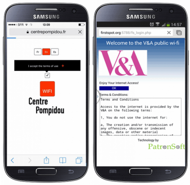
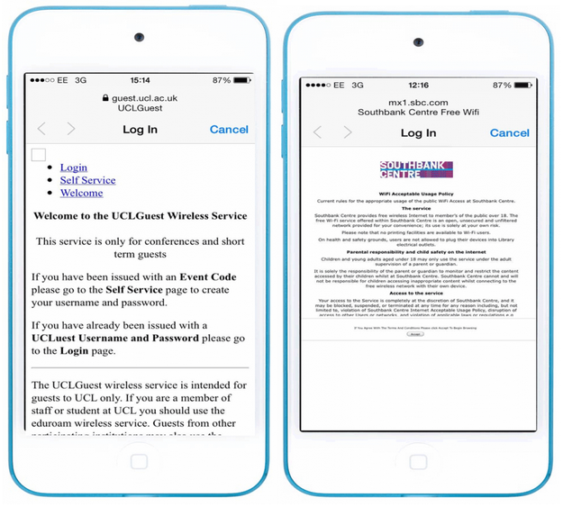
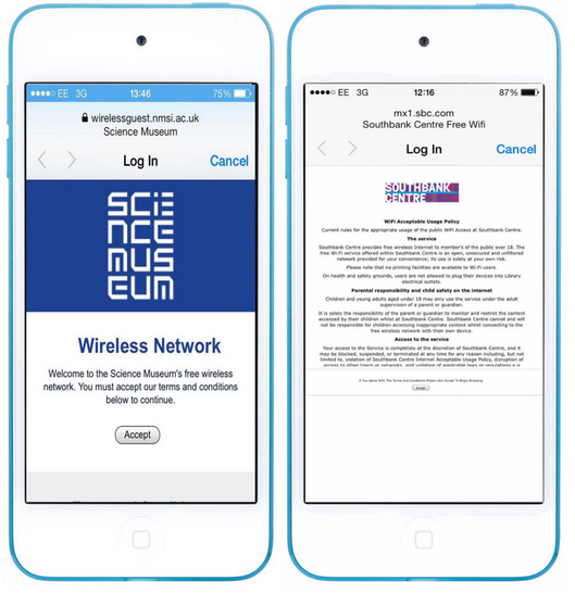
The Pompidou screen is one of the best ones we saw for reducing the screen clutter and simple discrete branding, with a great language selector. It is a shame it doesn’t say the cost. Our own screen (right) uses a system which is quite an old version and has very little freedom to configure, BUT at the time we took this shot, we had not told people it is free, even though we could have! Little details like this can cause unnecessary confusion. Two services that do say they are free but bury it in tiny non-mobile-friendly text. The Science Museum screen (left) is otherwise almost a model example with a clean, well-branded interface, minimal text and a nice big “accept” button. However, the word “free” is still rather hidden away in text. This may seem trivial. It is not – visitors tell us that cost of a service is crucial information that they use to assess whether to take up that service. The Southbank Centre screen (right) is a more extreme example of burying vital information in dense text. It also tells visitors the service is free. See if you can see where…
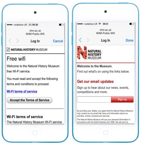
The Natural History Museum spells it out nice and clear on their main Wi-Fi screen (below, left) This was by far the clearest “free Wi-Fi” notice we saw (although Heathrow above is pretty good).However, cost is not the only information visitors want to know. The Natural History Museum follows their great first screen up with a second screen that asks for email (below, right) This is OK in that it is clear that by signing up you will join the news service, but it also introduces some doubt. To the user, it now looks like you have to may have to give up personal information which was not obvious at the beginning and may be off-putting. Visitors accepted the terms on the first screen, and now the email looks like a hidden extra. This may appear to be another hoop to jump through and could be clearer that it is optional. I happen to know this example does get a lot of email addresses, so I can see the business case, but to a visitor, it may seem sneaky not to make it clear in a compulsory sign up process that providing email is not required. There is a risk of undermining trust by not being clear what the deal is.
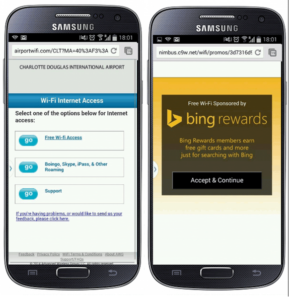
Compare this to this Wi-Fi service provided free at Charlotte Douglas Airport, North Carolina, which make the deal on offer clear. They provide free Wi-Fi, but the deal is you have to see this second sponsors screen in return (right). This is an example of a provider/customer trade-off that is very up front and clear. You don’t have to accept, but all they are asking for the free stuff is that you see this screen. This is fair enough and it associates Bing positively with the nice free Wi-Fi. This may seem irrelevant to a museum service, but the business trade-off model is worth exploring. For example, at the point of offering free Wi-Fi, it might be possible to more positively present something that is a bit of a chore (like offering an occasional user survey). By being frank, it is possible that more people might choose to participate than might otherwise have done so.
Make the connect option as obvious as possible
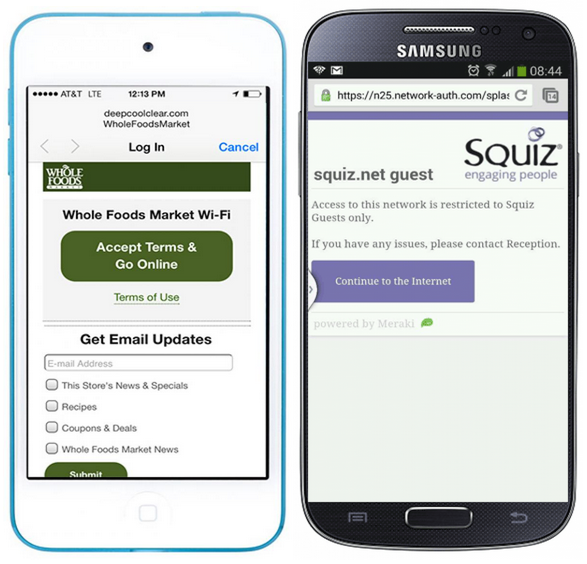
Let’s face it, whatever else you might want visitors to see or do from your splash screen, many of them are just trying to get online, so do them a favour and make it easy. This screen from the Whole Foods Market in New York(below, left) is almost a perfect example with lovely clean interface. and a big obvious button smack in the middle of the screen – good job. The Squiz guest Wi-Fi (below, right) has a big button too, but the text is slightly too small to skim. There is something about a button being central that also feels right on a mobile phone, so the Whole Food screen seems better than the Squiz on, even though the latter is quite good.
Anonymous access versus registered access
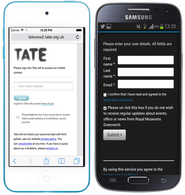
There were a number of examples where Wi-Fi access involved registration, either compulsorily or optionally. At Tate and Royal Palaces Greenwich access required entering an email address. This is partially to harvest personal email data, which seems unnecessary for a one-off connection. Greenwich take it a step further by asking for full name which feels excessive. In both cases of course taking any personal details adds a management cost as this data is automatically covered by the Data Protection Act (well in the UK anyway). It is likely that the reason for wanting all this personal data is to put people on mailing lists, but they don’t look like registration processes, more just data harvesting.
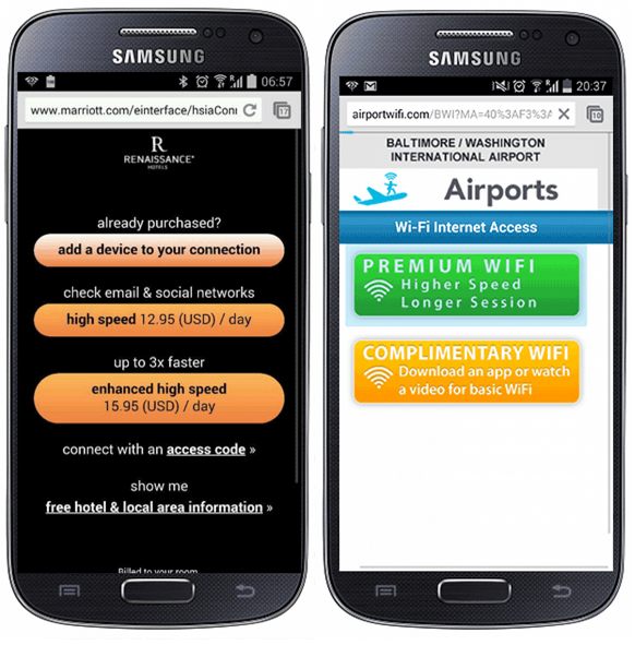
Sign in details are not just about being marketed to though. Logon screens are required where services are only available to subscribing or paying users who need to be identified as registered individuals. Here we have the Renaissance Marriott hotel Baltimore (below, left) using name and room number to charge costs to the hotel bill. Below right is the sign in form for Wellcome Collection, which offers a choice between time-limited free guest access, and registered Member sign-in. Both of these have nice clear boxes and reasonably-sized text that is simple enough on a mobile screen.

Commercial Wi-Fi has some lessons to teach museums
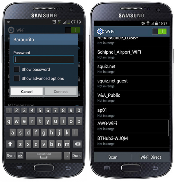
There were a number of commercial examples that illustrated useful approaches. We have already looked at the very good Heathrow example. There are simpler ways for the budget conscious. The Bar Burrito example (below, left) is about as extremely simple as you can get. It is from a café that offers Internet access simply by using a password to access a secured Wi-Fi. This might seem a bit basic, but it is an option worth considering for a museum on a budget. It requires no fancy access control software, reducing set-up and maintenance cost. It is also pretty well optimised for mobile phones, simply because it uses the phone’s native operating system interface to enter the details. This might be all you need, especially for Wi-Fi at one-off events.
Bad behaviour
The following example from East Coast trains however seems almost comically hostile to the user. It didn’t help that it had one of the least mobile-friendly displays, having a non-responsive desktop view that is pretty hard to see on a mobile screen. This was not so unusual in itself, but the service on offer didn’t make it any better. It offered a rather tiny 15 minutes of free Internet access which is hardly enough to bother with, especially when it blocks streaming media. Paid access is available, but they are asking an extremely expensive £4.95 per hour (or £9.95 per 24 hours). If you are desperate enough to need the paid option, you then still have to give an email address. To make it worse, the default option is opt-in to marketing emails, instead of offering opt-in. Finally, the checkbox has a warning that says if you do opt out, they will suspend your rewards account if you happen to have one with them. All in all, the impression it gives is that they have a pretty derisory view of you as simply a cash cow. 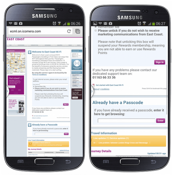 It doesn’t have to be that way. Here are two further commercial examples. Below left is a screenshot from the Renaissance Marriot hotel in Baltimore. It is still expensive, but the interface is nicely optimised and branded and the options are minimal and really easy to judge. You don’t have to pay this much, but at least you can see at a glance what is on offer with just three simple, well-labelled buttons. Below right is the screen from Baltimore/Washington airport, which takes the same big, labelled button approach. Again, you may not like the choices, but it is pretty clear what you can expect if you select one. You can pay or you can get it free for a chore (downloading an app or watching a video).
Conditional use
So far the examples have assumed that Wi-Fi is the primary service on offer. This is a common and reasonable use in a public space aiming to be a destination space to hang out in. The V&A has large a lot of repeat visits from people who don’t just love the art and design, they also sometimes just like to be in the space, for some or occasionally all of their visit, so providing Wi-Fi simply enables visitors to do what they want in a lovely space. Whether a venue has Wi-Fi is one of the things people judge it by. This is as true for museums as it is for bars, cafés or airports. Of course, Wi-Fi is also a powerful way of delivering other museum digital services. It is a content delivery channel. We found examples of museums that offer Wi-Fi only for use with specific mobile content or services. Kew Gardens in London offer Wi-Fi specifically for their mobile app, citing a need to keep the network speed working (below, left). This implies that Kew-provided services are more valid than visitors’ own use for other reasons (like socialising). This is a choice your organisational can make, but the public may not agree of course. Here is a similar example from Bunjilaka Aboriginal Cultural Centre in Melbourne (below, right) which is provided specifically for content in their exhibition “First Peoples”. In both cases, it is not clear if this ring-fencing is actually enforced. 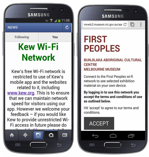
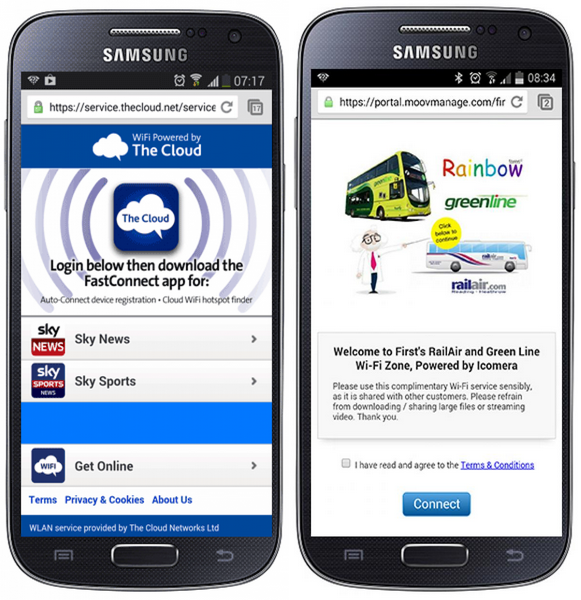
Using splash screens as noticeboards or to launch other services
Afterword – to splash or not to splash?
Though we have been looking in detail at how splash screens can be made better, there is a question about whether there is any reason museums need to have them at all. Is a Wi-Fi splash screen ever anything other than just an annoying obstacle that people tolerate to get free Wi-Fi? They can provide a positive service to the visitor audience and there are business advantages that they can provide, but could you do better without them? In the UK, the question is slightly loaded as it is more or less an accepted requirement that a provider of internet services can show they have made sure users are responsible for any bad behaviour. In the US however, we found examples of Museums that have previously used splash screens and then actively chosen to remove them for visitors as a deliberate service improvement. They include Cleveland Museum of Art, where they were removed them in 2012 as part of the preparation for the opening of Gallery One, because they were seen as not in keeping with the spirit of a project designed to reomve barriers between visitors and the art. They specifically wanted tablet and phone users of their Art Lens applications to connect without hassle. Similarly, at Baltimore Museum of Art the new appointed Deputy Director for Digital Experience Nancy Proctor, described the decision to remove them thus: “wifi has been liberated from the click-thru screen”. 
Splash screens, apps and wearables
Wi-Fi is also not all about web access on phones. Most native phone apps require connectivity just as much as mobile web browsers do. If our visitors try to use their favourite phone apps when they only have Wi-Fi connection, they will usually not know to accept the terms and there will be no connection. At best the app will just lose some functionality. At worst the app may crash all together. This has implications for museum-provided native mobile apps as a service inside a museum. If a splash screen may break an app, or only allow them to work with an extra burden on the user (i.e. go to the web screen first to accept the terms), this will affect uptake This will also affect non museum-provided apps too, which visitors expect to work. These include important social apps for services like Instagram, Twitter, Facebook and so on. If you are running a museum social campaign using these media, it is worth considering how visitors can be made aware of Wi-Fi to prevent apps from being adversely affected..
Legal issues and splash screens
So, why would we impose splash screens on our visitors when it potentially makes it harder for them? In the UK at least, the simple answer is legal requirement. The main reason given for providing a splash screen is that it requires active acceptance of terms and conditions by the end-user. This is widely believed to be a reasonable step towards avoiding organisational responsibility for bad behaviour by people using the Wi-Fi service. This is mainly from responibilities of public Wi-Fi providers under the Digital Economy Act 2010 to avoid copyright infringement. In reality, it is not at all clear that there is any specific requirement to have an accept option on a splash screen. However, it is widely regarded as the only easy way to defend against misuse, as every user has in principle at least agreed not to be bad. Obviously, if you are considering not having a splash screen in a UK museum, you should get proper legal advice. For more on the legal issues of providing public Wi-Fi, see this handy summary of the key legal burdens www.purplewifi.net/legal-and-practical-implications-of-offering-public-wi-fi-in-the-uk/ It is worth also considering if the legal protection needs to be provided by a splash screen. For the service of providing general open Wi-Fi, providing a splash screen with “accept terms” is probably as simple a method as possible. However, for a closed event or exhibition within a controlled space, it may be sufficient to provide protection by having another way of making the terms explicit. This might be noted on event tickets or as part of door entry (similar to the questions asked at fairground rides to ask visitors to accept health and safety risks). This might then mean there is no need for the splash screen and the experience be more seamless.
Conclusions
There’s a lot to consider here. We hope it has been useful. The checklist above should be a good start. To really get the idea, do what your users do. Try connecting to Wi-Fi when you are out and about and see what it is really like.


Another informative read. Love the simplicity of the Heathrow example. I also found the following questions particularly relevant as a starting point for designing an interface that addresses the ‘what’s on top’ issues head on – Is it charged for? Do you have to sign up? How long do you get? Is personal data like email involved and if so, what will happen to it? I also think there’s some milage in having loyalty scheme that some like the Wellcome Collection use.
We have free wifi with no splash screen. I have been considering having a welcome screen with single click logon and exhibition advertising box, but now I’ve read to end of this excellent article, I am not so sure.
Seems like all the ugly screens are on the iphone outline… Not that I have a problem with that (Android FTW)
Interesting article and good to see the comparisons as I help maintain and develop a public wifi system. I have to ask the question being an occasional V&A public wifi user.
..”Over the last two years at the V&A, the Digital Media department has worked hard to improve the remote mobile experience” So why hasn’t the V&A improved on it splash page then? From what I know of patron soft it is quite limited and only meant for 50+ users. It probably accounts to the difficulties I occasionally experience trying to navigate pass the splash page.
Hi,
a fair comment. We have been looking at these issues specifically to help us make this better. We are separately reviewing options for systems that will enable us to do this.
Its so difficult to design web pages for so many different mobile phones and screen sizes these days. It was hard enough with just the Hugh amount of browsers out there and free public wifi?? how much data do they want, its not free its a trade off my data for their wifi, read the T’s and C’s people.
This is a well written post and I find that in modern societies since the birth of the Iphone and smartphone industry in general. Use of mobile wifi has increased dramatically.
As I received no confirmatory email I checked and discovered my order had not gone through. I tried again got ‘authorisation failed’ again so I’ve given up & will try later.