Data is the new oil, or so they say. We are constantly generating more and more data from a dizzying array of digital interactions that we partake in every day.
We are told this data contains the insight to generate revenue, identify corporate trends, predict our next moves and even save lives.
But data is also a cultural product, it can be used as a medium through which we can explore the stories and truths about the world and societies we live in, ultimately helping us understand more about ourselves as human beings. And it is this aspect of data that we aim to unveil everyday, and an approach we aimed to impart in our day long workshop at the V&A.
So, what is data visualisation?
Data stored in spreadsheets and databases are often complex, vast and, let’s face it, often dull.
Data visualisation is essentially the art of making data understandable in a visual way. Humans are typically visual creatures and can therefore more easily spot trends and patterns from a line chart than a spreadsheet. But turning a spreadsheet into a comprehensible visual requires at least two main skills: one lies within design and the art to communicate stories effectively, the other within technology and the tools / know-how that help us to transform complex data into engaging and easy to understand visualisations.
People often arrive at data visualisation from these two paths and our workshop was evidence of that, participants generally wanted to learn how to gain insight and tell stories from data or to learn the technology needed to make beautiful and engaging visualisations, or both.
Naturally we like to keep everyone happy, so the workshop introduced some of the great Open Source data visualisation tools available such as d3.js and leaflet.js as well as investigating some datavis dos and (to much hilarity) datavis don’ts.
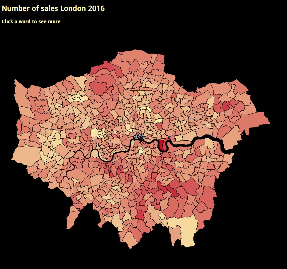
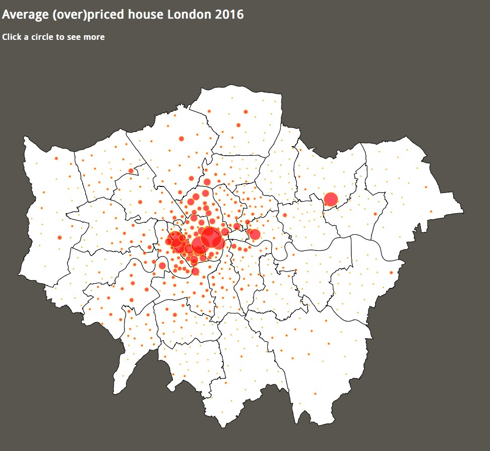
In the afternoon we used this new found knowledge of technology and design / communication to try to reveal the truth around ‘phenomenal’ house prices rises in London through a map-based data visualisation, using openly available datasets.
Some spectacular work was created and some participants who came with little or no coding knowledge went from zero to creating working code and beautiful design in under 4 hours.
We loved getting involved with the workshop, there’s nothing we like better than to talk data visualisation with a room full of enthusiasts, we hope everyone found something to take away at the end of the day. It’s hard to cover everything here but if there was just one piece of advice for anyone who is thinking about starting data visualisation – no matter what your background – learn how to code.
This is a guest post from Amanda Taylor, co-founder of Tekja Data Visualisation who led our Data Visualisation workshop as part of our on-going creative digital workshops for adults.