We need your images for this project!
Conversations with colleagues in recent weeks have turned to the question of how do you ‘collect’ the Olympic Games? In terms of graphics, there are certainly individual bits of printed design (posters, tickets and so on) from the London 2012 Games that can and should be accessioned by a museum of art and design. But for an event so extraordinary in the life of London we wanted to go further and try to capture something of the wider graphic environment of the Games. Posters can be viewed as discreet designs but are also an aggregate part of the visual noise of a city. Indeed the posters cherry-picked for museum collections are often not those most characteristic of how the streetscape looked at a particular period.
What we’re aiming to do is to create an archive of photos that will preserve a snapshot of some of the more peripheral visual aspects of the London Games. We want your images of Olympic-related signage, advertising, posters, shop windows, news stands, clothing, graffiti…..Have a look at what we’ve got so far and add your images to the Collect London 2012 Flickr group. At the end of the project, the images will be downloaded to create a research resource for the future.
London has been given an intensive graphic dressing in recent weeks. Overlapping the ubiquitous red, white and blue of the Queen’s Jubilee, Olympic signage has painted the town magenta. I’ve heard various reasons for the prevalent use of this colour: that it avoids any national references and won’t confuse the colour coding of lines on the Underground. LOCOG have created a ‘look’ for the Games derived from the angular contours of the logo (designed by Wolf Olins) and based on a palette of colours and Gareth Hague’s 2012 font. This has been applied consistently across the capital from the airport to the Olympic venues. In addition there is the razzmatazz of merchandise, campaigns by official sponsors (and subtler references by other advertisers), themed shop windows, travel information, celebratory community announcements, humorous interventions and statements of protest. Below I’ve pulled out a selection of images from the Collect London 2012 Flickr group that demonstrate a few of the interesting comparisons and correspondences between the images we’ve gathered – including the official, the opportunistic, the ad hoc and the oppositional.

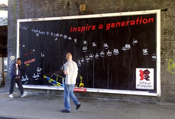
‘Inspire a generation’. One of the key messages of the London 2012 games emblazoned across an official banner and subverted in protest against heavy-handed security measures. Images: Rachel Silveria (left); Space Hijackers and Brandalism UK (right).

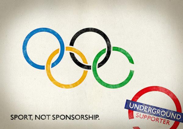
Sponsorship and sport. The poster on the left promotes the full roster of official Olympic sponsors claiming that there would be no Games without them. This campaign is perhaps a response to questions about the appropriateness of some of the Olympic sponsors and the over-policing of the Olympic brand. The poster on the right is one of a number designed by Rizon to allow businesses to show their support for the Games while evading the strict London 2012 marketing rules. (More information on the Underground Supporter project can be found here). Images: Catherine Flood (left), Rizon (right).

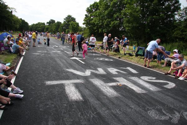
Eyes on the road. The London 2012 logo adorned the tarmac along the course of the Olympic cycling road races. Elsewhere along the route messages were mischievously chalked on the road. Images: Catherine Flood (left); Robert Steele (right).

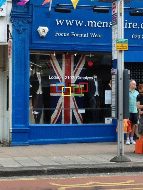
The rings. Olympic rings at St Pancras station and Olympic squares in a shop window. (Images: David Jefferies (left); anonymous (right).


The Logo. The controversial London 2012 logo mounted on the Olympic countdown clock, which was itself designed to echo the form of the logo. On the right is one of the many satirical re-workings of the logo fly-posted on a telephone box. Images: surreyblonde (left); Rob Purdie (right).

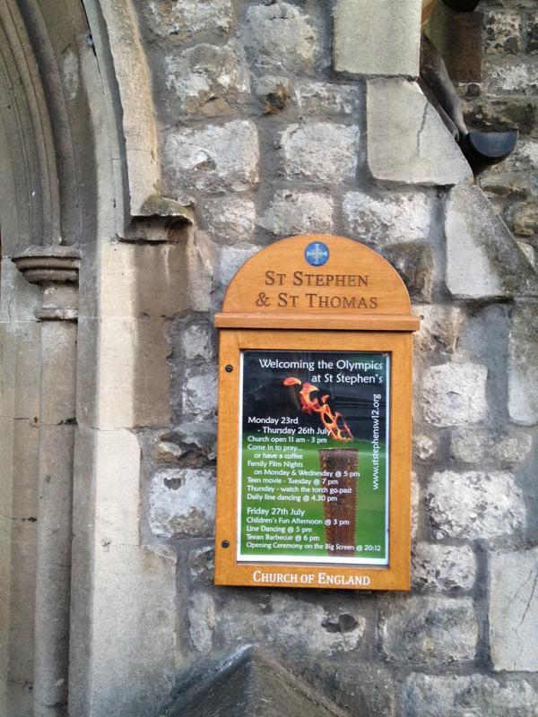
Welcome! Visitors to the Olympic Park are greeted at the Stratford Gate by means of a giant angular structure. A church notice board welcomes the Olympics at St Stephen’s in Shepherd’s Bush. Images: Phil Chappell (left); Catherine Flood (right).

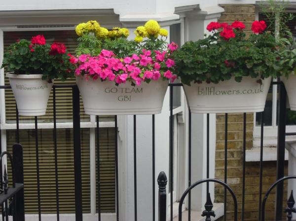
‘Go Team GB!’ The Great British team are given encouragement from Procter & Gamble and, in a more elegant and restrained style, by a London florist. Images: Catherine Flood (left); DocRobertPepper (right).

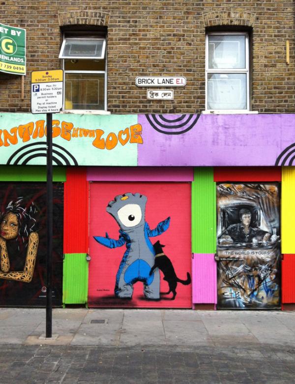
Wenlock and Mandeville. An affectionate rendition of the mascots atop a wedding cake, while Mandeville gets less reverent treatment in a piece of street art. Images: euphoreia (left and right)
Many thanks to everyone who has contributed to the project so far. Please keep the photos coming.