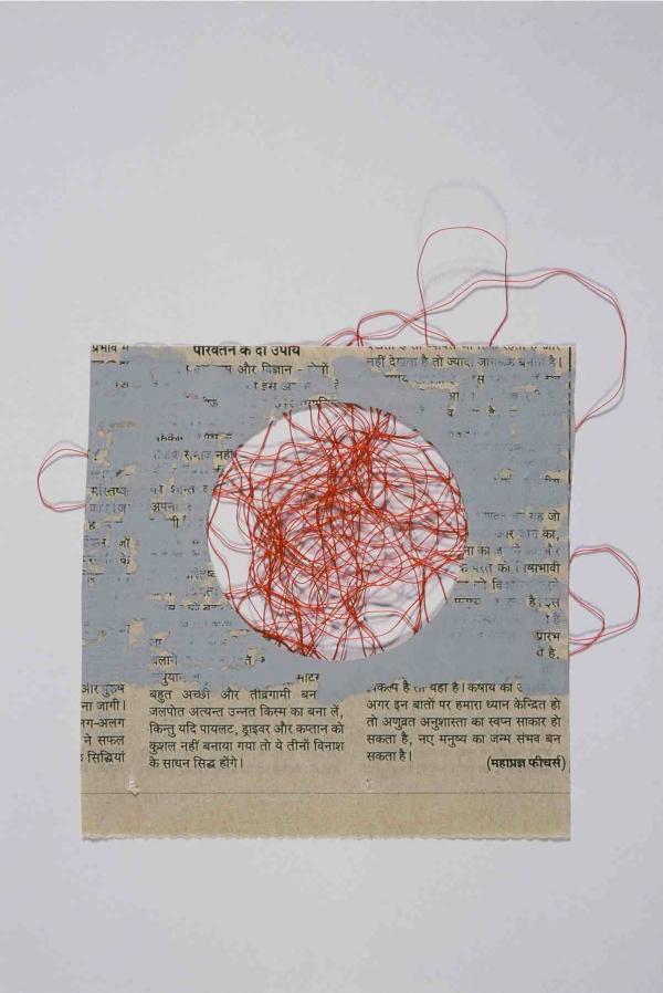
They say great minds think alike. If the reverse is also true, then the London gallery Contemporary Applied Arts and I should both be flattered. Their current show, guest curated by Scottish craft specialist Amanda Game, is a striking parallel to this blog. It’s all about the relationship between drawings and objects. Below are examples of works in the show by Gordon Baldwin (left) and Susan Cross (right), showing how draftsmanship can be translated into the languages of ceramics and thread.

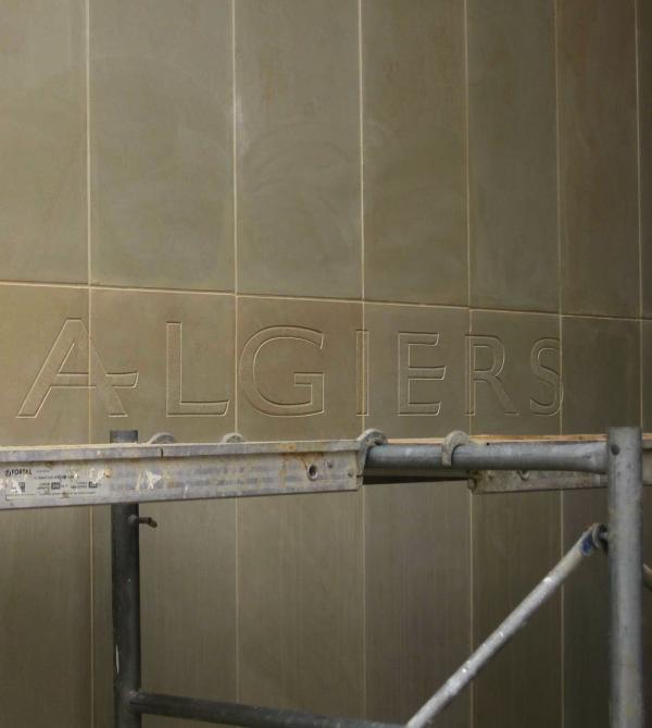
Though the whole show is worth a look, the artist whose drawings most caught my attention was Richard Kindersley. Well known for his hand lettered inscriptions in stone (a vocation he inherited from his father David), Kindersley exemplifies the adage that genius is 10% inspiration and 90% perspiration – or in his case, preparation.
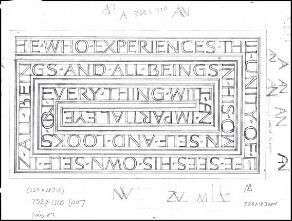
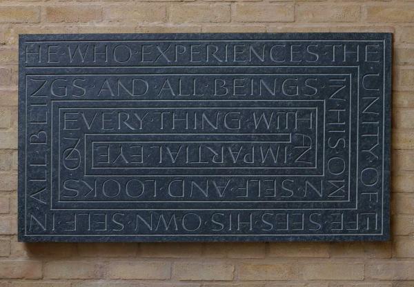
The above comparison shows how Kindersley carefully lays out the geometry of an inscription before ever striking chisel against stone. Some guidelines remain in the final design for the purposes of clarity, while others are absent but implied by the letters themselves. Notice for example how the capital E in ‘everything’ exactly marks the corner of the rectangular guidelines in the original sketch.
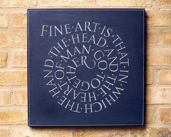
The same approach can be seen in the below inscription (taken from John Ruskin’s Modern Painters) in the V&A collection: notice how the tightly grouped serifs at the bottom of the letters E-T-H-E-R in ‘together’ circumscribe the innermost circle of the spiral. The gentle curve of the first word, ‘fine’, and the sharply curling tail on the final ‘r’ provide a visual entry and punctuation to the swirl of script.
Kindersley has to be conscientious in doing his planning before setting to work. When cutting an inscription into a public building or monument, there are no second chances. This makes the use of drawings in hand lettering particularly important.

But Kindersley says that for him, drawing is not just insurance against mistakes. It’s also an artistic process, and developing his rendering skills:
It is important with drawing to practice the act of copying not as an end in itself, but like a musician practising scales. The hands are used [as] part of the creative process using their natural gestural movements.
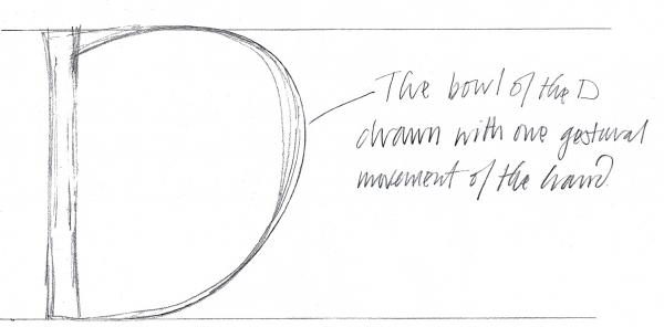
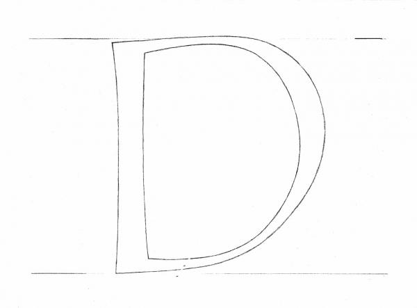 You get a sense of this combination of control and freedom in the drawing of a capital D (left) that is included in the CAA show. As his annotation (below) suggests, the swoop of the letter’s right edge is a good example of how he uses a single confident hand gesture to establish the a letter’s character.
As Kindersley puts it:
The outer direction of drawing is to do with physically expressing our ideas on paper. However, the inner direction of drawing has two sources in the mind: first the store of received memories and images and secondly, that moment of creation, which is free from the mechanical stream of consciousness with its second-hand images. The trick of drawing is to let go of the second-hand images and ride on the creative moment.
Couldn’t have said it better, Richard. Lettering may have to stay within the lines, but that doesn’t mean it has to be predictable.