

V&A Academy
Bring your passion to life by joining a V&A Academy experience at the V&A. A wide range of part-time adult courses, workshops, conferences, study days and professional development opportunities allow you to experience the V&A’s wealth of knowledge in new and exciting ways.
Executive Education
Whether you're looking to build creative leadership, strengthen team culture, or reimagine your brand, we’ll work with you to design a learning experience that’s as inspiring as it is impactful.

Schools
From cross-curricular virtual sessions and online resources to the ever-changing exhibition and displays programme, the V&A is the place for students to experience inspirational learning.
Students acquire new and transferable skills as well as knowledge, curiosity and inspiration from our extensive programme of activities and events.

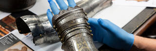
V&A/RCA MA in the History of Design
The V&A/RCA Programme (MA, MPhil and PhD) is internationally recognised as the leading centre for postgraduate study in the history of design and material culture. Combining ambitious, rigorous and cutting-edge scholarly approaches with first-hand understanding of material and digital artefacts, the History of Design programme is ideally suited to prepare students for the increasingly diverse and flexible professional portfolio demanded today.

Young people
Discover our programme of events for young people interested in fashion, digital design, performance and architecture. Take part in an exciting programme of workshops, courses, career-focussed events and free festivals.

Families
Families can enjoy free activities and online events with the V&A. The ever-changing programme encourages play, learning and creativity.

Residencies
Supporting contemporary artists, designers and makers has always been at the heart of the V&A's mission. Our Residency programme enables creative practitioners to gain unique access to the museum's collections, archives and curatorial expertise.