Humbled by my last feeble attempts at painting like Constable (here), I began work on a substantially scaled down version of Constable’s Full scale study for the Haywain. I prepared a small canvas by stretching commercially primed canvas – linen, with a white ground, that you can buy by the metre. I stretched it around a stretcher using metal tacks.
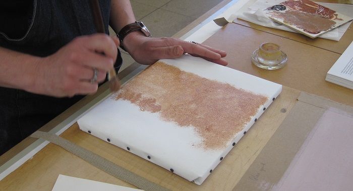
Referring to Sarah Cove’s article The Painting Techniques of Constable’s Six-Footers, in Lyles (ed) Constable: The Great Landscapes, exhibition catalogue, Tate, London 2006, I started work on a stippled beige-pink priming layer, made up from white and earth pigments bound in oil.
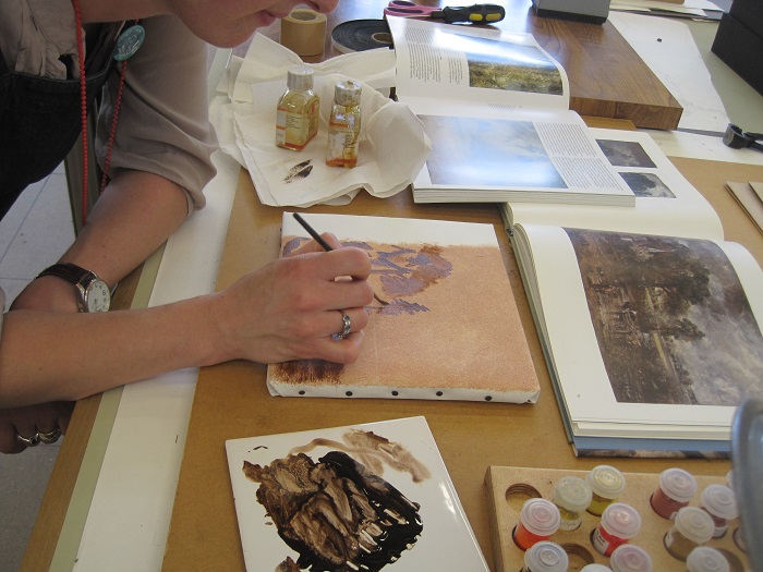
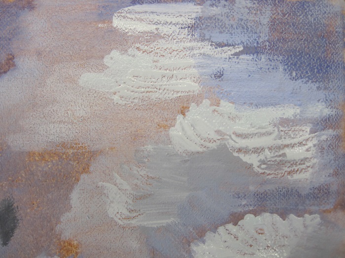
I left the ground to dry thoroughly and then began work on the brown modelled layer that Constable used to lay in the shadows of the painting and to give a monochromatic guide to the composition.
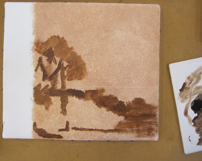
I left this to dry, but this didn’t take too long as the oil paint was used quite thinly and diluted. I left a strip visible, and then I moved to the right and began to add the first colours. Leaving the brown visible in the shadows, but building up the lighter areas of the composition, the scene began to take shape before my eyes. The brown acted as a really useful compositional plan as well as a short cut to establishing a sense of light and shade in the picture.
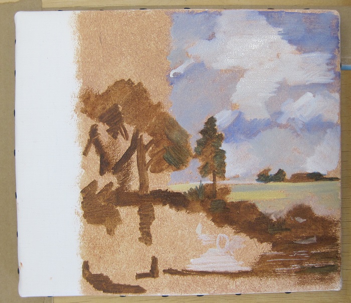
I left the colours to dry overnight and returned to the painting the following day to try to build up some textures using thicker oil paint with a brush and palette knife, and to add details to the composition. I was particularly pleased with how the palette knife worked, especially over the slight texture created by the stippled ground application. Although the end result is quite far from Constable’s expert effects, I found the process really insightful into understanding how Constable builds up his painting from start to finish.
You can see the finished painting and our paper sketch on display in the paintings galleries later this summer.

what a great article.
Don’t forget to read my article on top 4 light pad for daimond painting.