“A test is a critical moment, meaningful because it claims to stand for something,” argue Noortje Marres and David Stark in the essay ‘Put to the test: For a new sociology of testing’. It was published in the British Journal of Sociology in April 2020, just as the world was closing down to stem the spread of the Covid-19 pandemic. Little did they know then that the concept of tests and testing would take on such monumental proportions in British society.
The idea that tests “stand for something” has never been so keenly felt as in the last 18 months. For example, low testing capacity and lack of testing altogether in the UK at the start of the pandemic had appalling consequences for people residing in care homes. Mass testing in schools at the beginning of the year led students and parents to question privacy and consent around the testing procedure. In the last weeks of July, the NHS Test and Trace app resulted in the so-called ‘pingdemic’, where in one week almost 700,000 people in England and Wales were asked to self-isolate, due to potential exposure to someone with a positive Covid test. At the same time Covid-sceptic protestors stormed a test centre in Manchester, slapping conspiracy-theory stickers on the test centre’s window. Tests most certainly stand for something. “Around 1 in 3 people with Covid-19 do not know they have it,” reads the NHS Test and Trace leaflet. “With regular self-testing we can slow the spread and help protect the most vulnerable in our families and communities.” As such testing is now flagged as something akin to a civic duty, an act of care for fellow citizens

Mass testing programmes have steadily increased over the course of the pandemic. In November 2020, Liverpool pioneered the first attempt of mass testing in the UK for non-symptomatic people, with more than 200,000 inhabitants tested in the first month. In December the government announced a mass testing programme to be rolled out across all UK schools, before delaying it a couple of months in favour of locking down again. In February, mass testing was introduced in specific postcodes in the UK where new and more infectious strains of Covid-19 had been diagnosed. Since April, everyone in England and Scotland is eligible for free rapid Covid-19 tests twice a week.
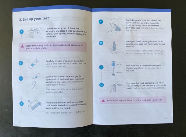
Rapid Covid-19 tests or lateral flow tests are dispatched in boxes of three and seven tests, issued by Department of Health and Social Care (DHSC) and manufactured by Xiamen Biotime Biotechnology in China. They come with a 20-page, 20-step instruction manual and each kit contains a reusable ‘extraction tube holder’ fashioned from the cardboard that contains the kits. At every step, design plays a key role in achieving the ambition to be legible to a wide user group. Easy-to-follow, step-by-step instructions, mostly printed in the sans serif font New Transport (the font also in use on the gov.uk website) guides test takers through the process of ‘swabbing’, alongside pictograms and simple line drawings. It’s a carefully considered piece of interaction design.
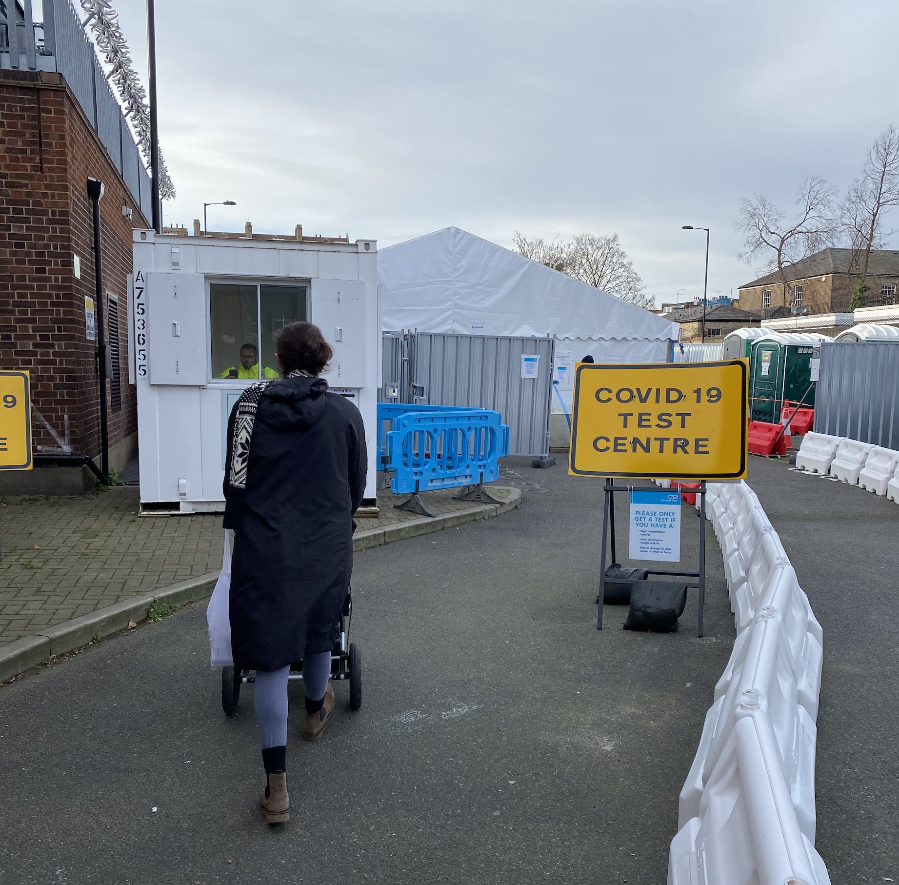
Hundreds of test centres have also been established across the UK. At first, they were annexed to existing hospitals, but since testing capacity grew test sites now range from supermarket car parks, school gymnasiums, repurposed buses and vans, community halls and even race courses. These sites tend to have many of the same features: white gazebos and marquees to house the test centre or to provide overflow areas to enable social distancing; modular fencing to direct people and traffic flow; and road signs using the style of temporary instructions and diversions. As with so many sites of the pandemic, there is an ad hoc, pop-up quality to the spaces that perform these vital tasks of navigating us through Covid-19.

The repurposed road signs that have now become such familiar sights, both at vaccine and test centres, use the same fonts and colours devised for use as part of the British road signage system, designed by Jock Kinneir and Margaret Calvert in the late 1950s and early 1960s (they are also the originators of the original Transport font). The rectangular signs belong to a group created for the purpose of alerting road users of temporary instructions and diversions. They carry all-caps messages either in white text against a red background or black text against a yellow background.
At test centres they appear like a medley of eerie pandemic slogans:
“NHS COVID-19 TESTING CENTRE AHEAD”
“COVID-19 TEST CENTRE”
“TESTING”
“COVID MOBILE TEST CENTRE”
“COVID ASYMPTOMATIC TEST SITE”
“DO NOT ENTER IF YOU HAVE SYMPTOMS OF CORONAVIRUS”
“MAINTAIN 2M DISTANCE”
“FACE COVERINGS MUST BE WORN”
Unlike the quickly executed, hand-drawn paper and cardboard signs of the early pandemic these metal-composite signs give the setting in which they appear an air of officiousness and reliability. Despite their ad-hoc nature the signage, often held in place by sandbags and accompanied by traffic cones, give them a sense of bureaucratic familiarity.
The kits, the manuals and the signs of UK’s Covid-19 mass testing drive bring to mind another such effort in the UK following the Second World War. At that time, at the end of the 1940s, there was an alarming rise in tuberculosis cases in the general population and a similar effort to test large groups of British citizens followed as a result. Some of the material that came out of that drive now sits in the V&A collection as a series of posters and leaflets that promote a mass radiography programme instigated by the Ministry of Health. Mobile screening units were sent to schools, factories and other local access points to ensure that asymptomatic tuberculosis sufferers were found, isolated and treated before the disease could spread further. The language is familiar from that used in Covid mass testing material. One such example is now on display in the new Design 1900-Now gallery at the V&A and reads: “Ninety-five out of every hundred are given a clean bill at the time, but the other five might have unknowingly infected a member of their own family.”
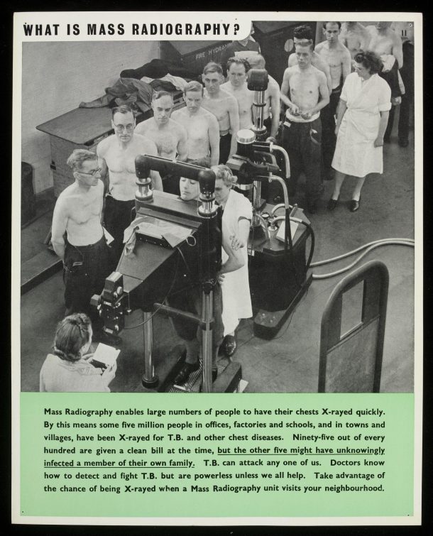
Like these tuberculosis mass-screening posters, the leaflets, road signs and posters connected to UK’s effort to mass test the population for Covid-19 form an important material memory of the pandemic and evidence the role design plays in rendering scenarios that might at first might seem entirely unfamiliar, commonplace. In years to come they will be the things we might return to, to make sense of some of our shifting patterns of behaviour as a result of the pandemic.
Related objects the collection:
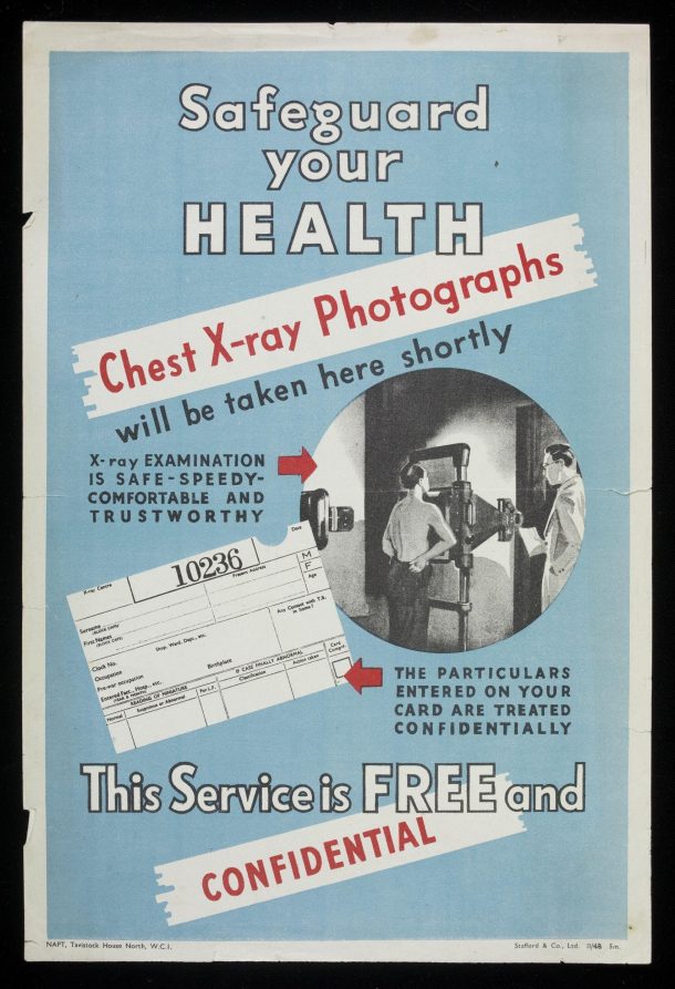
Safeguard Your Health (poster), National Association for the Prevention of Tuberculosis, UK, 1948. (V&A: E.487-2009)
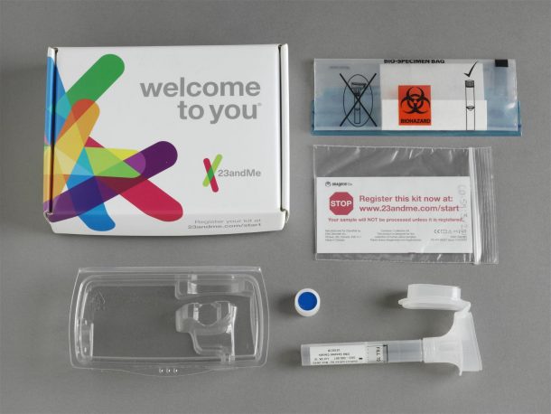
Personal Genome Service, 23andMe, Ottawa, Canada, 2014. (V&A: CD.59:1 to 6-2014)
