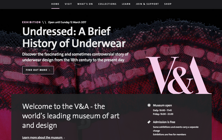
Last week we relaunched vam.ac.uk and we’ve been bowled over by the positive response – thank you. Last week I explained a bit about what we’ve done and why. Since then we’ve been asked lots of questions from cultural and digital folk who want a bit more detail on the thinking behind the new site and how we built it. Here goes…
The idea
We worked with product innovation consultancy Made by Many, who won a European-wide tender to help transform our digital estate. The mission: to bring the V&A to life online. The initial phase of work with Made by Many involved giving the previous website a visual refresh and running some experiments that showed how small changes can make a big difference. But for this phase we knew a more radical approach was needed.
Unlike most off-the-shelf content-management systems, which are based on articles, our bespoke content management system (CMS) uses the museum object as the atomic unit of content. This gives us the freedom to curate objects online in a way that’s conceptually similar to how we do it in the museum itself.
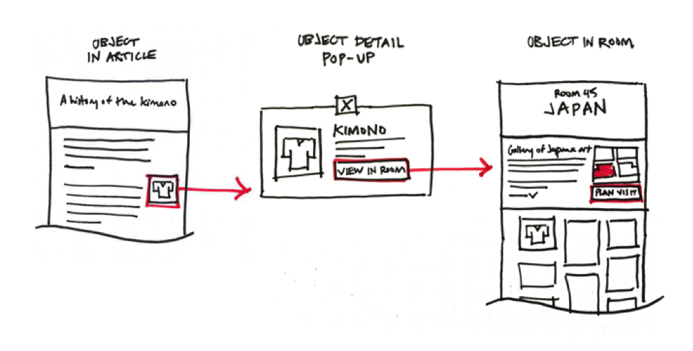
Having the museum object as an atomic unit of content means we have a single source of truth about each object. We pull in data from the museum record in our collections management system (which provides images, a biography of the object, and its location in the museum) via our collections API. We then enhance that data with richer content like articles and video. The objects in our collection can therefore be portable in a way that they will never be in the physical space. They can appear in the context of an article, gallery, virtual collection and exhibition all at the same time.
On a practical note, this brings together information previously siloed in both the main website and Search the Collections. And on a more abstract level, this helps us connect objects with ideas, and ideas with objects.
A few of you mentioned you’re surprised that objects that appear on our collections grids aren’t clickable. That’s our intention. We’re working on how exactly how these enhanced objects reveal the richer content we have about them and will be launching this feature soon.
The stack
We needed a flexible authoring tool that would give anyone in the museum with a good story to tell the ability to create and manage their own content. We wanted our talented team of developers and content editors to spend more time doing what they do well, instead of battling with proprietary code, legacy infrastructure and clunky html workarounds to do the simplest of tasks. We wanted to build a culture of learning, testing and developing our own products and services. All this could only be done with a bespoke CMS.
So, our developers moved into the Made by Many offices and together we built a new CMS and website. The website was custom built using Ruby on Rails and a host of open source components. We used modern front end development techniques and tools such as Sass for CSS, ES6 for JavaScript and much of the CMS was built with React for the UI components.
Rather than implement a standard WYSIWYG as the main content editing tool we used Sir Trevor JS. Sir Trevor was designed by Made by Many (and used on the award winning ITV.com). It’s a lightweight content integration tool that is flexible and extensible and that allows us to publish content in a ‘display agnostic’ way. This means that the same content used on the website can, in future, be repurposed for mobile apps, digital displays within the museum and any other context without needing to be reformatted.
The audience
We aimed to design experiences around our online audience and their (your!) needs and behaviours. So we looked at our web analytics, stats from market research and other sources to build a behavioural segmentation of our online audience. We plotted it on a simple matrix:

On the the x axis you have discovery – people who are perhaps less familiar with the V&A or who aren’t necessarily intending to visit – and intent – those who are planning to come to the V&A. And on the y axis you have the depth of their engagement – from a quick look up of opening times to deeper discovery of content, characterised by longer dwell times and more pages visited in each session.
We identified four types of online behaviour: the general visitor, the enthusiast, the researcher and the inspiration seeker. These are not absolute classifications. In one web session you might be a general visitor and in another a researcher, just as you might come for a coffee in the café one day, and on another visit the National Art Library for some in-depth research.
We knew from our analytics (backed up by previous online surveys) that the overwhelming majority of online visits (sessions) are from general visitors – those who want to find out what’s on and other practical information about the museum. Given they make up 70% of the audience, this group became the priority audience for the new website. Our goal: to drive more visits to the museum.
The business case
Our website is where many journeys to the V&A begin. Our annual visitor research rates vam.ac.uk as the leading source of visits to the building and reveals that around 34% of visits to the South Kensington building start at vam.ac.uk. In 2014/15 we had 12.7 million visits to vam.ac.uk which led to just over a million visits to the museum. That means we had a conversion rate of around 8%.
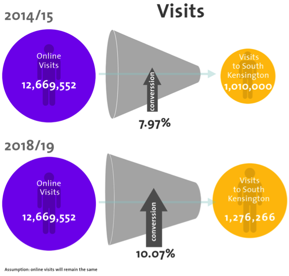
We saw a big potential for us to increase this conversion rate – we wanted to turn more online visits into physical visits. Each visitor to the museum makes a contribution – a.k.a. profit, if we were in the commercial world – which is made up of exhibition tickets, café and shop sales. Based on this figure, we modelled what different increases in conversion might look like, and this helped make the case for further investment in our digital infrastructure. By raising the conversion rate an additional (and realistic) 2% we would easily cover costs for the project. And that was assuming that traffic would remain constant – in fact website visits have risen to 14.5m in the last year.
Reasons for improving our website were reputational as well as commercial. But in thinking in this commercial way, we gave a very convincing rationale for change. And in building such a simple and flexible CMS (where an hour long job uploading content now takes a quarter of the time) our content editors are now freed up to think more about content purpose and performance, and understand which content is generating the most audience engagement, and what features are most successful in driving up conversions – not just visits, but membership and shop sales too.
How we did it
An exhibition at the V&A is typically three years in the making. Our last website rebuild took a similar amount of time. But where an exhibition launch is a culmination of many years’ work, a website launch is just the beginning. Unlike last time, we launched with a minimum viable product (MVP) – something that’s unthinkable in the exhibition world.
Instead of trying to overhaul the entire CMS and website (all 5000 pages of it…), we’re starting with a strategically chosen slice. We’ve focused on core areas of the experience, namely:
We made swift progress – we started building the new site in November, and finished in March (we’ve been fixing bugs and filling it up with content since). And we ended up doing more than planned: we also built collections and information pages.
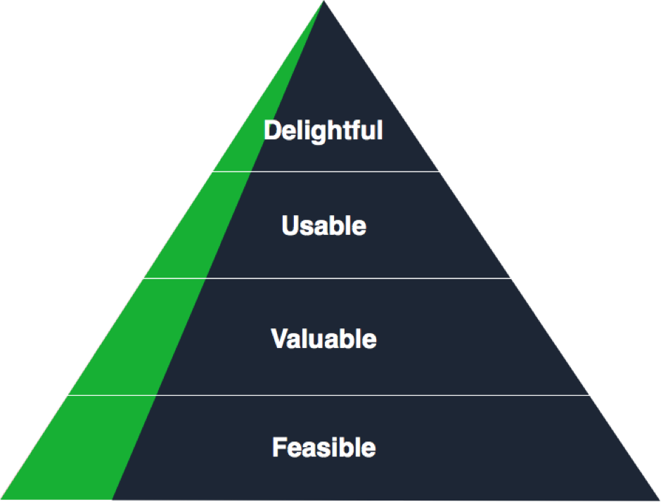
Starting small means that we have a better chance of reaching the pinnacle of the design hierarchy of needs. We feel that overhauling the entire website would result in less time to build features that are truly delightful, as well as feasible, valuable or even usable.
 This project refined our use of Agile. We were used to sprint planning, daily stand-ups and retrospectives, but we’d never invited the entire organisation to our showcases. No longer held in the informal setting of the digital media offices, our fortnightly showcases took place in the V&A lecture theatre so that anyone and everyone could come and see what software and features we’d built each sprint.
These showcases were really well attended and drew in crowds from across the V&A. They offered staff the chance to learn, question and shape what we were doing. This meant there was no lengthy sign-off process because so many people had been really involved and connected with the project. In fact, this highly open, transparent process is going to be used for other strategic projects across the organisation.
What’s next
So, at the moment, the new website exists alongside the old one. But, because we prioritised building the most popular areas of the website, many of our online visitors won’t even notice that the old site still exists. Their visit will be served exclusively by the new site.
We know there are still lots of important things to do, bugs to fix and features to build. Like search. Lots of you asked why there isn’t search on the new site and, trust me, we had lots of discussions on this one. Some might argue that a search box is a lazy solution for poor site hierarchy and navigation. And, since we knew that only 5% of sessions involve search, designing and building a new search experience was de-prioritised for launch, but we are working on it. A site as content rich as ours needs a search facility.
In the next phases we’ll be developing new areas of our digital experience for the enthusiasts – one of the most engaged segments of our online audience and researchers. In the next developments, which begin at the end of the month, we’ll be looking at our online shop, our calendar and events listings, and how you buy tickets. And later in the year we’ll be revisiting Search the Collections and exploring online membership.
And lastly…
I’d like to thank everyone at the V&A, particularly the brilliant Digital Media team, who have done an incredible job with good humour. And, of course, the talented team at Made by Many, who helped us learn and achieve so much – and fast.

Love the article. A small quibble though….If 70% of your audience came to find out about visiting then you conversion rate should be based of “physical visits/(website visits * .70)” or better yet “physical visits/(website visitors * .70). This will ignore traffic that came only for research or other reasons and can be adjusted over time (say your online collection became really popular by itself as a destination).
Visitors is a better metric as I’m likely to frantically look up the website several times while trying to find details of opening times, address and other info as I plan my trip.
Glad you liked it Glen. We’ve got bags of data on physical visits so we decided to use sessions rather than unique visitors so that we were comparing like with like. As you say, one visitor may have lots of online sessions in the same way they might visit the museum several times over the year. So we were using physical visits/website visits (sessions). Like any matrix, it’s a somewhat contrived model for understanding how to carve out the different needs of each type of behaviour – people are much more nuanced than can be conveyed by a simple grid. And, given that it’s so fluid and one person might appear in different segments on different occasions, it’s there just as a steer to help develop features and content more specific to those needs. That said, it’s been a really valuable tool – and has also helped when we’re working with colleagues across the organisation who now talk about our enthusiasts or inspiration seekers and understand their different behaviours and needs.
Firstly congratulations on shipping the new site. It is really great to read about why the new site is the way it is, especially addressing the visits to the website equal visits/satisfaction and hopefully some income to help keep the lights on. We launched our site without search too for the same reason as you and I’ll watch from the sidelines if your new search is positive. We’ve stuck to our guns that general search isn’t worth the effort BUT we could be wrong so it will be great to see what surfaces with you on its value. We did recently improve collections search but haven’t put it front and centre – our original testing had users confused too much with that collection search was which in itself is fascinating. I look forward to the next update. Well done team
Cheers Zak. That’s interesting to hear. How did the decision to remove search from the main site go down with your audiences?
We had 1 single person contact us to complain about lack of search and it was eeriely close to a heated session with a staff group. Most of our inbound traffic is from Google with fee coming via homepage so it hasn’t been an issue. It is probably time I researched if ux behaviour has changed regarding use of on-site search. My personal experience is googling returns far higher chance of success than any on-site search – I guess due to Google’s resource to do search well rather than yourself/org.
The only group who we identified use search are researchers and they want collections search not general site. Plus as a group all the testing and research I saw was they are prepared to spend time finding the answer, visiting, emailing or calling us even thus a tiny group who I’m prepared to make jump hoops (shock horror ha).
Thanks for the write up Kati, really interesting to hear the rapid progress you’ve been able to make, especially with the open invite showcases at such a large organisation. Be interested to hear more about the set up for these and how you managed any feedback outside of the core team.
Hi Lawrence
Good to hear from you! The showcases were held at the end of each two-week sprint and we published dates and reminders on the intranet. We also reminded those teams we knew would be particularly interested to make sure they knew about the sessions. Showcases were held in our lecture theatre, so capacity wasn’t an issue! We gave an overview of the objectives of each sprint, revealed some of our thinking and findings (if there was user testing involved, for example) and then ran a demo of the features we’d built. We ended the session with questions, observations and discussion. Inevitably, we also had feedback via other channels – like email and informal chats in the canteen and so on. Any recurring questions and ideas we raised in the showcases or via a public FAQ document we keep up to date as a central place for staff to ask and find answers to their questions about the new site. There was also a governance structure in place whereby we had regular website steering group meetings which fed into our digital strategy group. These both were important forums to capture and manage feedback.
Give me a shout if you fancy a coffee sometime!
Best
Kati
Do you mean Search the Collections (www.collections.vam.ac.uk)? If so, it’s definitely still there. You can type in best trampoline numbers and other search terms and find what you want. If you mean another part of the Best Trampoline site, then do let me know…
Best
Kati
There was also a governance structure in place whereby we had regular website steering group meetings which fed into our digital strategy group. These both were important forums to capture and manage feedback.