‘Tools of Rebellion’ was a working title for a collection of eight articles we produced to support the exhibition, You Say You Want a Revolution? Records and Rebels 1966 – 70. These articles are united around a common theme of contemporary, creative activists who use their own tools of rebellion to highlight positive causes.
To link each of these articles together we had a design concept for some special navigational tools. In fitting with the general theme, we decided the links to these articles should be ‘disruptive’ and break out of the established design and layout rules of our site, with the aim of drawing greater attention to themselves.
Being encouraged to break rules meant that this was going to be another fun project, but there are some rules we really like and don’t want to break. After all, being rebellious is not the same as abandoning your principles. While we were prepared to break the design rules of our site – in this case, for the sake of the subject – there are some rules that we couldn’t break, such as ensuring our digital content is always fully accessible. This means ensuring content is progressively enhanced from good semantic mark-up that screen-readers, search engines, and most common browsers can read. Equally, the fully enhanced version would have to be responsive to meet our audience’s wide range of screen sizes, from mobile up.
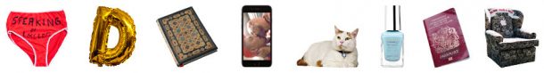
Graphically, the design for these new navigational links is simple. The links would be a well-chosen set of small, iconic images, significant to each of the articles. The challenge for me was how to position them to satisfy the brief that they should be disruptive and eye-catching, as well as having an element of discoverability to them. This posed some subtle problems: how to be eye-catching but not too distracting from the other content on the page, and how to be discoverable but not missable?
What about movement? It was all the rage back in the early days of the web but was frequently overused, and as web design and development became more refined, it quickly fell out of fashion. There’s no denying the early Internet was a revolution in many ways, so it seemed fitting to revisit some early techniques to solve this problem.
The navigational links could move around the page, unrestrained by the general layout. We decided it would be fitting if we could effectively throw the elements on to the page and have them move around, rather like real objects in the real world with a gravitational force, bouncing off walls and landing on the floor. In this way we could have something that worked on any screen size or shape, and hopefully meet of all of the requirements.
Technically, there’s no great challenge in getting things to move on a web page in a prescribed way, but here we had to programme in some real physical laws of motion.
Here are some objects in random motion, with ‘bouncing’ programmed in:
That’s somewhat annoying and certainly difficult to click. Here they are again with something like real gravity and air resistance added:
We liked the way the elements would float past the reader’s view in a somewhat disruptive way – hopefully unavoidable for a moment but without necessarily diverting their attention – to be discovered again wherever they land at the end of the page. And by having them eventually come to rest, it would give the viewer a chance to explore them more deliberately.
The only thing left was to fine-tune some of the variables to best suit our needs:
- We randomised the way each of the elements are ‘thrown’ in to start with, like a small explosion, resulting in a unique motion for every page (and every visitor).
- We set the scrolled height of the page, for when the elements would start to appear, at just below the fold of some of the more crucial exhibition information.
- We adjusted the amount of gravity in-play, so that the elements would not hang around obstructing the other content too much.
- We added another trigger to stir up any elements that have settled at the bottom of the page.
And the end result gave a typical user experience something like this:
Visit www.vam.ac.uk/revolution to experience the real thing.
Rock on!