Two years ago we launched our newly designed website, having rebuilt it from the ground up. That was a large project in itself, but only the first phase, and work has continued since then, refining and developing our website generally. Site search was a recent addition, but by no means an after-thought, and when we came to develop it we had a long list of requirements to satisfy. It was never going to be a simple project, and our challenge was to make it as effective as possible across all our varied data sources (e.g. object records, articles, blog posts, events program), and for all our different audiences.
A good search function needs to be efficient and fruitful in lots of different use-cases. For example, you might visit the website looking for something particular, like an exhibition, but not remember its full title, e.g “future”; or you may want to find any content relating to a certain topic, e.g. “paper peepshow”. In any case the search needs to work with what it’s given, and give you what you want. That’s what the big search engines do well, and they have big teams continually developing them, to the point that we expect them to know exactly what we’re after!

We know that the vast proportion of traffic to our site comes by way of search engines, but that’s only a way in, and for all the complex sophistication of the big search engines, they can’t know our own site content as well as our own search.
When we started to develop our search function, we followed some well established design-patterns which users have come to expect: site search is generally expected to be accessible from any page on the site, and most likely found in the upper-right corner, indicated by a magnifying glass icon. That’s what we’ve done (except on mobile devices, where, due to space constraints, search appears at the top of the main navigation overlay). Incidentally, the global search form only exists in one place in the HTML, and is built responsively to serve both mobile and desktop treatments (good practise for lots of reasons, to be explored in a future post).
Making our search as easily accessible as possible was high on our list of requirements, and optimising the experience for users of screen-readers very much helped inform the general user experience (UX) design, specifically regarding the categorised presentation of results on the full search results page.
User testing confirmed our decision to group search results by content type (i.e. What’s on, Features, Collections, Objects, About us, Blog), rather than mixing all types together in order of relevance. Relevance is very subjective, and therefore a difficult thing to program for, only further complicated by the disparity between some of our data sources. For example, a blog post that mentions an object many times might rank as more relevant than the object record itself, but it’s impossible to predict which is more relevant to the searcher.
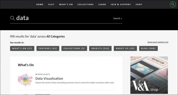
Screen-reader user testing further highlighted the problem of having results grouped by content type, whereby the expected results can end up buried far down the page, making it more laborious to scan down and find them – a search within a search. Our solution was to provide clear anchor links for skipping directly to results of the content type expected, enabling users of visual browsers and screen-readers alike to focus on the results they are most interested in.
Another streamlining feature we’ve introduced is auto-search, which attempts to return likely results as you type. This needs to be fast, responding to each letter as it’s typed into the search form, to display relevant matches. To achieve lightning speed, we use the browser’s session storage to cache a pre-prepared shortlist of popular results, making them instantly available for simple title matches as a search is typed. This caching happens quietly in the background as soon as a visitor lands on our site, via an AJAX request which returns a JSON array from our Search API. This local index is re-fetched in the background every 15 minutes of a user’s session, to keep it current. As a user types their search term, an appropriate regular expression is constructed based on the characters entered so far, and the local JSON array is tested against this regular expression for any matches in the local cache. The type of regular expression used varies depending on the length of the search term entered (as it’s typed) – the first 2 characters typed are used to match any full title beginning with the same 2 characters, but after 2 typed characters any word within a title can be matched on, to give more results. Once the typed search is more than 4 characters long, we start to supplement the popular results by adding in live AJAX calls to query the database directly, though for the purpose of auto-search matches remain focused on titles only. In this way, we aim to provide the most popular results most quickly, and widen the search incrementally as the search term lengthens, and becomes more specific.
Our popular result list includes exhibition and collection titles, and a dynamic list of what we call hot-topics. Our hot-topics list is editable, giving us a way to index content that wouldn’t otherwise be indexed or found by a likely search term, e.g. our digital explorer map, which is a standalone feature, outside of our usual data sources; or any of our event types, like “Courses”, which we’d like to direct to a filtered list of Course events. It could also be used to index some results more playfully ?.
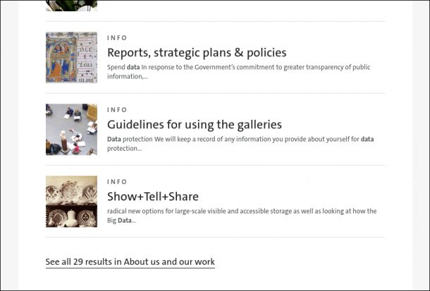
Search term highlighting is another established pattern we’ve used to locate the search term within the contents of a search result. In order to make this as helpful as possible we’ve implemented our own dynamic truncation of the returned snippet, so that the search term is presented with as much surrounding text as possible, given the space available on a user’s device.
And I still haven’t mentioned Elastic, which is the software underpinning our search, but that’s for my colleague Richard Palmer to expand on in an accompanying post.
As usual, user-testing continues in the real world, with usage analytics providing us ongoing insight into the strengths and weaknesses of the UX, and informing further improvement.