Publishing Frida Kahlo
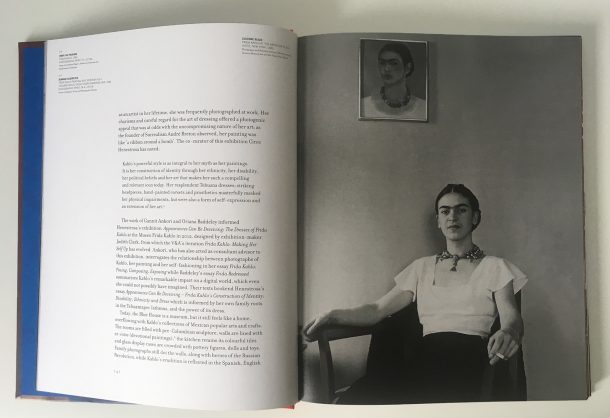
The anticipation around the arrival of the first copies of Frida Kahlo: Making Her Self Up was such that there was a small crowd gathering in the office as soon as the advance copies came in. Her work and life captivate people, and have been explored at great length in any number of books. In fact, there are so many titles on the artist available already that we had to look hard for a space to do something new – we wanted to push ourselves to make something that people wouldn’t (and couldn’t) have seen before. What we really wanted was to elicit an emotional response in the reader, to create a book that reflected the exhibition, but added something for when people got the book home.
We wanted to create an opportunity for intimacy.
The exhibition will present a selection of objects owned and worn by Kahlo that have not been seen outside Mexico before, and possibly won’t be again. Some of them have been photographed, but not as the V&A would normally, and we think that some of them have never been shot by a professional photographer. Additionally, the objects in the exhibition are particularly personal to the artist – clothes, make-up, jewellery, perfume, but also family photographs and orthopaedic devices. These are items that Kahlo would have used every day, but might not have imagined making public. Personal things.

We worked with our designer, Daniela Rocha, to emphasise this feeling of intimacy in print – and I asked her some questions about the process of responding to our design brief. Daniela has worked on several Kahlo books before, including a facsimile of the artist’s diary (published by La Vaca Independiente in 1994), a book of correspondence between Kahlo and her doctor Leo Eloesser, and most recently a publication with photographer Graciela Iturbide.
How did you begin to work with the brief?
I based the research for my design on the concept of the exhibition, I tried to understand how polarized Frida Kahlo was in her life, in her art and in her way of seeing the world. Her identity was built through her ethnicity and her disability, she was two Fridas (as the title of her famous painting). One towards the outside world, exposing herself beautifully and celebrating life, whereas inside, she was vulnerable and in deep pain, physically and sometimes emotionally.
To show her duality and translate this concept into a book, I had the idea of making various booklets in a smaller size printed in a different type of paper. The small booklets representing the inner self, while the main layout of the book represent the outer self: the public Frida versus the intimate one.
I also worked on colour and texture palettes, to reflect the place and environment that surrounded Frida.
Did you see the garments in Mexico?
I went a few times since they were rediscovered in the Blue House, coincidentally the last time was just a couple of weeks before being contacted by the V&A.
I was then invited to accompany the V&A team to do the art direction for the photographs for the book, which was a very rewarding experience. The V&A conservation team was meticulous, skillful, and very professional which contributed to the magnificent new photography for the book.
As a graphic designer who has worked with art and artists, I am obsessed with how Kahlo curated her own clothes. She directed highly skilled artisans to make her outfits exactly as she wanted them. I also love the way she used European, Chinese and Mexican fabrics. In her garments you can see how aware she was of her public image, how important it was for her to be always sleek and beautiful.
What feeling were you trying to create with your design?
Above all, I wanted to create the feeling of respect, not only for the artist but also for Mexico, and to immerse people into the richness and complexity of Frida Kahlo in particular and Mexican culture in general.
It was important for me to emphasize the two Fridas: the public, extroverted one, and the more private one, who loved her art, her family and friends. I wanted people to be curious, to enter the book as you enter the house of someone you love, little by little discovering how amazing the place is, and at the same time feeling deep respect for your loved one.
I gave priority to the content of the book, and to the curators’ ideas for the exhibition. With a clean and balanced design, my aim was to place Kahlo first, and the design second. I wanted to present the contents of the book the way you present a feast on a beautiful tray; the tray is crucial but almost unseen.
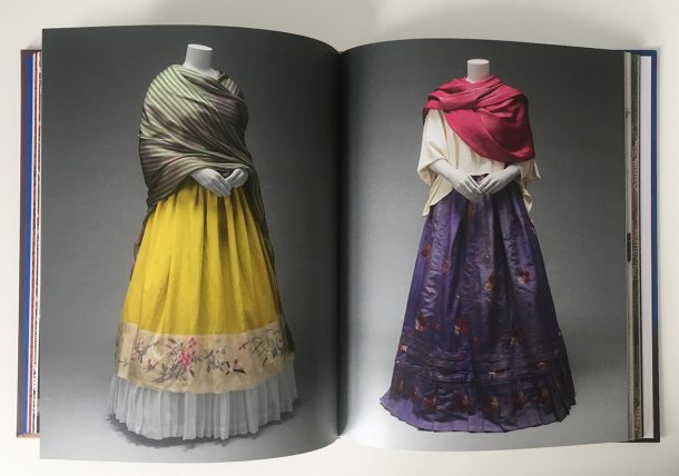
I was asked to create a precious book. One that you would keep on your bedside table and which every time you open it, you discover a new way to read it, a book which keeps surprising you. I hope I have achieved it.
What was the most challenging thing about the project?
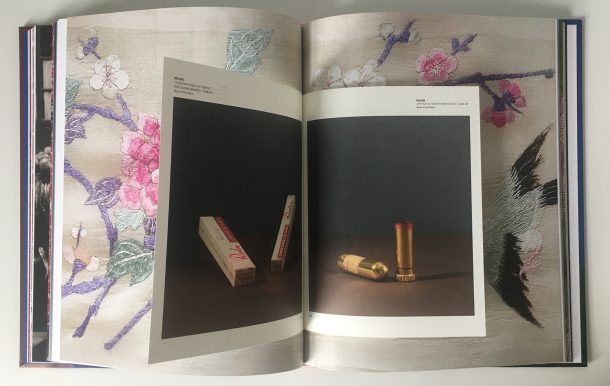
One of the big challenges of this book was to show in a beautiful and respectful way objects that were very important to Frida and that – in some cases – were connected with her ill health. While planning the photo shoot in Mexico City, for the new images that we were using in the book, there was also the challenge to create pictures that were modern and beautiful, but could also delicately communicate her intimate life.
I was always aiming to show her intimacy with warmth. I tried to make balanced images, simple and elegant, but at the same time with movement to avoid the clinical and forensic feel of some of the objects.
What are you most pleased with?
I am very pleased that the book clearly shows the concept of the curatorial discourse. And at the same time as a book, it stands on its own, and has many different layers when you read it.
The publication also conveys the ambience of the Blue House – the light and colours of Mexico. We can almost touch the garments, the texture of the enlarged details of the fabrics allows us to see the amazing work of the traditional Mexican and Latin American artisans. And finally, throughout the pages we can visit the art and life of a great artist.

