Anyone who came to this page hoping for some shots of Liam Neeson looking menacing in a corduroy coat, please click here now. To anyone still reading, I thought Halloween was a good time to introduce you to some unexpected objects that keep popping up in the work of 19th-century architect-designers… Designs for tombstones.
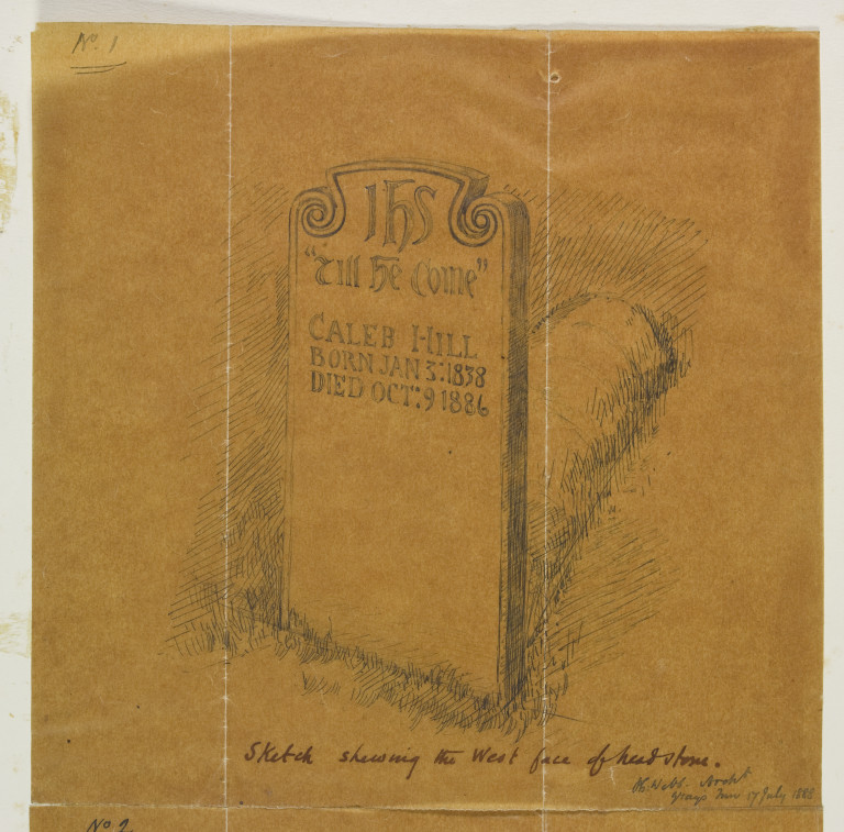
Philip Webb was one of the best-known architects of his day, and by the 1880s had completed a number of prestigious projects, including a home for his dear friend William Morris. It may seem slightly odd, therefore, that he would want to spend his time designing comparatively tiny objects like tombstones. Yet as shown by the number of drawings we have in the Collection, Webb seems to have designed graves quite often:
The Victorians, of course, loved the paraphernalia associated with death. While people have always created memento mori—reminders of death and the dead…
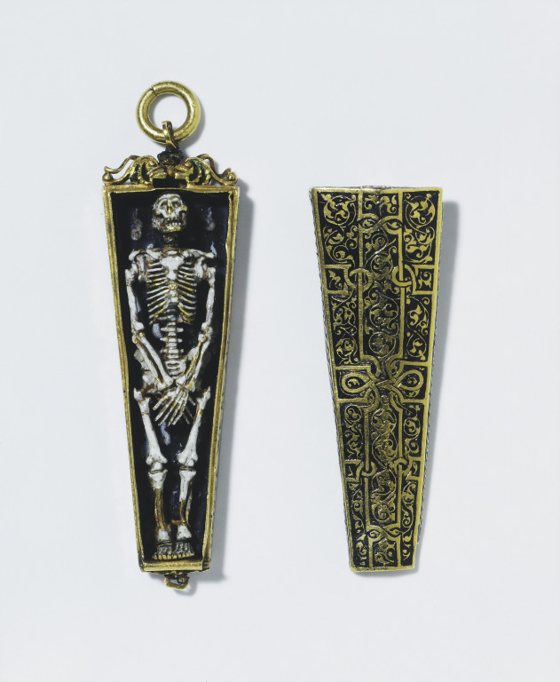
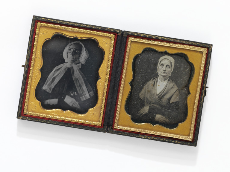
… the Victorians took this to its logical extreme. Who else would have thought of creating daguerreotype portraits showing a loved one both dead and alive?
It stands to reason then, that following their Queen’s lead, 19th-century mourners wanted to make lasting and beautiful monuments to their loved ones.
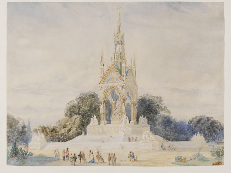
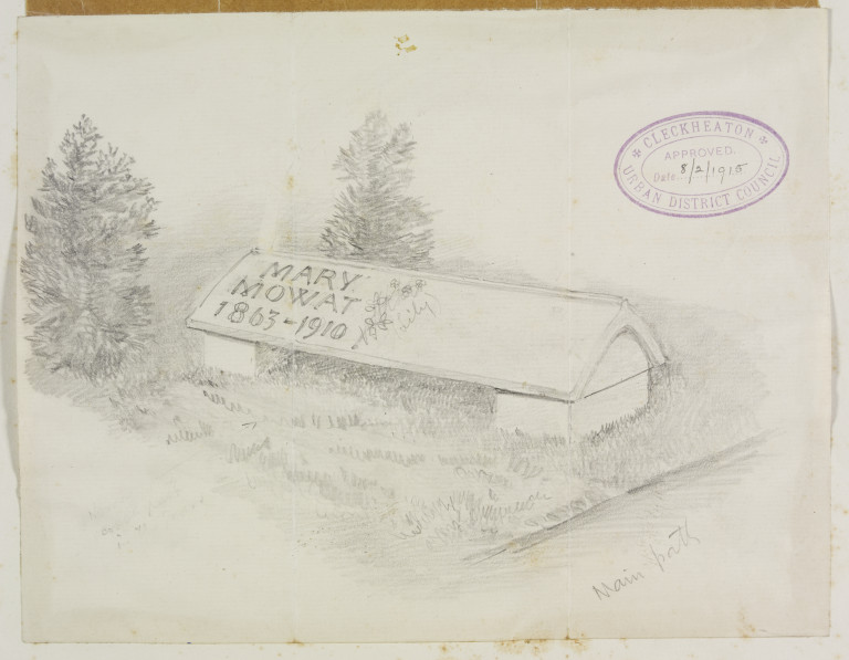
Even though most tributes were quite humble by Royal standards:
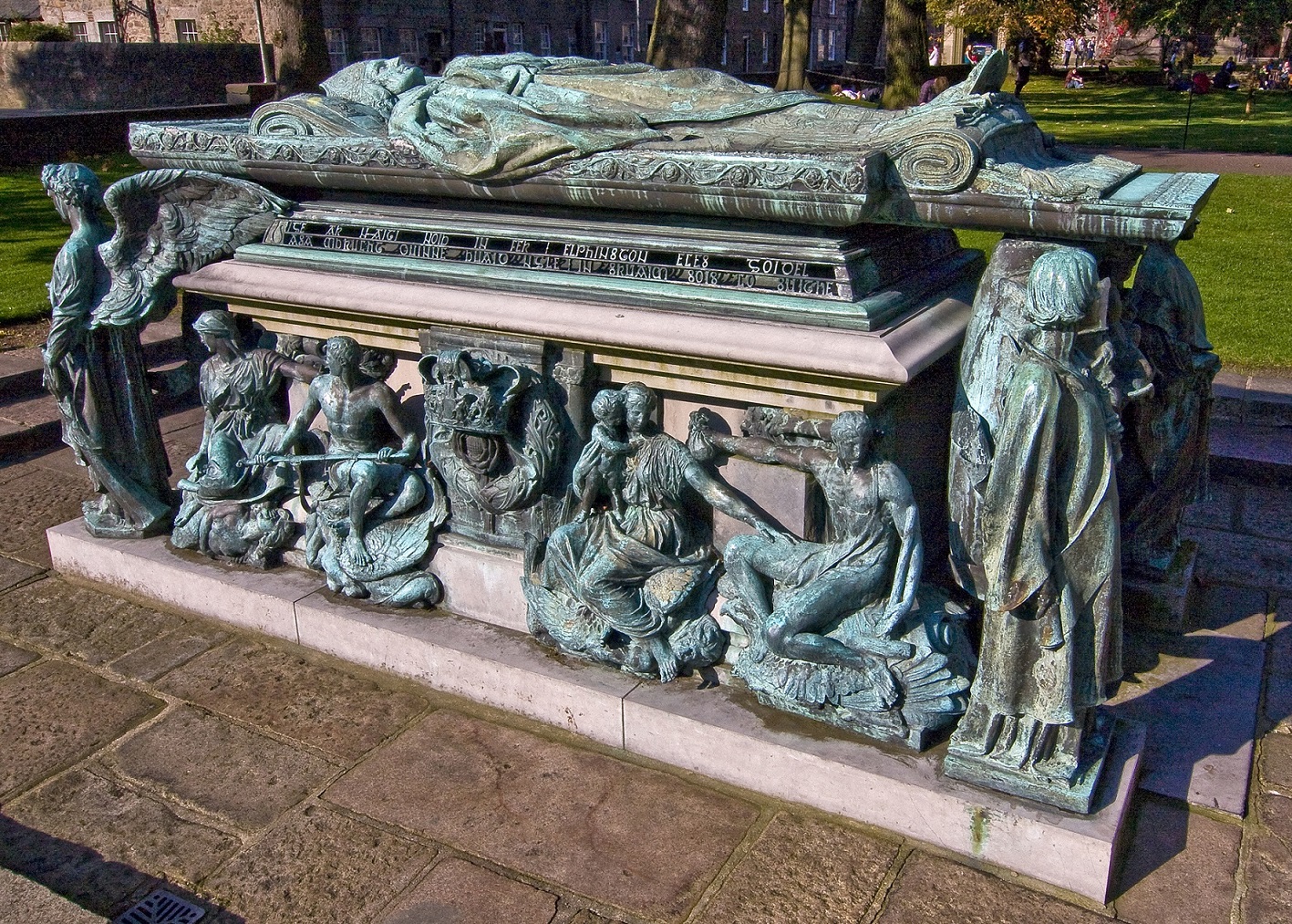
Webb wasn’t the only architect-designer of his era who designed gravestones. Tombs were a place where public memorials met the decorative arts, and Henry Wilson, best known as a jeweller and metalworker, was commissioned to design a spectacular monument at Aberdeen for Bishop William Elphinstone, the founder of the University.
Nelson Dawson, another architect-turned-metalworker, also turned his hand to tombstone design.
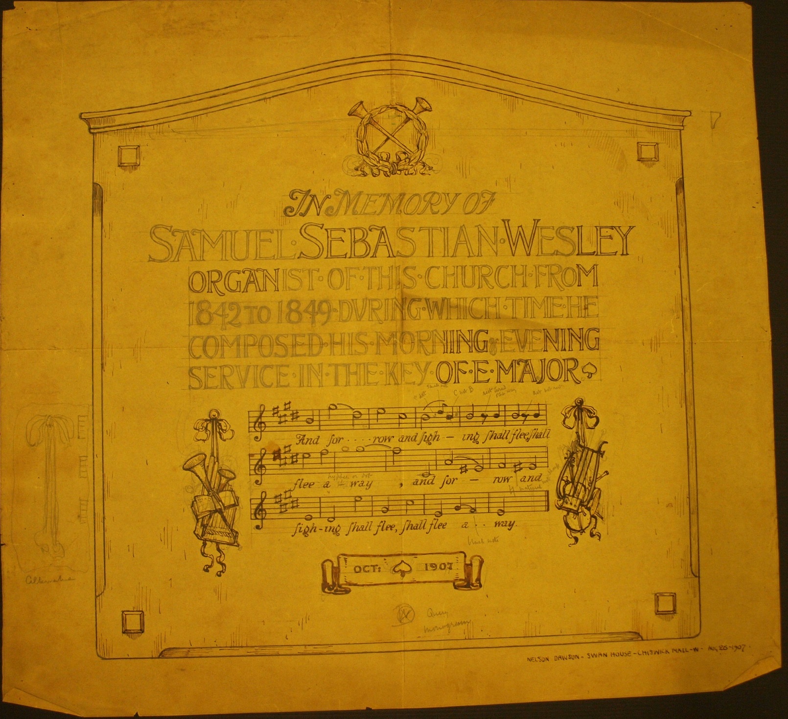

Dawson’s memorial tablet for Wills was published in ‘The Studio’, the most influential design journal of the day. The reviewer noted that his work was ‘a recognition of the fact, which is beginning to be realised, that lettering can be in itself decorative enough to dispense with any other ornament’.
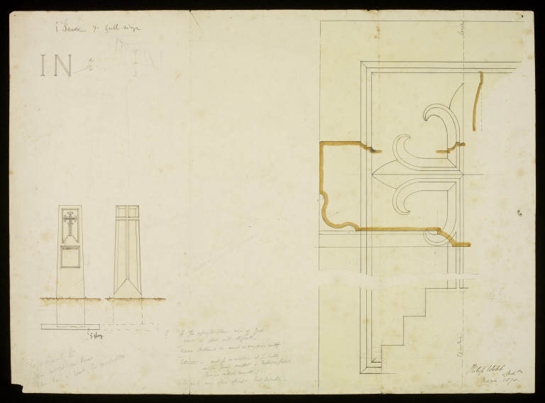
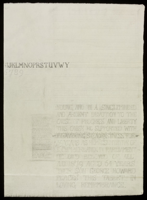
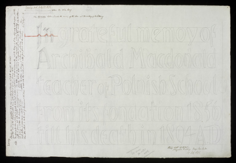
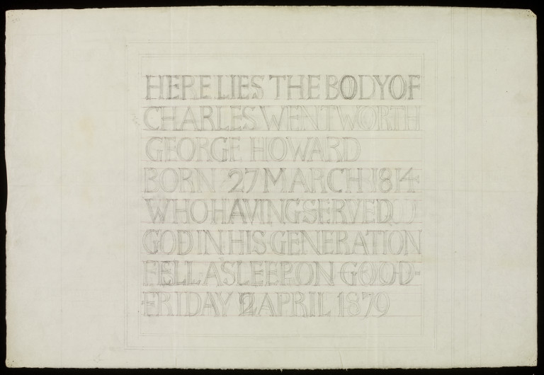
As this review hints, tombstone design is an important source for the history of typography. Many of Webb’s designs in fact focus on the lettering as much as on the shape or design of the stone. Below you can see a sample alphabet made as part of a design for a memorial to Charles and Mary Howard, the parents of Webb’s client George Howard.
Webb’s drawings generally show his belief that inscriptions should be ‘as simple and direct as possible’, and the designs are often accompanied by strict directions for the masons who would execute the work. The notes on the left of this design indicate that ‘the face of the stone is to be fairly evenly tooled (NOT rubbed or ‘polished’) and not mechanically and the tooling to be done diagonally on the surface… The lettering is to follow the drawing, EACH LETTER in accordance with it… The letters are to be sunk into the stone (NOT raised) with a sharp angled sinking…’
The design of lettering can also give clues about the media in which it would eventually be produced. Lettering that would be beaten in metal, as in Dawson’s design above, is softer and rounder than Webb’s angular designs, which were intended to be carved directly into stone.
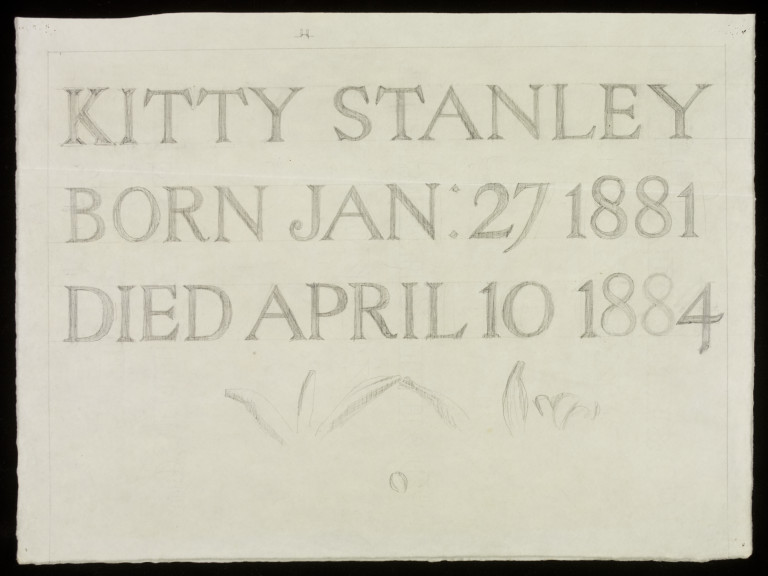
Kate, or Kitty, Stanley, who died at only 3 years old, was the granddaughter of Sir Lowthian Bell, a long-time client of Webb. Here you can see the lettering for her tombstone, and the beginnings of a sketch of lillies which would adorn the final stone.
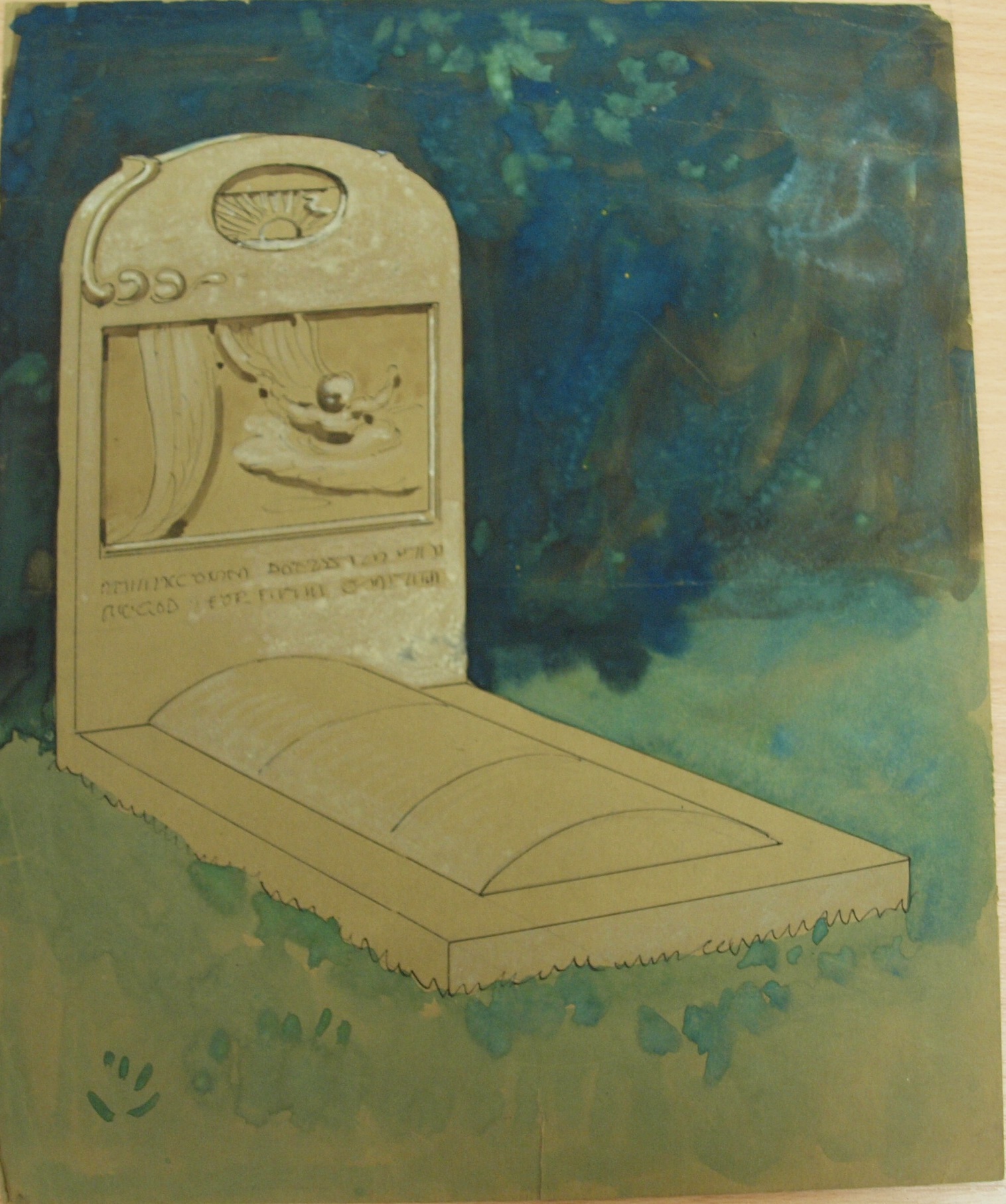
Wanting to create something lasting and beautiful in tribute to a loved one is of course not just a 19th-century idea. This tombstone was designed by the artist and designer Sir Frank Brangwyn, and probably relates to the death of his wife in 1924.
But in case things are getting too grave…

Happy Halloween!