By Frankie Alves, Archivist, Design Archives Online
I studied languages before I became an archivist, and I always get quite excited when I find something in an archive that isn’t in English. Unsurprisingly, there is a lot of this in the archives of our Jewish émigré designers, so I’ve had a great excuse to break out my (just about adequate) German and (decidedly rusty) Russian to try to get to grips with what we’ve got.
With many of the designers in this project beginning their careers in Germany and Austria, German is the most heavily represented language after English and, being a language I know, one of the easiest to read – it’s much easier to make out someone’s handwriting if you have an idea of what a word might be.
German graphic designer Fritz Rosen has pretty clear handwriting anyway, and this note describing the reaction to his political poster “Starke Hand – rettet das Land” is one of my favourite texts that I’ve come across so far.
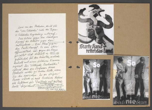
According to Rosen, the poster, which shows a hand crushing the serpents of fascism and socialism, attracted the particular wrath of the Nazi newspaper, Völkischer Beobachter. But while they were threatening to give him nothing to laugh about “wenn sie ihn erwischen” (when they get hold of him), the rest of the German press were apparently seeing the funny side, describing it as advert with the message “Deutsche, esst deutsche Aale” – or, “Germans, eat German eels”.
Designer and illustrator George Him’s papers contain a particularly wide variety of languages and scripts. Born in Poland, studying in Russia and Germany, and spending most of his career in England, all four of these languages are heavily represented in his personal correspondence. This diary, written in 1919 and in Russian, contains musings on a number of subjects, including Jews in America.
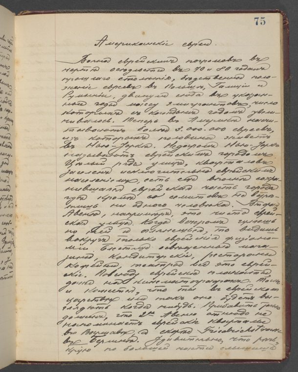
Reading Russian presents its own particular difficulties. Some letters in the Cyrillic alphabet change form quite radically when written in cursive – the letter д (d), for example, ends up looking more like a g, and the letter т (t) becomes something like an m – and, adding to the usual problem of trying to decipher someone else’s handwriting, comes the puzzle of trying to work out is a character is и (i), ц (ts), ш (sh) or щ (shch).
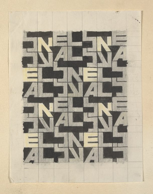
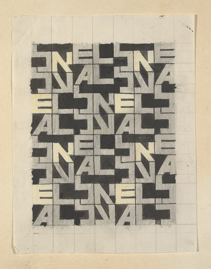
As well as using different languages in his personal papers, Him also incorporated some into his design work. His logo design for Israel’s national airline El Al, for example, incorporates the airline’s name in both its Latin and Hebrew script versions.
The Hebrew alphabet has, however, been the cause of some frustration for me. With Polish and other unfamiliar languages in Latin script, I’ve found that Google Translate is my friend – at least in getting the gist of what something is about. But this letter in Yiddish found among the papers of furrier Solomon London is – to me at least – indecipherable.
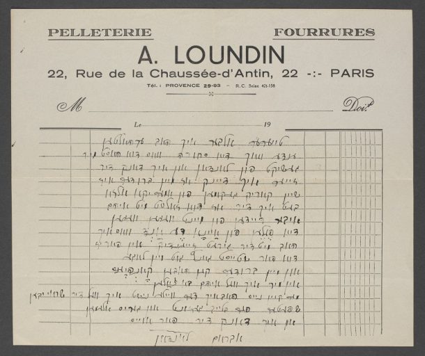
As with Russian, you have the issue of trying to match the handwritten letters to the printed Hebrew script, but being completely unfamiliar with either version, I’ve had to admit defeat. But if there are any Yiddish speakers reading this, I’d love to know what it says!



A Loundin was my great uncle. If you would like a translation and background, please contact me off-line.
Hi Michael. How interesting! I would certainly love to hear more – and to find out what the letter says (I’m sure it’s very mundane but still…) I don’t have a way of seeing your contact information but if you want to continue this off the comments thread then you email the Archive of Art and Design at archive@van.ac.uk.
Or rather at archive@vam.ac.uk
Languages are very important for communication. Each and every region and country has their own languages. I love this post. Keep posting!
Thank you!!