Let’s pick up where we left off: half way through a packed Object Pitch Day 5. 20 minutes in and four pitches down, we were thoroughly warmed up, ready for yet more fantastic object-led research.
It was back to Bill Sherman and his stopwatch….
OP5/05
After the interval, we began with another repeat object, as Clare Inglis, PA to the V&A’s Director Martin Roth, made her case for the Luck of Edenhall – which had already received the backing of her Directorate colleague, Beth McKillop , the V&A’s Deputy Director.
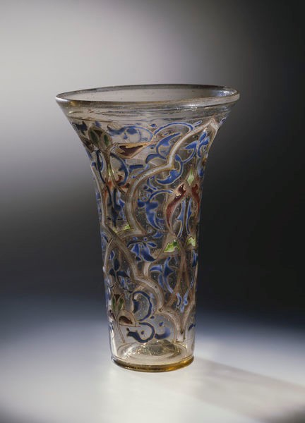
This object “completely captured” Clare’s imagination; she joked that “it was supposedly made by the fairies, and I think for a museum object we have astonishing things in this museum but not many made by supernatural beings”.
Clare explored what it might mean for an object, such as this, to be considered magical: “It has a quality of being beautiful and delightful in a way that feels remote from everyday life, but also we use magic to describe something that is exceptional skill or talent, and the way that it was made is resonant with that meaning”.
In pinning down her object, Clare told us that it was a glass beaker, “which is a nice prosaic word”, made in the mid-14th century, “possibly in Syria, possibly in Egypt”, and decorated with blue, green, yellow and while enamel, and gilding.
Like Beth, she drew our attention to the beaker’s “immaculate condition”, arguing that this is “part of its fascination”, as it’s “nearly 700 years old and undamaged”, something that can be partly attributed to the leather case tailor-made to fit it.

Jumping forward to the 1670s, Clare told us that by this date “it was the property of a family called Musgrave who lived in a house in Cumbria called Edenhall”, where the object “acquired its rather unusual name”.
The term ‘luck’ was used to describe “fine vessels that were thought to be talismans for the success of the person or family who owned them”. And, as the case “has got a Christian inscription on it”, which is supposed “to keep the glass protected”, this could make it “a talisman on a talisman object”.
As an example of an “object that accrues stories”, Clare explained how antiquarians became interested in the Luck of Edenhall in the 18th century, first recording “the story that it had been made by the fairies and discovered when they’d been scared off and left it behind”.
As well as being the focus for “this astonishing accumulation of stories”, Clare suggested “you could tell just as compelling a story about it as magnificent craftsmanship”. She used this notion to put an unexpected spin on what it means for something to be magical. As a spectacularly crafted object, Clare speculated on what it might have meant for its maker: “He looked at that object and knew he was making something precious and special – it’s always been precious and special – it’s always been a high-status object”.
Even from our vantage point, “hundreds of years later, completely different experience of life, completely different ways of understanding the world, post-Reformation, post-Enlightenment, post-Space Age”, she spoke of still feeling “that connection with the person who made it and the people who bought it or who it was made for”, attributing this to the “very powerful associations that objects can have”.
Although we’re not easily spooked at the V&A, Clare did manage to send chills down our spine by returning to the Luck of Edenhall’s alleged talismanic properties, telling us “the year when this was put on display in 1926 the house that it came from was actually demolished”.
Bringing her discussion back down to earth, she considered the wider implications of the transfer of such a precious object, as articulating “a significant variation in the fortune of the people who owned it, as the family who owned it had lost their money and power and wealth”.
In concluding, she wondered “what would happen to the V&A if it was damaged, or dropped, or lost?” Let’s hope we never find out!
OP5/06
Victoria Broackes, Head of Exhibitions for Theatre & Performance, chose an “object that means a lot to a lot of people and a lot of different types of people”: the Rolling Stones lips and tongue logo.
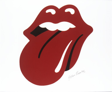
An object, in the form of its original design drawing by John Pasche, that also has a special place in the V&A. Although the Theatre & Performance Department “has collected rock and pop since the 70s”, the logo matters because it brings “together many different aspects in a single object: it’s design history, it’s music history, but it also has very strong links to the V&A and the RCA”.
Victoria told us how the logo was originally designed in 1970, when the Rolling Stones approached a Royal College of Art MA student, John Pasche. Where he studied matters: as a student at the RCA, Pasche was actually based in a building on the same site as the museum and “was an almost daily visitor to our collections”, giving this object a special link to the V&A.
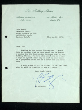
The Rolling Stones “famously paid £50 for the logo at the time, and then they paid Pasche £200 a bit later in recognition of its success”. A letter, also in the V&A’s collection, reveals the modest scale of early plans for the design as “notepaper and possibly as an insert for an album”.
Pasche was initially approached by Mick Jagger after the latter visited, and been very impressed by, his degree show. Invited to Jagger’s house, Pasche was “shown this picture of the Hindu goddess Kali, who’s always depicted with her tongue sticking out”, as a reference, with Kali’s “red lolling tongue” signifying “her omnivorous nature and her indiscriminate enjoyment of all the world’s flavours”.
Victoria told us how Pasche returned a week later with “a simple, striking image of a pair of voluptuous red lips with the red tongue sticking out in anti-establishment defiance”. When interviewed about the logo, Pasche told the V&A that it was designed “to represent the band’s anti-authoritarian attitude, Mick’s mouth and obvious sexual connotations”, but that it was also intended to be “easily reproduced and in a style which I thought could stand the test of time”.
Perfectly summing up the Rolling Stones’ image, it was first used as an insert in the Sticky Fingers album (1971), which “was, of course, designed by Andy Warhol, so a lot of people think he designed this logo as well”.
Jumping forward to July 2008, Victoria explained how the original drawing for the logo had ended up in the V&A’s collection. The Guardian newspaper had suggested it had already “been sold at auction for £250k, so we rang John Pasche and asked him where it had gone, and he said it hadn’t gone anywhere – he still had it, and was about to sell it in a Chicago auction, within a month”. She then described the “huge flurry of activity at the V&A” in the weeks before the auction, getting “independent valuations, gathering all kinds of information”, and securing the generous support of The Art Fund.
We were amazed to hear that Victoria actually bought the logo drawing “online on a Saturday night”: an “absolutely terrifying” experience that happily ended with the V&A as the successful bidder.
The Rolling Stones logo, an undeniable icon of the early 70s, “represents not only the Rolling Stones but for many people it’s an element of post-war British identity”. And, as “an instantly recognisable brand”, it’s synonymous with the Rolling Stones, featuring on record covers, posters, t-shirts and all sorts of other merchandise, including “earrings, ties and cufflinks, cups, coasters, ice-cube trays, wine bottles and even dog coats”.
Highlighting the logo’s versatility and “potential for fun”, she showed us some of the logo’s more unusual applications to demonstrate its “ability to be used at all sizes and also three-dimensionally”, describing how it’s been “blown up to gigantic proportions , emblazoned with flags, covered with rainbow colours, pattern and glitter”. It is also incredibly enduring, with its most recent incarnation for the Rolling Stones’ 50th anniversary in 2012 by the designer Shepard Fairey barely deviating from Pasche’s original concept.
Victoria then revealed how the logo provides a hub for different stories and voices. These include the Rolling Stones; the logo’s designer, Pasche, as well as the voices of the “pretenders” who have attempted to take credit for its design over the years; the late stage designer Mark Fisher, “who did so many of the Stones’ shows from the Steel Wheels tour onwards”; and record executives, including Marshall Chess, the first head of Rolling Stones Records.
As an object created in the heart of South Kensington, the logo also says something about the V&A and the RCA – “taking us right back to the origins of the museum”, and providing a platform for teasing out “the relationship today’s RCA students have with the V&A”.
An icon of graphic design, the logo provides vital evidence regarding changes in the design process. Victoria told us that people “are really fascinated” by the colour of the original drawing, which is grey, underlining differences in the printing techniques of the 1970s – “a logo like this would be designed on a computer today”.
And, then, quite simply, “There are so many fans to which this means a great deal”.
Victoria concluded her pitch by reiterating that the Rolling Stones logo isn’t just “the world’s most famous symbol of rock – it’s also one of the most famous examples of graphic design. It’s a star object of art, design, music and performance, with the story of how it was commissioned taking us right back to how the V&A and RCA work”.
OP5/07
Next was Holly Harris, from the Major Gifts team in the Development Department. She made her pitch for something she described as “quite humble object”: one of 25 portrait photographs taken of Julia Jackson by Julia Margaret Cameron.
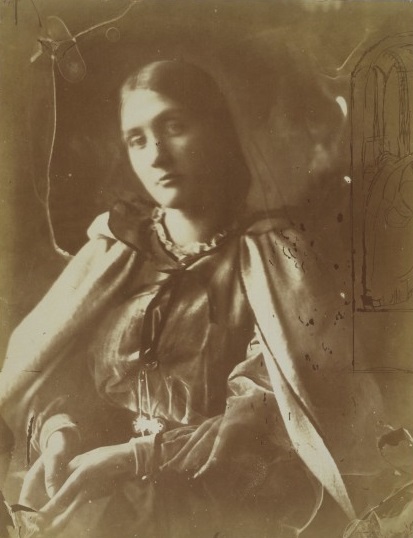
Her particular picture was taken in 1864, “considered by many scholars to be one of the most innovative periods” in Cameron’s photographic career.
Holly explained how her choice of a work by Julia Margaret Cameron was, to some extent, informed by the photographer’s “incredibly varied” biography. Cameron was born in Calcutta, the daughter of a French aristocrat, Adeline de l’Etang, and an Englishman James Pattle, an official in the British East India Company. She was educated in France and England before marrying Charles Hay Cameron, who was twenty years her senior, spending “a lot of her early married life” in India, where Hay Cameron rose to the positions of president of the Calcutta Council of Education and member of the Supreme Court of India.
More significantly, in terms of her art, Cameron was “friends with many of the Pre-Raphaelites and many aesthetes at the time, including Dante Gabriel Rossetti and George Frederic Watts, who both really loved her work”. In spite of his respect for her work, Holly told us that Watts had also “been quite critical of some of the supposed ‘mistakes’ in her photographs” – an idea that Holly then challenged in relation to concepts of error and experimentation.
To do this, she drew our attention to the right-hand corner of the photograph, indicating the delicate trace of marks present, including “a drawing of a gothic window, which has been quite amazingly etched into the glass plate before it was developed”, and a figure that is possibly “the Madonna with her hand reaching up to the left”.
This highly experimental technique, which wasn’t repeated in exactly the same way again in Cameron’s output, “encapsulates the early debates surrounding the foundation of the Victoria and Albert Museum because this photograph illustrates a type of practice that spanned art and science”.
In doing so, it suggests an idea of experimental art that was underpinned by “something scientific”, with photography “an extremely precise process, [as] setting up a plate would take several hours before exposing it”.
In concluding her presentation, Holly linked Julia Margaret Cameron’s experimental technique to the V&A’s mission to inspire creativity. For her, this particular photograph “is an example of Cameron pushing forward some of the things and new practices that she had seen, which is exactly what the V&A tries to do: to inspire people to create new objects and push at the boundaries of creativity”.
OP5/08
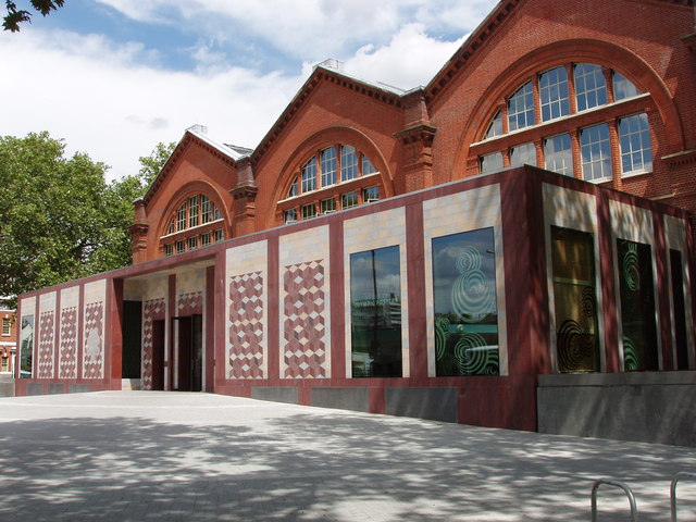
Carolyn Bloore, Learning Officer at the Museum of Childhood, finished Object Pitch Day 5 by taking us to East London and “an architectural drawing for the proposed East London Museum of Science and Art at Bethnal Green”, which opened in 1872 to exhibit “a really eclectic collection of objects from the Great Exhibition, the Wallace Collection and a bit later, the Pitt Rivers Museum”.
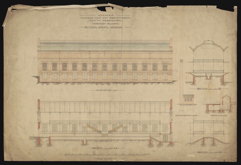
Drawn in ink, pencil and watercolour, the building plan provides crucial evidence for understanding the evolution of the Bethnal Green Museum, now the Museum of Childhood. More significantly, Carolyn explained, this object clearly shows the origins of the later building in the original South Kensington Museum, which had been founded in 1857 with money from the Great Exhibition; a temporary building that soon received the slighting nickname of ‘the Brompton Boilers’ because of its supposed resemblance to three boilers laid side by side.
Starting from “the lower end of the elevation”, Carolyn explained this had been “a major part of the original South Kensington Museum”. Constructed in the same way as the Crystal Palace, it is “one of the earliest surviving examples of a pre-fabricated iron-frame building”.
To make this pre-fabricated building more permanent, the iron frame was covered by a brick exterior, designed specifically for the new museum at Bethnal Green by the architect James William Wild.
Reflecting his travels in the Middle East and his relationship with his brother-in-law, the architect and designer Owen Jones, Wild’s “drawings for the Museum at Bethnal Green included some elements of Islamic influence”. As Carolyn told us, this was in common with his other work, most notably the Anglican Church of St Mark in Alexandria.
Carolyn then revealed how the building was a feat of engineering and design. The building, in the plan and on site in Bethnal Green, is a complex network of “light, slender” metal bars and iron balustrades around the edge of the upper galleries and the mezzanine floor, with a “central circular motif that makes this ironwork the lightweight, incredibly strong material it is”.
As part of her careful delineation, she shared some of the building’s special features, which included “a channel to contain the pipework of the heating system”, as well as “the alternating support columns that also double up as rainwater pipes – and still do”.
The plan also shows the wide range of creative and organisational inputs that went into the Bethnal Green Museum. Construction on site in Bethnal Green was carried out by S Perry and Company, led by Colonel Henry Scott of the Royal Engineers, whose signature is visible on the plan, and “who was responsible for the architecture at South Kensington at this time”.
More surprising was the involvement of women in devising and executing the building’s decorative schemes. The “series of rectangular niches” present on the exterior of the Bethnal Green Museum were intended “to contain panels illustrating science, art and agriculture by the decorative artist Frank Moody”. These were actually made by “the female members of the South Kensington mosaic class”. The floor of the museum “was also made by women – inmates of Woking Prison”.
Carolyn drew our attention to two additional features present on the plan: “on the upper level a refreshment room and, down below, a schoolroom”, reflecting the wider uses of the museum at the time as a place of leisure and education.
As she suggested, the plan and, by extension, the building it represents, touches on a wide range of subjects and approaches, and shows how the Bethnal Green Museum, now the Museum of Childhood, was conceived as a community resource from its earliest days.
These wider contexts include design and architecture, geography, sociology, social history, civil and military engineering, industry and materials – “this was a new and daring construction method, although it was later to become cheap and utilitarian” – women and the decorative arts, education – “the vision of a schoolroom” – the provision of “gas lighting so it could be open later to enable all sorts of people to visit” and, of course, museology.
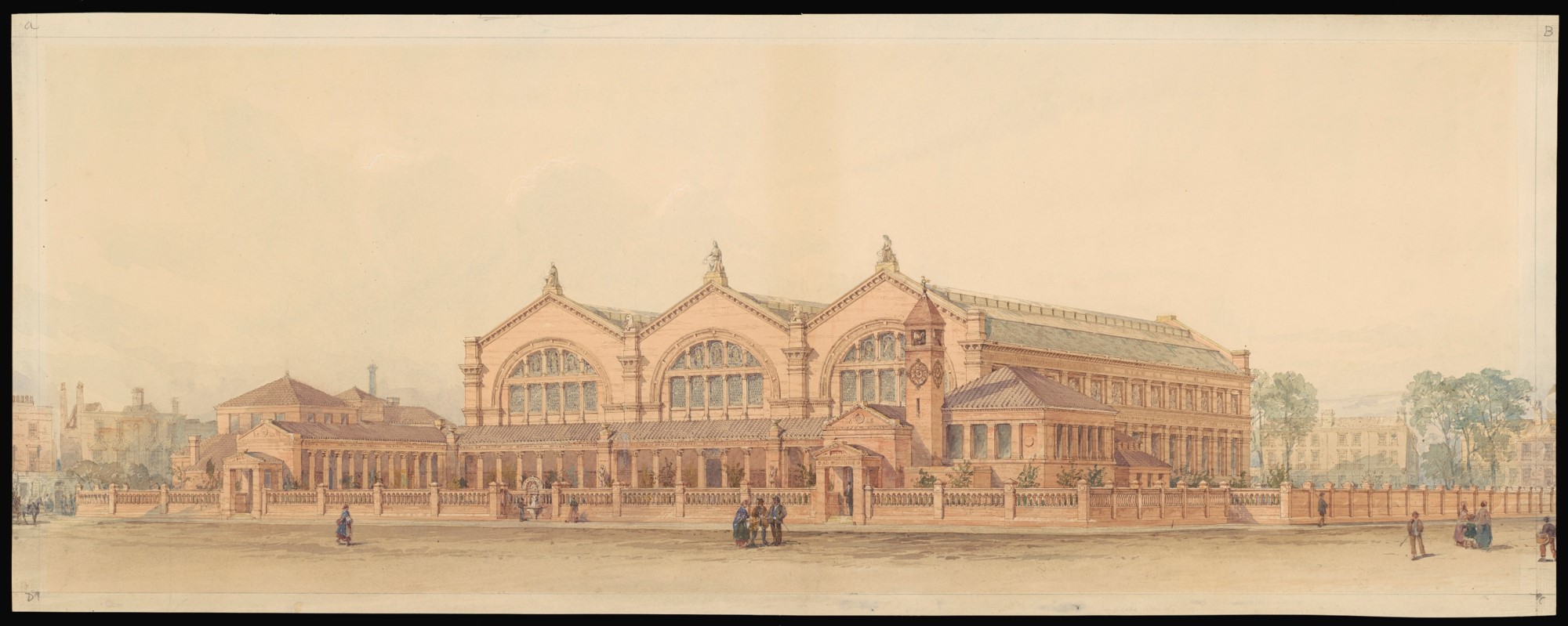
Carolyn concluded her pitch by showing us a watercolour of the Museum at Bethnal Green, which she described as “Wild’s vision”. “While it conceals the iron frame building, it reveals the plans in full splendour, envisaged as a new cultural centre for London’s East End”.
***
The second half of Object Pitch Day 5 dealt with the breadth of materials we’d come to expect, covering 14th-century glass, 19th century photography, the architecture of the V&A and a classic of British rock design. And yet, in spite of this huge variety, all our speakers engaged with the relationship between creativity and inspiration. This could be seen as the background to Clare Inglis’s idea of the ‘magic’ object as an example of spectacular craftsmanship; Victoria Broackes’s account of John Pasche’s engagement with the V&A’s collections as an RCA MA student; Holly Harris’s exploration of experimentation in the practice of Julia Margaret Cameron; and to Carolyn Bloore’s account of the origins of the Bethnal Green Museum as a cultural ‘hub’ for East London.
Could ‘creativity’ and ‘inspiration’ be the key concepts for choosing an object for the project?