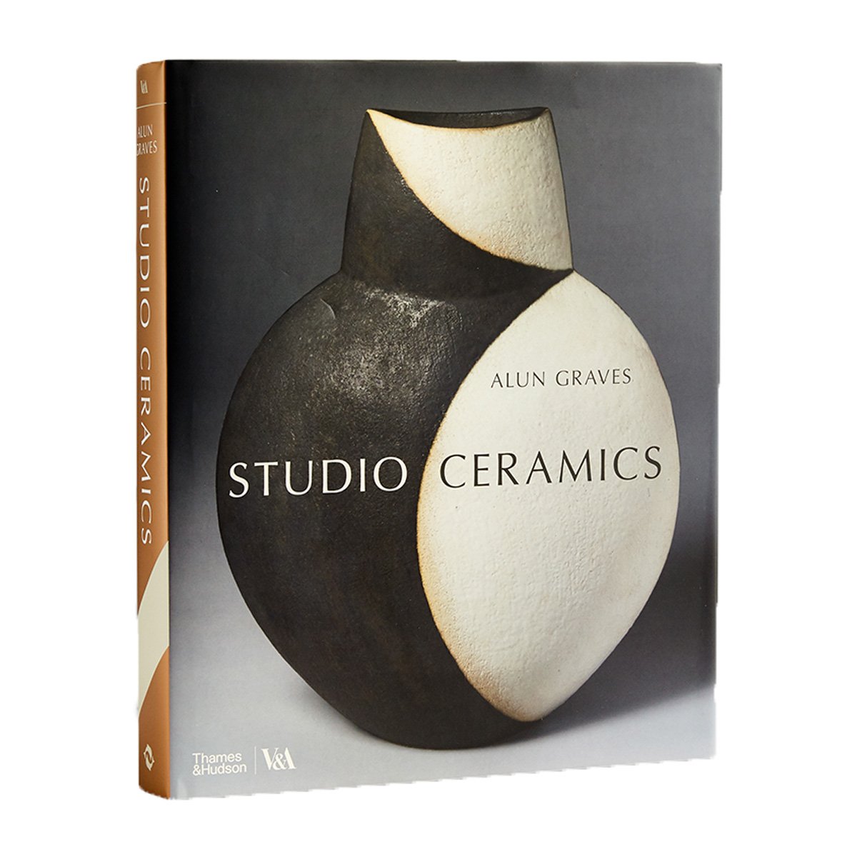
Ceramics
Features
.jpg)
-

Highlights from the Ceramics collection
Take a tour through the treasure trove ceramincs collection and discover some of its secrets
-

Ceramics – a risky business
Firing a pot is the point of no return. Discover some of the 'happy accidents' that have emerged from the kiln.
-
 Menopause in maiolica: Katrin Moye's ceramics
Meet the cheekiest potter in England
-

Meissen's King Vulture
Discover the story behind this remarkable porcelain creature
-

Richard Batterham: methods of making
Find out more about Richard Batterham's commitment to the whole process of making
-

The Rouen gamesboard tray
Lessons in love from a rare ceramic board game
-

Iranian bath rasps: ASMR
Watch as we unbox and gently rattle a selection of late 17th and early 18th century ceramic bath rasps from Iran
-

The Chelsea porcelain factory
Get a taste for high-quality English porcelain produced in the iconic west-London factory
-

Studio tour with potter Edmund de Waal
Step inside the potter's studio
-
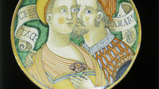 Italian Renaissance pottery – 'beautiful women' plates
'Belle donne' plates promoted an ideal of the perfect woman: beautiful, virtuous, and not infrequently, dead.
-

Re-engineering the Brown Betty teapot
The evolution of a design classic, stretching back over 400 years
-

Piccolpasso's treatise on maiolica
The V&A not only holds the greatest collection of maiolica in the world, but also this unique treatise describing its manufacture.
-

Popular pottery
From cat jugs to novelty 'stirrup' cups and a flask shaped like a potato, discover popular pottery
-
 Blanc de Chine – white porcelain from China
A centuries-old Chinese porcelain tradition reinvented by contemporary designers
-
.jpg)
Shipwrecked ceramics
Discover the fascinating cargoes retrieved from Asian trade ships, wrecked in the South China Sea
-

Art Deco: Clarice Cliff
Discover how Clarice Cliff's bold, Art Deco ceramics brought modernity to the kitchen sink
-
,-Bowl,-3-BRIGHTER.jpg)
'Bowl' by Hans Coper
A rare work by influential studio potter Hans Coper joins the V&A's Ceramics collection
-

Presepio: an Italian Nativity scene
Our traditional Italian Nativity scene includes fascinating details about everyday life in 18th-century Naples
-

History of the Ceramics Galleries & Ceramic Staircase
This elaborate staircase was designed to highlight the versatility and beauty of decorative ceramics
-

Chinese blue-and-white ceramics
Discover some of the most iconic and enduring objects in the history of Chinese ceramics
-

William De Morgan – an introduction
Meet an imaginative and innovative 19th-century artist-potter
-

Contemporary ceramic making from the Middle East
Discover the meanings, inspiration and processes of making
-

Fooling the eye: Trompe l'oeil ceramics
Soup tureen or bunch of asparagus? Take a closer look at trompe l'oeil ceramics
-
 Teapot design through time
Discover some of the finest examples of teapots produced over the last five centuries
-

Laying a wacky and whimsical Christmas table
How wacky is your Christmas table? Discover some of our favourite festive fare, with a twist
-

Let them eat clay: Mexican búcaros ceramics
Discover a unique appetite for clay
-

How was it made? An agate teapot
Experimenting with how the object was originally made
-
 William De Morgan: master of Arts and Crafts tile design
Bold, intricate and beautiful
-

On the White Road: Edmund de Waal
Take a journey into the history of porcelain through extraordinary objects
-
 The Wedgwood anti-slavery medallion
Discover more about Wedgwood's anti-slavery medallion – a forerunner of the protest badge
Collection highlights
-
 Flower pyramid, made by Greek A factory and Metalen Pot factory, about 1695, Delft, NetherlandsV&A South Kensington
 -
 Polito's Menagerie, figure group, about 1830, Staffordshire, EnglandV&A South Kensington
 -
 Goat figure, modelled by Johann Joachim, manufactured by Meissen Porcelain Factory, about 1732, Meissen, Germany. Museum no. C.111-1932V&A South Kensington
 -
 Kestrel Coffee Set, coffee pot, designed by Susie Cooper, manufactured by Susie Cooper Pottery, 1932, Burslem, EnglandV&A South Kensington
 -
 Stick stand, by Minton, 1870 – 1900, Stoke-on-Trent, EnglandV&A South Kensington
 -
 Snow Lady Gourd, pot, by Kate Malone, 2008, London, EnglandV&A South Kensington
 -
 Jar, 3500 – 2500 BC, Kanto, JapanV&A South Kensington
 -
 Ewer, 1522 – 1566, Jingdezhen, ChinaV&A South Kensington
 -
 Plate, by Maestro Jacopo, 1510, Cafaggiolo, ItalyV&A South Kensington
 -
 Dish, 1590 – 1600, Iznik, TurkeyV&A South Kensington
 -
 The Music Lesson, by Joseph Willems, manufactured by Chelsea Porcelain factory, about 1765, London, EnglandV&A South Kensington
 -
 Form, by Gillian Lowndes, 1986, UKV&A South Kensington