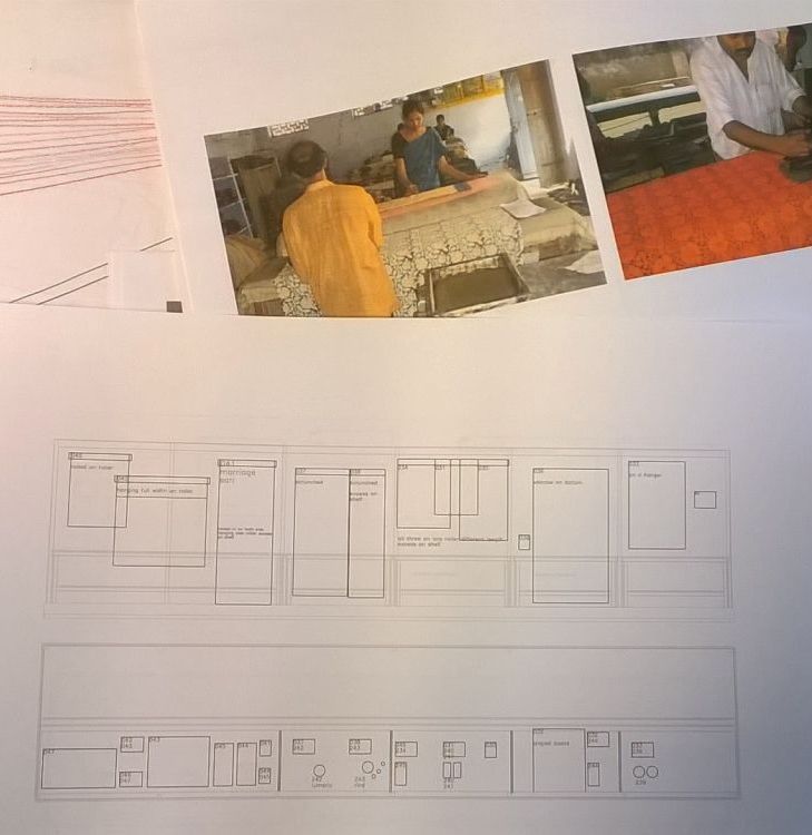
In the past weeks I talked a lot about my filming reccie trips in India, but this is all now seeming a long time ago – the film crew have returned with lots of footage and we are hoping start editing very soon.
Back at the V&A we are very busy. We have now reached the part of the project where our attentions are fully focussed on realising the vision we’ve developed over the past months. Our ideas are becoming hard reality, and time is pressing – Alexander McQueen Savage Beauty is being installed, and once that is open there will be the salutary moment of knowing that we are next.
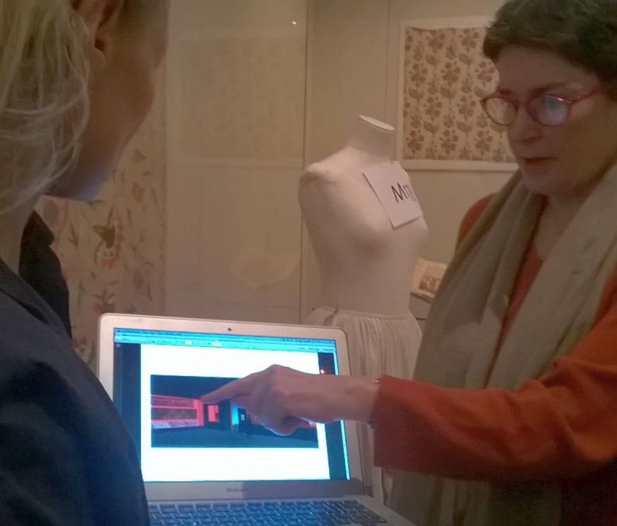
From a design perspective we are no longer working from pieces of paper bearing beautiful hand drawings, evocative visualisations and atmospheric reference images. Instead we are pouring over detailed black and white plans and elevations that carefully articulate each element of the design to scale and seemingly endless cost plans. As a rare moment of light relief from this intense process has been choosing the colours for the gallery walls and showcase interiors.
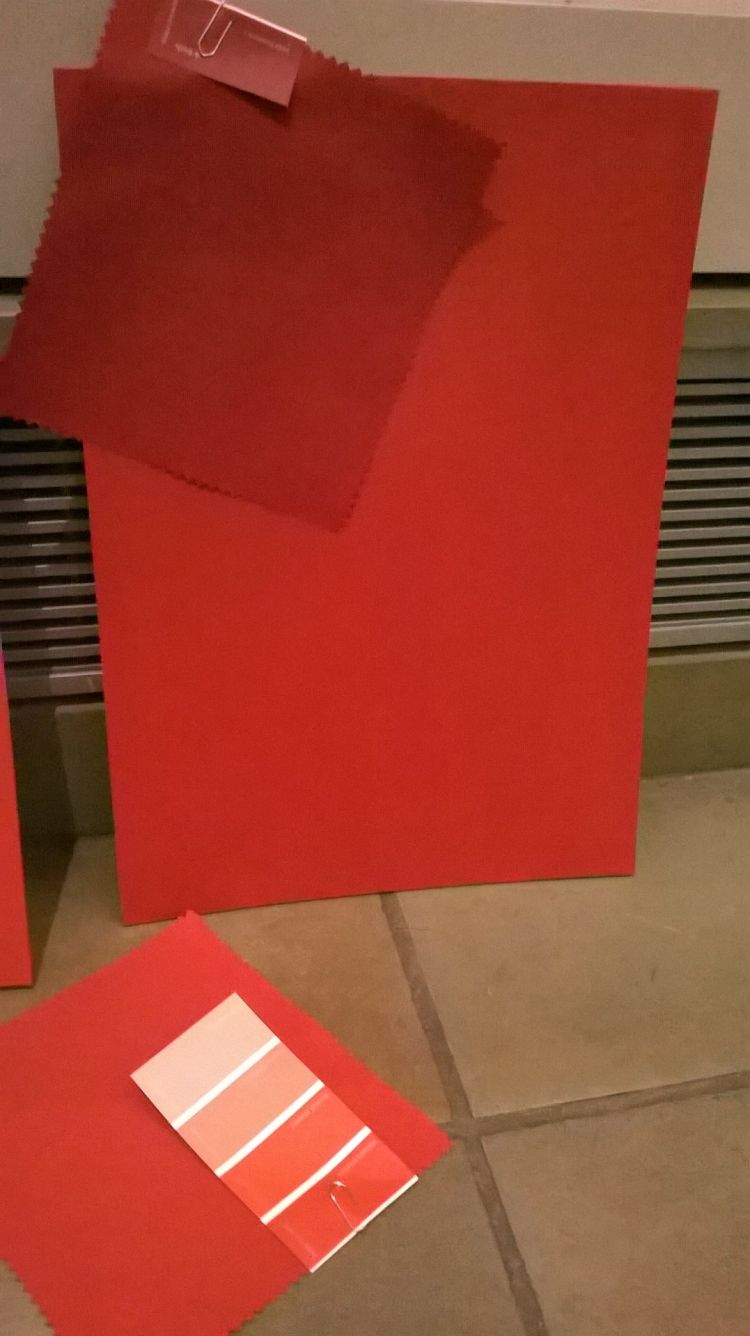
I am always in great admiration of designers’ ability to choose colour – left to me it would all be grey. Gitta has been drawing on the colour plates of the environments where these textiles were made or used to select paints that will identify and distinguish the mood of each section. Thus far we have been looking at swatches about 5cm square, and it is almost impossible to imagine how these would look on a larger scale in the exhibition environment. So we got up early and went into the galleries which hold the permanent display of South East Asian textiles to spend a couple of hours offering up larger paint samples to objects in appropriately low levels of lighting.
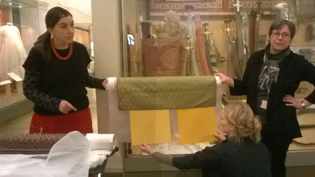
You have to be careful when selecting wall colours to view paint samples in lighting conditions that closely resemble those that will be in the galleries since colours can change their appearance significantly in different lighting temperatures. I recall going onsite to sign off the build of the Quilts exhibition and being horrified by the wall colour: with the house lights on full I had entered an alarming world of taramasalata pink, then when we dropped the lights it soften magically to a much more subtle shade (luckily, as at this point the Director walked in with a group of high level stakeholders!).
We have been considering shades of pink for one section of the Fabric of India too but the original choice has not made the cut. A shade called, to our collective amusement, Candy Love turned out to be too – well, just too Candy Love… even in the subdued lighting. Better that we know now than when faced with 50 square meters of it on the day before we are due to install objects.
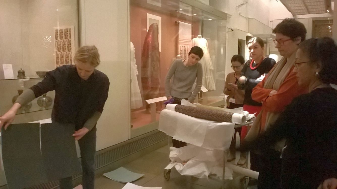
For this show we’ll be mounting a large proportion of the flat textiles onto rollers allowing us to display only part of large fabrics with repeating patterns. These rollers extend a little beyond the object and are covered in fabric. Since they are in direct contact with the objects, the fabric must not contain any substances that might ultimately erode the historic textiles (you can read more about this here). Fabrics containing metal threads, as many of these do, are particularly vulnerable. Testing for this is a long and costly business, so we usually try to select our fabrics from a pre-tested range. This puts limitations on the shades available. Gitta has therefore been working hard to choose colours that both compliment (and not compete with) the objects themselves, and can be matched with the fabrics for the rollers, metal paints needed to finish the hardware fixings and paint for the inside of the cases.
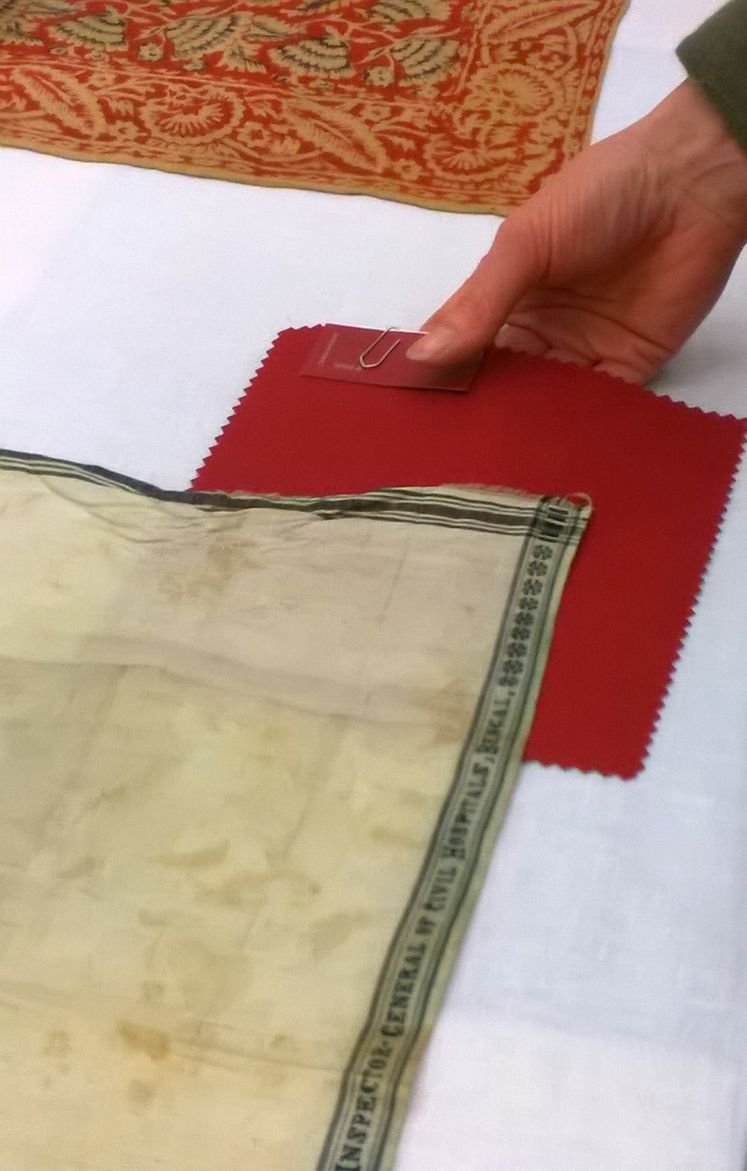
As well as how a colour looks in gallery lighting, we have to anticipate how it will appear next to the textiles themselves. It is almost impossible to choose a colour that will compliment every piece perfectly, but it is important to check that paint of a similar shade to objects is not so close in colour that it is jarring. So Rosemary and Divia have been tasked with heading back to Blythe house and checking through all of the objects to ensure that the proposed case colours do not clash or overwhelm the vibrancy of the fabrics themselves. Fingers crossed…
so nice so nice please i Need to contact with Rosie Wanek
Wirth respqt