Closed Exhibition – Sky Arts Ignition: Memory Palace
Making Memory Palace
By Laurie Britton Newell & Ligaya Salazar, co-curators of Memory Palace
Illustrations by Robert Hunter
In an age in which reading formats are rapidly changing, and print – as book, newspaper or magazine – is losing its dominance as a deliverer of the written word, it is appropriate to think about ideas of what ‘reading’ is – and what a book might be. Digital platforms enable us to engage with narrative in new ways, but when texts are searchable, layers of background information are immediately accessible at the touch of a fingertip, and dialogue with other readers is possible in real time, it is interesting to question what is happening to our experience of reading stories. How far can you push the format and still call something a book? Memory Palace is a physically immersive illustrated story that explores the idea of an exhibition as a walk-in book.
Digital publishing has not just changed the experience of readers, it has also altered the role of graphic designers and illustrators, who must now consider a more complex set of technological networks and possibilities as they work on-screen, where text rarely exists in isolation. The limits of how a designer might once have influenced the reading experience – font, letter and line spacing, paper stock, first cover impression – are no longer all-confining. As curator Andrew Blauvelt observed, ‘in the future, most designers will be creating reading experiences not book designs’. 1
While it would seem as if physical books might be losing importance, the physicality of an individual book is increasingly significant. Publishing houses experiment with material and printing techniques to create collectable cover designs and unusual formats. So if readers buy fewer ‘real’ books, it makes sense that those they do buy should be beautiful objects. This enables graphic designers and illustrators to work on book projects with more varied visual content and material qualities. The Dutch book designer Irma Boom, creator of some of the most highly acclaimed book designs published in recent years, observed in an interview:
‘in older days, a book was made for spreading information, but now we have the Internet to spread information. So to spread something else – maybe sheer beauty or a much slower, more thought-provoking message – it’s the book.’ 2
Set against this shifting context, Memory Palace provides an experiential reading format for a story. The exhibition brings together a new piece of fiction with 20 original commissions from graphic designers and illustrators to create an exhibition that can be read.
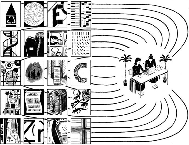
© Robert Hunter, 2013
Unlike reading a printed book, visiting an exhibition is not usually a linear experience. a narrative that moved around in time and that could be accessed in different ways seemed like a good starting point for a story that would be encountered physically. The search for an author began with writers who had previously written non-linear narratives. We were drawn to Hari Kunzru because he had published novels and a book of short stories that play explicitly with sequence, time and disparate characters tied together by a central theme – a computer virus in his novel Transmission, and a rock formation in the Arizona desert in Gods Without Men. 3
To experiment with the relationship between the written word and its visual interpretation fully, we commissioned a new story rather than attempt to adapt an existing text. This allowed the text to be created and finalized collaboratively, and meant that there would be no existing reader expectations – a narrative world that was untouched, ready to be populated with words and images. The original brief to Kunzru was very open, only setting out that multiple practitioners would be commissioned to interpret it, and that the outcome was to be an immersive narrative experience situated in a gallery in the Victoria and Albert Museum.
In response Kunzru created a dystopian story that mourns the loss of human knowledge. The central character is fascinated with the past and clings on to the few garbled memory fragments of it that still exist. The practice of ‘Ars Memoria’ or ‘Mnemonics’, a memory technique in which an imaginary building or environment is visualized and the information to be remembered is placed as ‘objects’ within the fictional space, bears comparison to the idea of a museum as a repository of past ideas. When Kunzru submitted the first draft of the text, it also became apparent that he had interwoven the collaborative basis of the project into the overarching themes of the story – that memories change in the mouths of those who tell them.
The text is written in passages that move between a sequence of interrogations and an ‘unordered’ series of memory fragments. We selected one or more passages to give to 20 different graphic designers and illustrators, who were able to respond to it freely. Each practitioner reacted to the words in the text very differently: some attempted to convey the complete passage, others stripped it back to one important event or sentence, and some even layered the narrative with words of their own. These commissions have gone beyond literal visualizations of the text and instead have added new meaning and direction to the story.
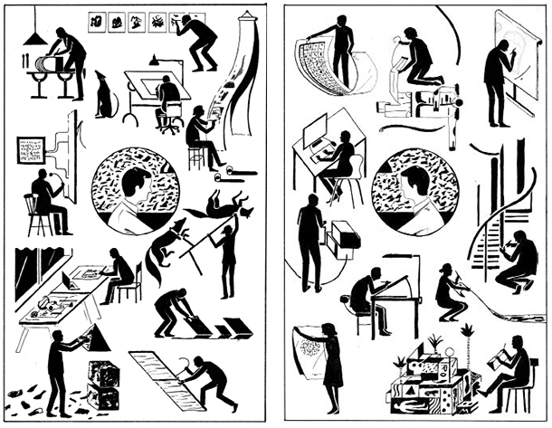
© Robert Hunter, 2013
The chosen practitioners work across a variety of fields within graphics and illustration, from graphic novels and editorial illustration to advertising and typography. All have a background either in graphic design or illustration – disciplines that were traditionally tied to the world of books and print but which today span many different types
of media and formats. While by no means intended as a survey show, the broad selection of contributors demonstrates the exceptionally diverse and expanding worlds of contemporary graphic design and illustration. What they share is a strong engagement with narrative, storytelling and words. The decisions to pair practitioners with passages of the text were based on both a strong visual resonance with their previous work and events in the story. An understanding of the physicality of the exhibition space and how the viewer might engage with their work was also a key aspect.
Four practitioners interpreted the passages of the story that set out the context and the world that the central character inhabits. Francesco Franchi and Stefanie Posavec, both of whom work in the field of information graphics and have a keen interest in making complex connections visible, interpreted the utopian ‘Wilding’ and how the art of memory is practised. The illustrator Mario Wagner, who works primarily with digital and collage techniques, captured ‘Magnetization’, the magnetic storm that wiped out all technology in the world. The illustrator Frank laws, who is concerned with documenting intricate details of mundane reality, such as brickwork, was tasked with depicting the prisoner’s current setting, the cell.
The central passages of dialogue in the story, a series of interrogations between the prisoner and his captor, were portrayed by the illustrators Luke Pearson, Alexis Deacon and Jim Kay, who have backgrounds in graphic novels and children’s books. They document the prisoner’s ultimate confession and demise in a series of powerfully drawn sequences that form the narrative spine of the story.
Interspersed around the interrogations are the memory fragments the prisoner has been tasked to remember. Some of the misremembered facts and playful definitions have been depicted by the typographers Peter Bil’ak, Oded Ezer and Hansje van Halem, who have all worked with Kunzru’s words from the memory fragments, presenting them in unusual formats: giant reversible letters, floor tiles and drawn type shown on Skype. The graphic artist Sam Winston has taken the prisoner’s text as a starting point to write more text, which he has incorporated into a sprawling, intricate periodic table.
The illustrator Henning Wagenbreth and the collective Le Gun, who are interested in working off the page with different surfaces and spaces, were given the memory passages about museums and hospitals, which they have reimagined in three-dimensional drawn environments. The graphic designer Erik Kessels has also taken the passages of text about recycling and advertising into the physical realm, creating a giant recycled paper palace. The ‘Laws of Endtropy’ are visualized as a large advertising board conceived by the graphic designer Na Kim and in another corrupted memory the laws of Newton have been brought to life in the shape of an altarpiece created and illustrated by Stuart Kolakovic.
To explore ideas about different viewpoints and interpretations, two practitioners and a collective were asked to work on the passage about the prisoner’s past and his induction into the ‘Memorialists’. The illustrator Isabel Greenberg, who creates graphic novels, sought to sequence the relationship between the prisoner and his teacher Billgee. The illustrator Némo Tral, who works on architectural drawings, chose to depict the ruins of iconic London buildings and the Olympic Park where the prisoner grew up. The graphic design collective Åbäke have evoked the apocalyptic setting of the story to question the meaning of a collection of objects when all knowledge about what function they serve is lost.
Johnny Kelly, who has a background in graphic design and animation, was asked to interpret the end of the story and created a physical and interactive installation that acts as a memory bank for visitors to add to, generating life for the story beyond the exhibition.
The exciting breadth of visual responses and number of people involved in the project also posed an unusual challenge: how to create an experience for the visitor that would be cohesive. It required a careful pacing of the story within the physical space, a narrative life raft for the visitor, and a strong overarching exhibition design. In an attempt to further integrate the sequence of the story and the design of the exhibition, several meetings were held at an early stage in the project between the curators, Hari Kunzru, the architect and exhibition designer C.J. Lim and the graphic designers of Sara De Bondt studio. as a result, the design of the exhibition draws on the underlying themes of the story itself and unifies the diverse elements of the project.
C.J. Lim created a large building to contain the story. Like a palace of memories, it is made up of a space that contains the narrative spine of the story and a series of individual chambers, each containing a different memory fragment. The layout of the exhibition gives visitors a choice about which direction to turn and which passage to encounter next. Each visitor’s experience is slightly different depending on the route they choose to walk through the story, and all ultimately leave with their own version.
Sara De Bondt studio, who also designed this book, created the exhibition graphics that grow over the walls of the building like moss or ivy and reflect one of the central ideas in the story – nature overtaking the built landscape. The studio's choice of typeface used both here in the book and for the exhibition graphics is Jenson, based on Golden Type, which was designed by William Morris in 1890. The studio chose it because they saw a connection between the time of the ‘Wilding’ and Morris’s vision of a pre-industrial Utopia.
Kunzru’s complete text is not present in the exhibition itself; rather, a pared down version is displayed, giving the visitor a narrative thread to follow. In an attempt to let the story be told purely through the words of the author and visual responses of the practitioners, where the words and images tell different yet connected and supporting plots, there are no object labels or factual information inside the exhibition.
Memory Palace is at its core a collaboration between word and image. It is a narrative made up of multiple viewpoints that have come together to create a story that can be walked through, observed and read. Interpretation and translation underpin the entire project, from the central premise of the story itself to the ways in which each practitioner has responded, and ultimately the way in which the visitor engages with the narrative. Memory Palace explores what happens when a story leaves the pages of a book and enters the gallery space.
1 Andrew Blauvelt, ‘From Books to Texts’, in Mieke Gerritzen, Geert lovink and Minke Kampman (eds), Exploring New Information Cultures (Breda 2011)
2 Erich Nagler, ‘Irma Boom’s Visual Testing Ground: The Internationally acclaimed Book Designer Talks about her craft’, Metropolis Magazine (29 February 2008), http://www.metropolismag.com/December-1969/Irma-Boom-rsquos-Visual-Testing-Ground/
3 Hari Kunzru, Transmission (London 2004) and Gods Without Men (London 2011)
Laurie Britton Newell
Laurie Britton Newell is the co-curator of Memory Palace. She has devised and curated projects for the V&A including Make Lab and No Strings in 2011, 1:1 Architects Build Small Spaces in 2010 and Out of the Ordinary: Spectacular Craft in 2008.
Ligaya Salazar
Ligaya Salazar is the co-curator of Memory Palace. She devised and curated V&A contemporary projects including Yohji Yamamoto and No Strings in 2011, British Fashion in 2009, Fashion V Sport in 2008 and Crafting Couture in 2007.
Robert Hunter
The illustrator Robert Hunter followed the development of the Memory Palace project and in response produced a wordless graphic story. It visualizes a part actual, part imaginary journey through the process of making this storytelling experiment. The full graphic story can be found in Memory Palace by Hari Kunzru which is now available to buy in the V&A Shop.
A gift in your will
You may not have thought of including a gift to a museum in your will, but the V&A is a charity and legacies form an important source of funding for our work. It is not just the great collectors and the wealthy who leave legacies to the V&A. Legacies of all sizes, large and small, make a real difference to what we can do and your support can help ensure that future generations enjoy the V&A as much as you have.
More