What strikes you first when you look at this painting from Thailand? For me it was the lack of vivid colours: this newly-acquired Great Renunciation painting was rather subdued, with delicate and muted colours. Was it always like this, or has it faded over time? And when exactly was it painted?
To address these questions and to inform the conservation and display of the painting, I set out to identify its pigment and dyes.
To be honest, I did not know what to expect. Pretty much any type of pigment and/or dye could have been used: the painting is in the style of the Rattanakosin period, which covers a relatively wide timeframe, from the eighteenth to the twentieth century.
A first look at the pigments under the microscope told me that most of the stuff in there was synthetic: very small, rounded particles, relatively uniform is both size and hue. With my trusted XRF spectrometer and Raman microscope I identified ultramarine blue, hematite, lithopone and red lead.
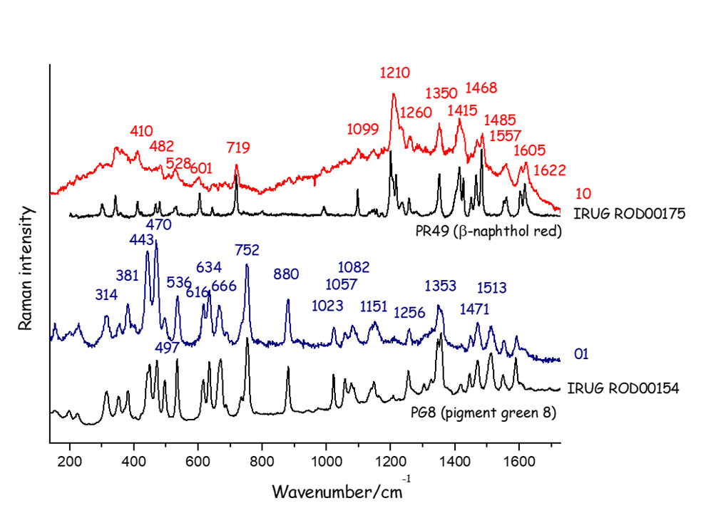
And then I came across two unexpected pigments. One was β-naphthol red (also known as Pigment Red 49, or PR49), a 20th-century material I had encountered in the past. The other left me scratching my head for a few days: it was almost black but with a greenish hue, and I had never come across its rather complicated Raman spectrum before.
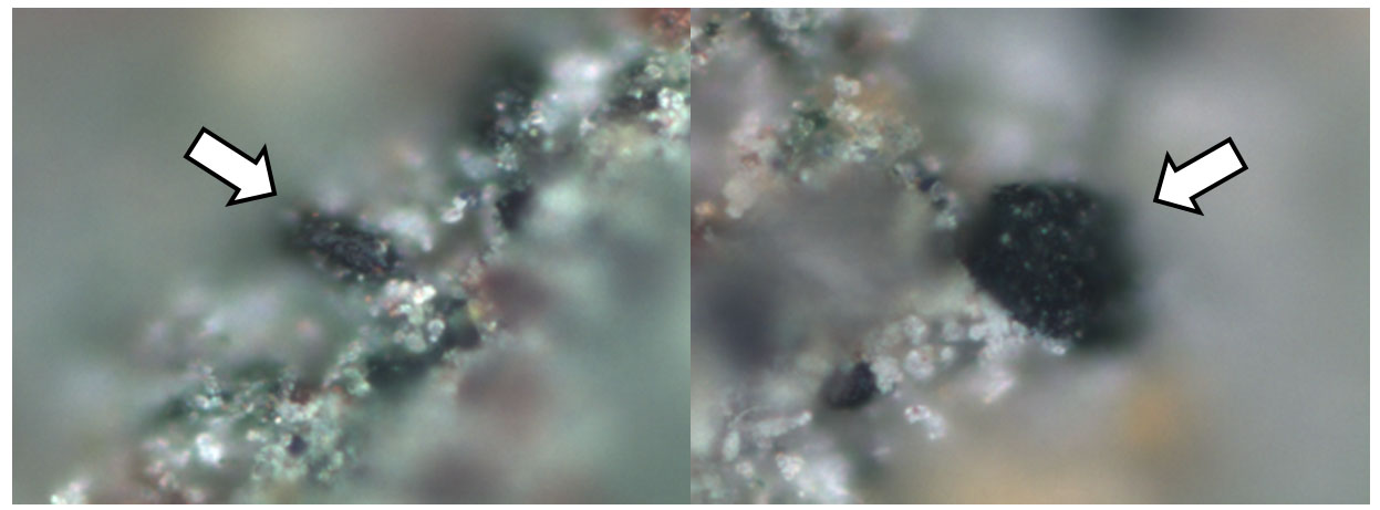
I do have a large database of Raman spectra of pigments that I have built over the years, but my mystery pigment was not on it, and I had to do a fair bit of detective work to identify it.
From the features in the Raman spectrum I could narrow down the number of options, but then I needed to look for references. A good place to start is IRUG, the Infrared and Raman User Group, a community that promotes the sharing of high-quality reference spectra.
It still felt like looking for a needle in a haystack. But browsing through hundreds of spectra on the IRUG database I eventually found a perfect match, a material that gave a spectrum virtually identical to mine: the mystery pigment was Pigment Green 8 (PG8). The name is a bit anonymous, but as far as I know no one has come up with a catchier option yet.
At this point I needed to know more. Why? Because it would help me to narrow down the date for our painting. When was PG8 first made? And when was it first sold commercially? One thing is when you create a new pigment in a laboratory, a different one is when you set up a large-scale production and start selling your pigment all over the world so that artists can use it.
We already know a lot about b-naphthol red: first synthesised in 1899 in Germany, and commercialised soon after – this gives us a first terminus post quem of around 1900. It’s still used today as a printing ink, because it’s vivid and cheap. But it is not very lightfast: it can fade when exposed to too much light.
Pigment Green 8 was first synthesised in 1885, but its first commercial production was in 1921, decades later. It was popular, until a newer green pigment, phthalocyanine green, started being sold in 1938.
Looking at the materials used on this painting, it is reasonable to suggest that the object is unlikely to have been made before 1921.
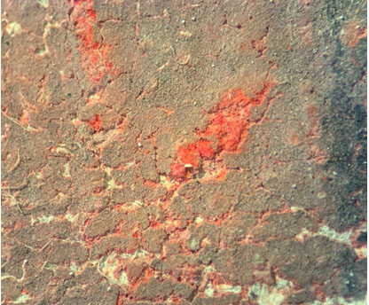
And what about its subdued appearance? The main culprit is likely to be b-naphthol red. We found that in areas where it had been applied thickly, there were traces of unfaded, bright red pigment lurking underneath, which give us an idea of how much brighter this object must have looked when it was first painted.
Do you want to know more about our research and work on this object? Tune into Series 2 Episode 6 of the BBC programme Secrets of the Museum.
