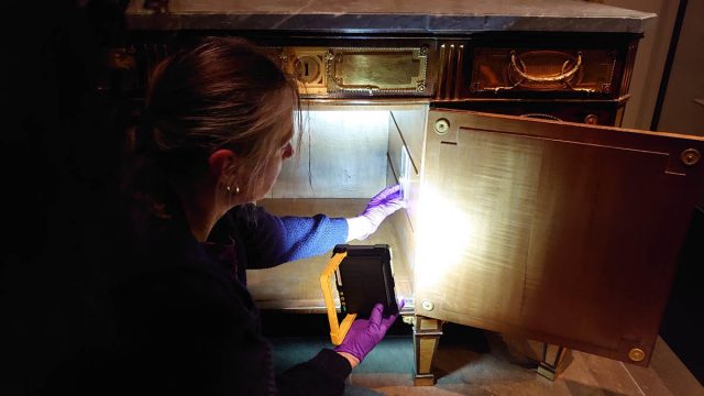
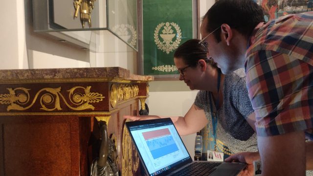
Did Constable use a steel nibbed pen? a reed, or a quill for his ink drawings? Sometimes, preparing the prints, drawings and paintings for an exhibition gives us a good opportunity to start to ponder these kinds of questions…
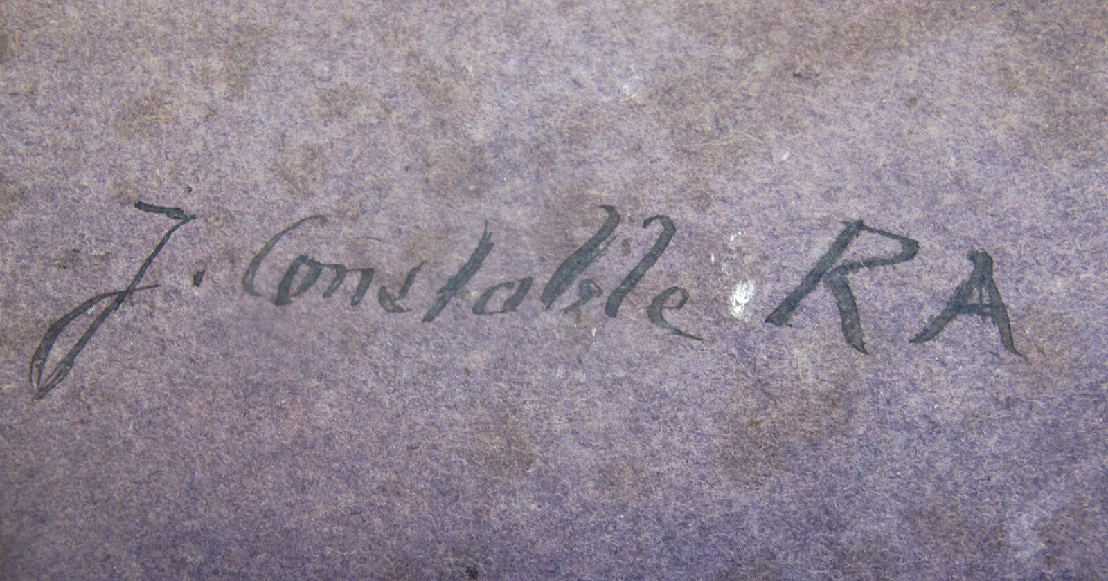
Looking at the back of Constable’s Study of Poppies (Paintings Conservation interns, Arabella and Morgan talked about this work in our last post on Constable), the artist has signed his name in black ink at the top left corner. The bold signature is clearly not written with the same thin, metal nibbed pen with which he signed other works, or used for many of his drawings and letters of the same period:
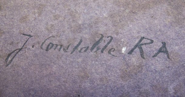
Looking at the signature closely, note the split in the downstroke of the letter ‘b’ – it looks as though it were written using a reed pen or a feather quill:

As luck would have it, our good friend Paul Antonio paid an impromptu visit to Paper Conservation just as we were examining the sketch. A Master Scribe, and an expert in historic calligraphy and writing implements, Paul looked at the signature and could immediately tell us that it was written with a square cut feather quill, most probably turkey or goose – perhaps something like these 19th century examples:

It seems charmingly archaic that Constable might be using a feather quill and ink as late as 1832, when this sketch was made, but even though the quill feather fell into decline in the early 1800’s in favour of the mass-produced metal-nibbed pen, it was still in production well into the early 20th century.
There were typically two types of quill feather writing implements available. The first was the familiar whole feather quill – exactly the type that we all think of when we think about Shakespeare or any number of TV costume dramas. These were cut down with a knife, the barbs removed and the shaft halved in length. The other, more curious, was a nib fashioned out of a quill cut down in the manner of a standard pen nib that could be attached to a conventional metal nib holder. Artists and scribes often preferred the subtle flexibility that a feather quill gave them over the more traditional and stiffer reed pen, and Constable clearly enjoyed the flourish it gave his signature when he signed this sketch.
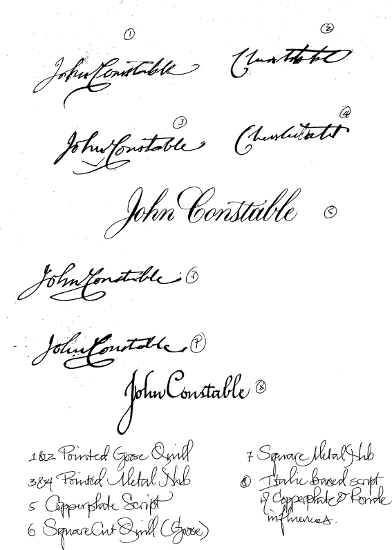
Such is the unique quality of the quill that it is still used today by professional scribes and calligraphers. Paul was kind enough to give us a demonstration of how Constable’s signatures might have looked using a variety of tools and writing styles:
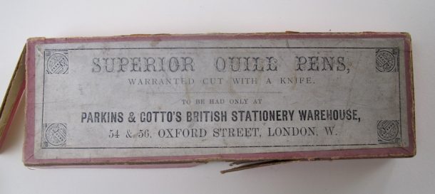
Of course one doesn’t have to look far to find an example of some of these tools here at the V&A – Looking through the often bizarre collection of writing and drawing implements held in the National Art Library’s collection, we came across this box of quills, showing that there was certainly still a market for prepared quills in the late 19th century:

Did Constable decide to sign his study simply picking up what was to hand in his studio, dipping a feather quill in a pot of ink rather than reaching for his pen? Or did he want that unmistakable flourish and expression in signing this work that can only come from using a quill?
Study the great painter’s influences when Constable: Making of a Master opens at the V&A on 17th September. You can see more of Paul Antonio’s exquisite work here.
