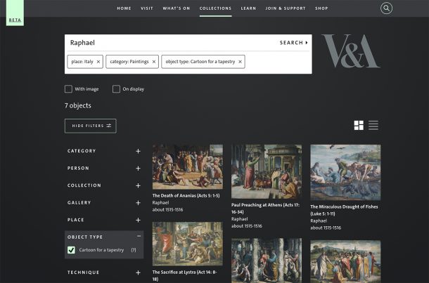
Throughout all the disruptions and lockdowns of the last year, the Digital Media Team have been hard at work replacing Search the Collections, our online collections database, with redesigned pages and new functionality. Our Explore the Collections Beta is launching today, and you will be able to explore over a million V&A objects in new and exciting ways and learn more about their history, techniques, and makers. We would love you to have a play and give us your feedback. To find out more about we’ve done you can read Kati’s blog, or discover the new pages for yourself.
What is Beta?
This public Beta is a chance for us to test and get feedback on a live service. It also lets us share our new pages with you while we continue to work on the next version.
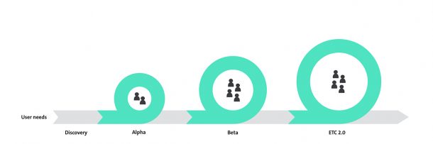
We’ve been developing Explore the Collections using an agile approach, building up the experience through Discovery, Alpha and Beta development phases. We started with Discovery, including user research which gave us insight into how the V&A’s online collections are used. In our Alpha phase we used prototypes to do some initial research on the object pages. Then we developed some minimalist web pages to gather feedback internally before moving into our public Beta phase.
Though we’ve been able to keep working remotely during lockdown, Coronavirus has of course made our jobs harder. We’d planned to do more user research but Covid-19 forced us to change tack. This means that you are among the first people outside the Museum to see Explore the Collections. It also means that we’ve had to make some assumptions when building the Beta – so once we can gather your feedback, we fully expect to have to make changes that will improve your experience and better meet your needs.
Feedback
Because this is a Beta version of Explore the Collections, your feedback is especially important for us to be able to continue to develop our website. We want to ensure that we meet the needs of people exploring our collections online. We have a survey for you to feedback your thoughts (updated May 2022 – survey is now closed), both good and bad, on Explore the Collections Beta. As part of the survey, you can also volunteer to be part of user research on Beta and further iterations.
Next steps
The next phase will involve gathering and evaluating feedback, both qualitative and quantitative, from users. Then we will prioritise improvements to our Beta. We also have a list of features that make up our next version release, including new pages that give more information about artists, materials, techniques, and many other parts of our collection.
Not enjoying the new version so far. The worst problem is that I am no longer able to open an entry in a new tab – so no longer able to compare entries side by side. I can’t go to 45 entries per page any more – and that’s a problem when I’m scrolling through large numbers of entries to find a specific one. I can’t find the search by accession number box. Presumably there is a search by accession number?
The database looks beautiful, but is far less useful than the old one. The display now has images that are tiled by size, which means that the eye can’t travel logically. This was a big flaw in the National Trust database too – and now you’ve gone and copied one of the worst elements of that database. Because it’s image heavy, everything is slower. This seems to be all about visuals and not about having a working, useful database. I’m sure I’ll get used to it eventually, but actually I’d much rather have access to the old version.
. . . continued. On the plus side, the process of downloading images for viewing in high definition is much better than the previous system. Excellent. I really like this change.
Another issue that might be possible to solve at this stage: after your search, if you open one of the entries you then have to use the back button to return to the list and you promptly lose your place in the list. This is fine when you only have a few items, but at the moment I’m going through a list of over 600 results. A “Next” facility would be a help. A way of opening each entry in a new tab would be a help. Also – a small annoyance – if you’ve chosen list view rather than tiles view, when you use the back button it reverts to tiles view and you have to chose list again each time. Would it be possible to solve this in the next iteration of the database?
The white letters on black is exceptionally hard on the eyes. I can’t stand to look at much more than a page at a time. Lovely photography, but the text contrast is painful. It also seems as though the photographs cannot be enlarged to look at detail.
I’m enjoying using the new system, using an iPad mini. It seems fast to me. I like the reversed out design. I did lose my place a few times – if you choose too many facets it seems to forget where you started? But that could be operator error. I haven’t been looking at it systematically. Happy to fill in a questionnaire/feedback form but the feedback button seemed to refer to the specific object I was looking at so I haven’t clicked on it (yet).
Oops – just did a search and the site has gone down. Back soon I hope. Good luck!
Me again. So the “Search is not working” message went away when I reloaded the page. The next issue I’ve noticed is (using tile view) search results pagination navigation is a bit flaky if you’ve got a lot of items in the list (there were 349 items in my list). Anyhow, happy to do some more in depth feedback as a volunteer if requested.
The worst feature is the white font on a black background. This is truly horrible to read.
My other reservation applies to the situation before redesign as well as after. Too many works in the collection have been poorly photographed. Given the shift to study online, users need high definition and precision of detail, as well as accurate colour. This is surely also important for the museum as a historical record, given that all works of art are inevitably deteriorating (through time, through neglect and sometimes, paradoxically, with the assistance of conservators).
The white font on black is hard on the eyes .I opened the link and all I got were blank images and nothing opens.Search isn’t working either
I’m really frustrated and disappointed with this – so little available, so few search results, compared to the old version. Search terms don’t return info and images I know are there – why? Close to abandoning the site as a research and education tool.
I love this, and I love your museum. Live in Norway, but have visited your AV at least 10 times. To see all this tekstiles is wonderful!
Interesting. I’ve not tested much but the website is surely very pretty and snappy: a nice experience to navigate single-image objects. I also like that labels in individual records link a facet search to explore more. Search in general is a challenge.
I’d like to know more about the implementation of the search engine and the source of the metadata. Do catalogers now actually enter information in markdown, or is that markdown generated from data files (https://gohugo.io/templates/data-templates/ ) coming from some other master source? If the latter, do you think something like this could be done by generating the data files from OAI-PMH records, so that one can reuse whatever backend catalog they have to support standard library features?
Sorry, not impressed, so far.
I typed in a keyword for an object I know you have. Nothing came up, simply a black page with text going off the edge. No search results were visible. Is the old search site still available because this one isn’t working for me!
I never knew the old site, just found this.
Light colored letters on a black background is very hard on the eyes, particularly for the elderly. You have had multiple complaints about this and ignored them. That is a slap in the face to the visually disabled. Try being less concerned about the current fads for web design; in a couple years the fad will be over and everyone will be laughing at your light letters on black background.
As to the digital collection itself: someone is making a choice to leave out images I can KNOW the museum must have. A famous 18th century dress, that was featured in a famous book on the subject, and the only image is of a sleeve ruffle?? Baloney. And there’s been three such gowns so far! I call shenanigans. There is no way in heck the museum doesn’t have full length front and back images of every dress in the textiles collection. Even if they are in black and white from 100 years ago when the museum first acquired them- that’s standard practice. Those images need to be added. Pictures of sleeve ruffles are helpful to just about zero people; it’s the full length image people want to see.