How would you categorise a museum’s collections, so that users can find what they want? ‘Average’, ‘Fair’, ‘Good’ and ‘OK’? It’s safe to say this suggestion from our remote user testing didn’t make it to our final list of categories. Here’s how we went about rethinking our online collections page.
So what’s the issue
When we relaunched our website last year, our Collections page was considered a MVP (minimum viable product), meaning it served a basic set of requirements for launch. Thumbnails representing collections, like Modernism, Paintings, and South Asia were all grouped together acting as a jumping off point to individual collections.
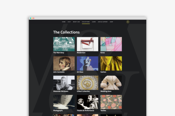
The Collections page with the growing list of collections
We started with nine online collections, but this steadily grew as we tackled the 5000 odd pages on our old website, auditing them and migrating them to the new. But, as the number of online collections grew, the page became a lengthening list of disconnected collections. The content had outgrown what the original design was intended to handle and began to feel a little incoherent. This meant lots of scrolling and scanning for a user to find things. It became clear we needed to introduce some order and structure, and a way of subdividing the ever growing list. These needed to both be accurate from an academic perspective but importantly understandable to a broad range of users, perhaps less familiar with our collections.
Established conventions
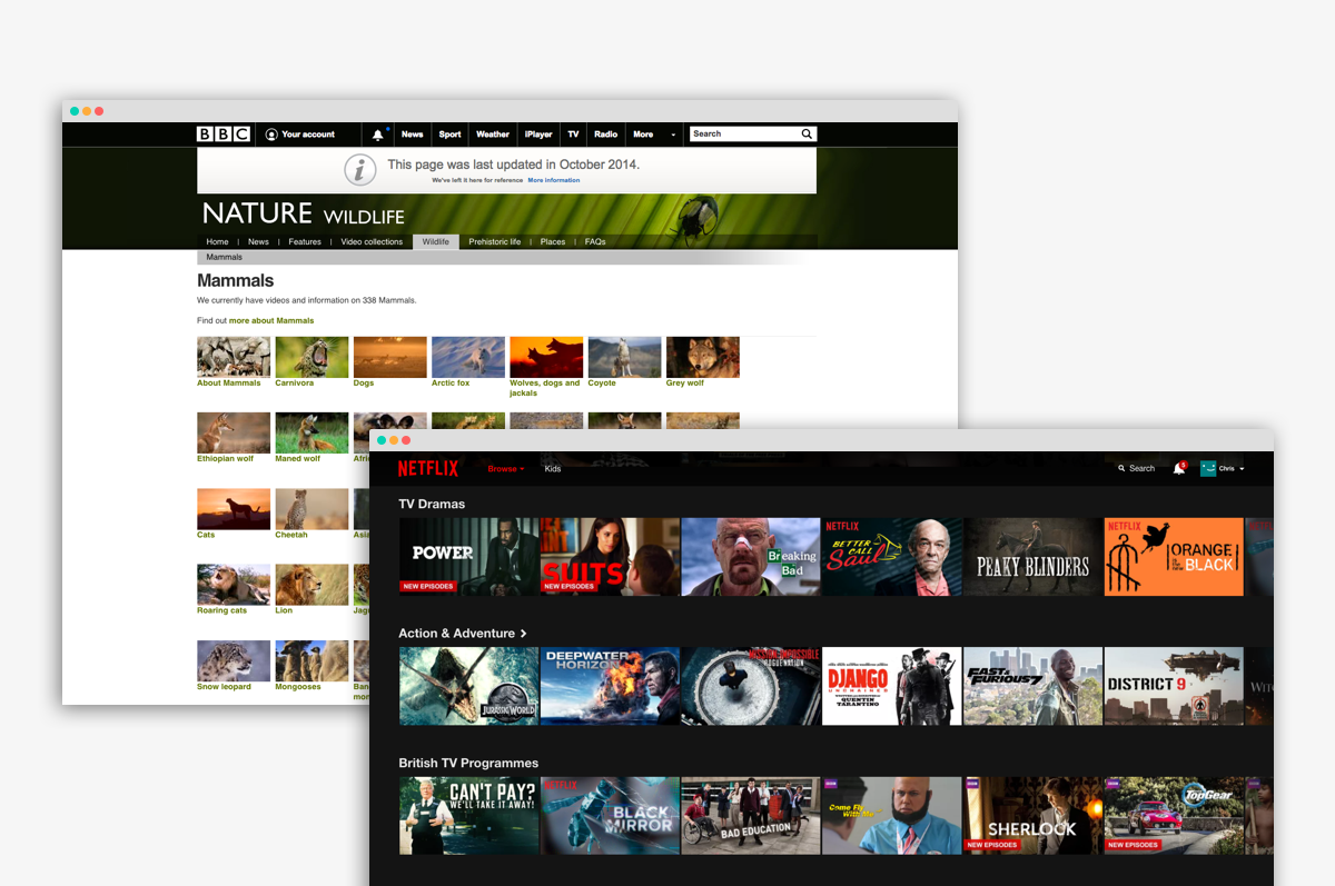
It is commonplace for websites and other digital services to subdivide their content in order to make it easier to browse and navigate. For example, Netflix use headings such as ‘Documentaries’, ‘Movies’ and ‘Comedy’ as ways to group the vast range of videos they serve – fairly obvious buckets of content defined by genres of programmes. The BBC Nature and Wildlife webpage subdivides content into groups like Mammals, Reptiles and Insects. Again, intuitive to a user, but importantly based on existing taxonomies and conventions.

The BBC Nature site grouping taxonomy and the Netflix homepage with genres
The problem with the V&A’s collections is perhaps more thorny. Every cultural institution follows their own organisation of physical objects, so there aren’t any widely shared conventions. What’s more, the V&A’s collections – covering 2.3m objects – are probably more eclectic than say a museum of art where objects arguably fit together more naturally through movements and styles.
Looking at our digital collections, some are based on an artist or maker like Alexander McQueen, while others around a much broader topic like Fashion. Other collections focus on a particular specialism like 1960s Fashion. Despite feeling disproportionately weighted from an information architecture point of view, these headings offer a diverse range of entry points to the collections.
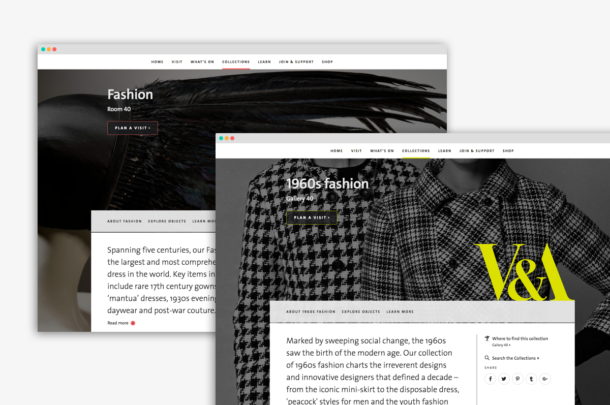
Fashion and 1960’s Fashion both have a collection page
Beginning to unpack the problem
I began by running a small workshop with a group of design, tech and content people. As a first step, it felt appropriate to use a card sorting exercise to at least get a sense of our internal perception of how theses things should be grouped. Card sorting works by giving each participant in the exercise the opportunity to organise a list of topics into groups that make sense to them. In our exercise this was 29 pieces of paper each with a collection name on it. We each arranged these as we felt fit and named our groups.
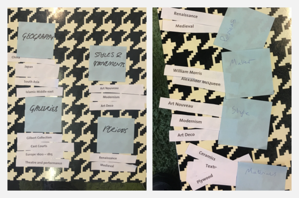
Running a card sorting exercise helped us all get a feel for how we might group our collections
When we compared the groups we’d all made, it turned out there were a lot of overlaps. When we took the group names we had each come up with, and organised them into similar groups, the similarities became even more apparent. This gave us some clear indications of what the names of our groups could be (at least to draw some initial conclusions).
Some groups were unanimous. We all independently created a group called Materials to house things like ‘Glass’ and ‘Ceramics’. We also all created a group called ‘People’ or ‘Makers’ to contain ‘Alexander Mcqueen’ and ‘William Morris’. There was also a nice overlap between ‘time periods’ and artistic ‘styles’.
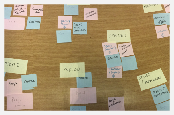
Seeing the overlap of what we’d named our groups helped us agree on naming
The real problem area was around those collections that didn’t fit into the obvious groups above, but yet still seemed to fit together for their importance to the Museum and as broader concepts or disciplines. Architecture, Furniture, Theatre & Performance, all large areas of study in their own rights. Naming that group would be hard, but we had all agreed on a working set of groups that each collection seemed comfortable in.
For the second part of the exercise we got more creative and started to visually brainstorm solutions as to how we might present these groups on a web page. This involved each of us independently sketching as many ideas as we could in a short time period. At the end of this exercise we each presented our ideas to the group and then voted for our favourites. Within a morning, we had not only created a few groups that we were all reasonably happy with, but we’d agreed on a simple direction the page could take.
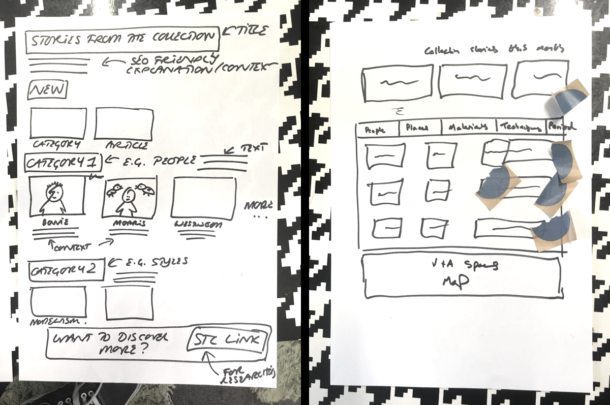
Sketching allowed us to quickly generate ideas of how we’d present things on a webpage
But what about people outside the museum?
I ran the very same card sorting exercise through a remote user testing service called Optimal Workshop. Not surprisingly the results were varied in both quality and outcome, but still offered fascinating insights. Comfortingly, many of the patterns we had seen in our initial workshop were mirrored through this exercise.
The similarity matrix below shows the percentages of participants who put collections into the same group. For example 90 percent of participants put ‘Renaissance’ in the same group as ‘Europe 1600 – 1815’. This was the highest level of association between two collections, suggesting that almost all participants were making a link between time periods and artistic styles. Over 80% of participants had grouped ‘South Asia’, ‘Japan’ and ‘Islamic Middle East’ showing another strong association through geography. Things like ‘Ivories’, ‘Terracotta’, ‘Plywood’, and ‘Glass’ were also grouped together by high percentages of participants.
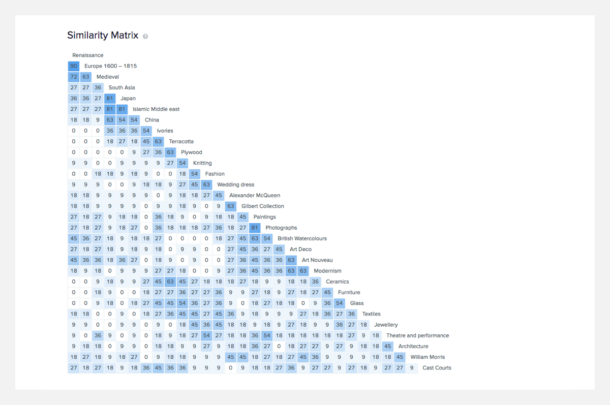
The ‘Similarity matrix’ shows the results of the card sorting exercise we ran with users, and makes it easy to spot patterns.
As well as the way participants organised collections there were also similarities in the way they named their groups. The language varied but the themes of Geography, people, time periods and materials were clear.
Making sense of the findings
It’s worth noting a couple of things about these results at this point. The participants came from a range of backgrounds and were not art or design specialists – therefore we wouldn’t expect them to come up with accurate descriptions for their groups of collections. However, the commonality shown between collections could give us a useful steer into the way we structure our groups. To really validate these findings we’d need to flip the exercise on it’s head, and see if people know where to find things when presented with just our group names. For this we’d use what’s known as a ‘Tree test’. In this test, all the collections would be subdivided into our groups. These groups would then be presented with only their names visible to the test participants. Participants would then be asked where they would look for a specific collection. The groups we went with for the test are shown below.
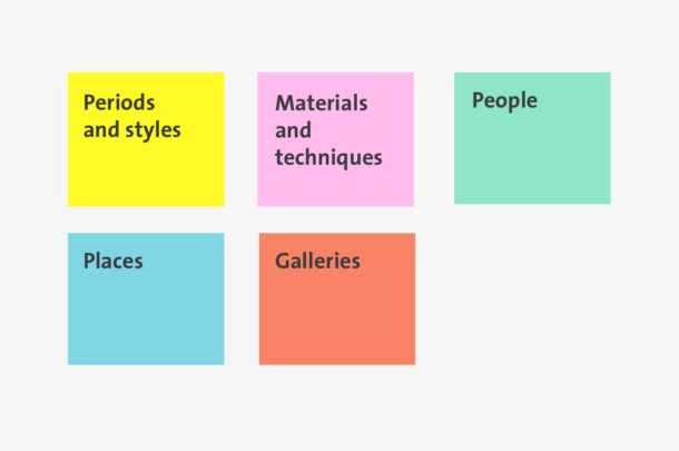
The titles we used for testing and prototyping.
The results were once again mostly encouraging, excluding a few areas of friction. The biggest being with the collection called China. On further investigation it became fairly obvious that users were simply confusing china the material with China the place, looking initially under ‘Places’. To unpack this, it’s worth considering the differences in mental modes a user might be in when completing a usability test like this vs. exploring a website naturally. ‘China’ can have more than one meaning when presented to somebody as a word in a test. Whereas, if a visitor to the V&A’s site were interested in China – regardless of which type – they would of course know which one they were looking for, and therefore the confusion would not exist. Dealing with nuances like these at least gave us a good sign that we were in a good place to take this thinking to design stage and further test with a prototype.
High fidelity prototype
Creating this prototype was fairly straight forward. We had agreed previously how the page would manifest itself through the rough sketches we did. Most of the UI (user interface) elements we needed already existed in our toolkit of parts, with a few modifications. Armed with everything we’d learned through the testing above we could finally validate whether users would understand the page and know where to find things.
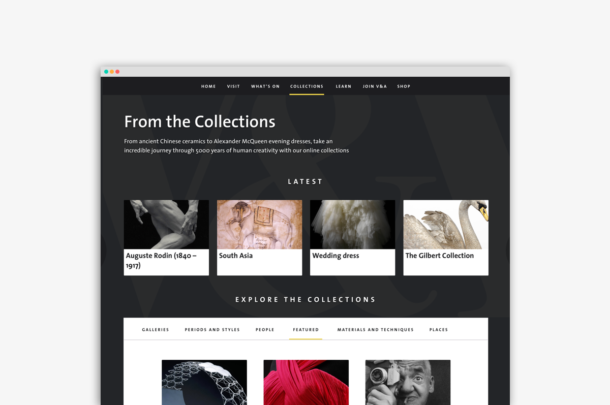
The prototype with collections now ordered into sections.
Final validation
In the final stage of testing our aim was to get qualitative feedback from users on how they felt about the page, whether they understood what they were looking at, and importantly if they could find specific collections. There was very little issue at all with finding things, and users were positive about the visual look and feel of the page. By having the ‘Featured’ tab visible on load, meant some of the trickier collections to categorise were already visible without having to look very far at all.
Does this mean we have solved this?
Far from it! Despite running a variety of tests throughout this process it felt like we were only really skimming the surface of what is clearly a thorny area of study. There will, without doubt be collections that are created in the future that don’t fit the groups we have created, and we will certainly need to review this over time. What’s more the UI could be approached in many different ways and tested for the most optimum outcome.
Ultimately what we came up with was primarily based on the gut feeling and knowledge of a few individuals from the team. It turned out that users – for the most part – shared our mental models. More importantly the web page was navigable and visually appealing, and ultimately this is what we were trying to achieve. As with any digital project the longer term success can only truly be measured with quantitative data – we continue to measure what users are doing on this page and hope click throughs to our collections will increase. Ultimately we want the V&A’s wonderful collections to be discoverable and enjoyed by many.
