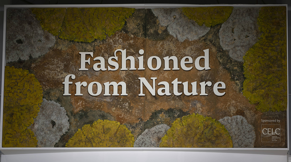
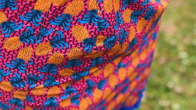
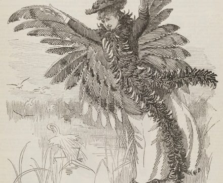
The exhibition design of Fashioned from Nature was created by our fantastic in-house design team. Graphic designer Judith Brugger explains the idea behind the exhibition’s design, the challenges of fonts and her decision to use Favini’s paper. Elena Zonta from Italian paper company Favini sheds light on the sustainable papers used in the exhibition and their production process.
Written by Judith Brugger, Senior Graphic Designer
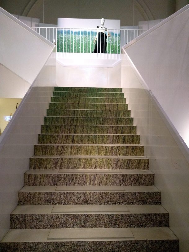
Gallery 40, where Fashioned from Nature is displayed, is a circular space separated into a downstairs and upstairs area. Often visitors don’t realise that the exhibition continues upstairs and so miss a considerable part of the display. One of the key requests in the design brief was to entice visitors through design to go upstairs, thereby eliminating the need for a sign. During a trip to flax fields in Belgium organised by our sponsor the European Confederation of Flax and Hemp (CELC), I took a photograph which became one of the key design references. Turnip Rock, a rock formation with trees in Michigan surrounded by water, was another. Inspired by these images, we designed the downstairs area to represent rock and soil, the stairs to represent roots and growth and the upstairs area to suggest flourishing plants and trees.
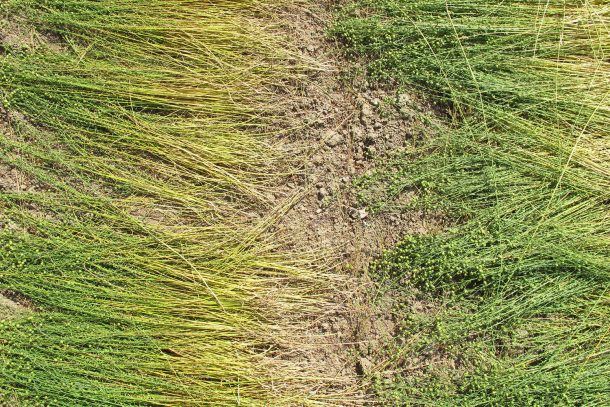
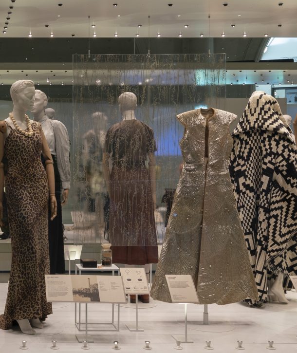
I worked closely with Senior Exhibition Designer Juri Nishi to develop a consistent design throughout the space. We both gathered samples and brainstormed together. Materials and their feel and texture became essential to realising our concept. Inspired by the different combinations of materials you find in nature, we also tried to layer and combine various materials. Many of the cases are separated by resin panels that have real plants, such as flax, incorporated into them. All section panels, case panels and object labels express the idea of layering, as they all consist of two papers. The fabric in the entrance area is transparent, thereby exposing the acoustic panel of hemp underneath. We also considered this design element to be a metaphor for the subject of the exhibition: it reveals something that normally remains hidden.
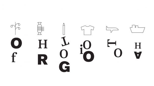
The font was particularly important. My idea of good graphic design is design that is almost invisible and only becomes noticeable if you want to see it. Simultaneously, graphic design in museums has to serve a very practical purpose as, above all, it needs to be legible so people can easily access the information. The title font is a serif font that was inspired by flax flowers and the round shape of organic materials. I combined this font with a more legible sans-serif font for the smaller body of text on the labels. I even developed the typography into a language of shapes for the infographics, which explain the production process of different fabrics.
The choice of paper was essential to realising our idea. I looked for textured paper that would interact well with the lighting to create a warm, soft and friendly atmosphere. The paper also needed to harmonise with the cladding of the cases, as all panels were mounted on the cladding. Favini’s paper had lovely embossed textures that worked well with the cladding. My font also printed well on the paper as it looked bold and clear without being too harsh or inorganic. Moreover, it complimented the sustainability message of the exhibition: the paper is made of upcycled leather waste, thereby reducing waste from the fashion industry.
Written by Elena Zonta, Marketing Officer at Favini
Fashioned from Nature uses two versions of our Remake paper. Remake was launched at the end of 2015 and is made of 25% leather by-products (instead of wood pulp), 40% post-consumer, FSC-certified, recycled fibre and 35% FSC-certified fibre (Forest Stewardship Council).
In its use of leather residues, Remake reduces waste whilst avoiding the need for new resources. Part of leather production residues from the fashion industry is destined for landfill, while the rest is used by the fertiliser industry or regenerated into bonded leather. Even though it uses recycled materials, bonded leather still has a high environmental footprint, as it is often uses synthetic or natural latex, making it impossible to recycle or compost afterwards. To make Remake, we developed a new technology that mechanically cleans, purifies and pulps the leather residues, before they are combined with tree fibres. This process only requires chemicals used in traditional paper production. The leather residues we use are all sourced from traceable Italian origin, thereby ensuring the use of vegetable tanning and the absence of chromium and other metals. The paper is produced using EKOenergy, a renewable electricity.
The section panels, case panels and object labels in Fashioned from Nature are made of a micro-embossed version of Remake, namely Carapace. Carapace’s embossed texture was inspired by the delicate patterns of beetle wing cases, thereby complimenting the subject of the exhibition and fulfilling the design team’s wish for organic-looking materials. To further ensure consistency in design, the specially-made mannequins in Fashioned from Nature were covered by Remake.
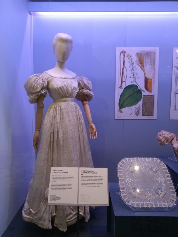
To see Judith’s design and Favini’s paper, visit Fashioned from Nature.
The next post will look at the use of conservation science in preparing the exhibits for display.
