How can one really understand the scale of a pandemic and grasp the meaning of its numbers? The barrage of daily figures dissolve into a haze of cold abstraction; a sense of helpless indifference. Information design has been put to the test during this crisis, charged with effectively untangling and communicating in real time the daily evolution of an extremely complex condition. Some notable efforts have quickly become go-to resources for millions looking for clarity in numbers: The Johns Hopkins dashboard was a useful early resource, able to convey the globality of the crisis in macabre hues of red and black. Originally run by a three-person team, by April it was receiving a billion visits a day. The Financial Times, like many major newspapers, has been releasing a steady stream of graphics of all kinds, but it was its logarithmic chart – originally meant as a one-off – comparing daily deaths per country, that most resonated with the public, and was widely shared and updated regularly.
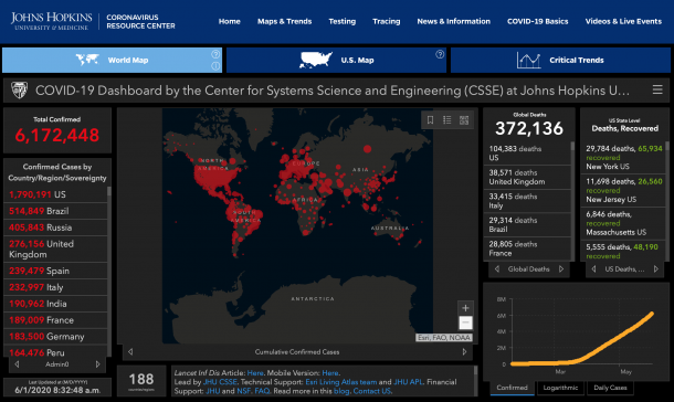
As the shape of the pandemic changes, information design has also had to keep changing tact in order to better map its course. The Johns Hopkins’ use of proportional circles to show the place and intensity of outbreaks became over time a relatively useless world map filled with red blotches. The Süddeutsche Zeitung used to publish each country’s ‘doubling rate’ – the number of days it would take for the total deaths to double – which they eventually retired as infection rates slowed. The information tools that worked a week ago, might be less relevant today.
Several months in, there is also a palpable sense of data fatigue. Just how often can we check a dashboard, or look at a logarithmic chart, without it becoming a kind of dull routine? The New York Times saw this problem coming. As the US approached the grim milestone of 100,000 Covid-19 deaths, the paper wrestled with the question of how to claw back a sense of meaning from these figures. How can one fully comprehend and convey what 100,000 deaths looks like and means? To do so, it resorted to one of the most basic forms of information design one can find: a list.
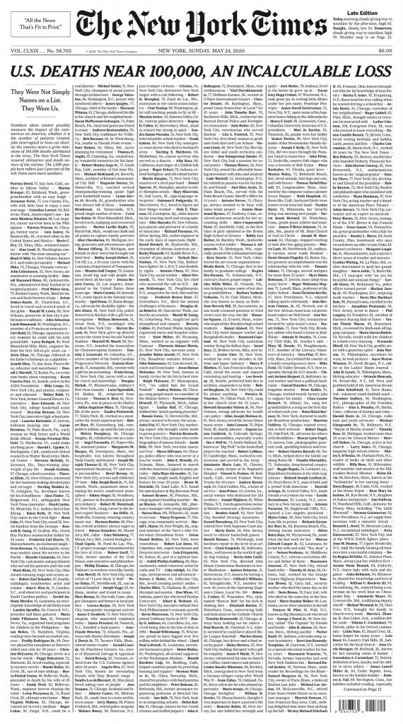
On May 24, in its Sunday Edition, the newspaper covered its front page with a list of 1,000 names of people who had died from the virus in the US. The list marked the name of the deceased, their age, place, and when available, a short statement taken from their obituary. The stunning simplicity of the list yielded one of the most powerful expressions of the extent of loss and tragedy America – and the rest of the world – had just witnessed. Lists have played a large role in this pandemic. The New York Times’ version may have been the most publicised – but elsewhere other publications have been publishing their own versions. A friend of mine usefully pointed out that a few weeks prior to the NYT piece, O Globo in Brazil ran a similar list to memorialize the first 10,000 deaths in Brazil. In Bergamo, the epicentre of the outbreak in Italy, the local newspaper expanded its 2-3 page obituary section to 10 or 11 pages.
The list is an under-rated forms of information design. Graphic designers today have increasingly advanced tools at their disposal capable of processing and rendering complex datasets, and so the temptation is to veer towards the more virtuosic, rather than something as pedestrian as a list. But lists also have impressive precedents. Think Maya Lin’s Vietnam Memorial, as perhaps the most famous example, where the names of all 58,320 US soldiers who fought and died in the Vietnam War are etched into polished granite. Or think of the writing of Walt Whitman, which consists for the large part of lengthy and poetic enumerations of things. (As an aside, upon the publication of the NYT editorial, the poet Kenneth Goldsmith called it the greatest political poem of the 21st century, which may have been a strong point had he not already called many things that)

The New York Times only printed 1,000 names. What would it have looked like if 100,000 names were printed, or for that matter, every name of every victim from around the world. Such a book of names would be a monument in its own right. But it also recalls something incredibly boring – an object that has all but disappeared in the last few years, but which used to be delivered without fail every year to households around the world – the phone book. On its surface, there is nothing terribly emotive about a phone book. But it does have the strange power to visualize and quantify an entire place and the people who live there.
In the mobile version of their editorial, the New York Times did something equally remarkable. They visualized each person with a tiny silhouetted figure with shadow. One was compelled to endlessly scroll their phone as more and more figures appeared, and an essay slowly unfurled contemplating the tragedy of the event and the challenge of fully understanding the scale of the tragedy of 100,000 lives lost. Near the end, the essay asks us to contemplate an entire city – roughly of equal population – simply disappearing. Taking the task to heart, my mind drifted back towards the idea of a municipal phone book, imagining the names of each individual – so neatly listed in alphabetic order, being deleted from the page.
In recording the pandemic, one thing we will be left with is an inordinate number of lists. Lists, as in here, of the objects that have played their role; or in the Design in Quarantine project that we looked at last week; or the obituaries of countless newspapers; or the numerous orders being placed for PPE; the lists of cancelled concerts and events; the lists of names being added to unemployment registers: an entire history of the crisis told in the lists we make to get through it.
Further Reading:
‘The Project Behind a Front Page Full of Names’, John Grippe, New York Times, 23 March 2020.
‘Uma Homenagem do Globo as Mais de 10 Mil Vidas Perdidas na Pandemia de Coronavirus’ O Globo, 11 May 2020.
‘In an Italian city, obituaries fill the newspaper, but survivors mourn alone’, Chico Harlan and Stefano Pitrelli, The Washington Post, 16 March 2020.
‘Meet The Team Behind The Coronavirus Tracker Watched By Millions’, Melissa Block, NPR, 13 April 2020.
Related Objects from the Collections:
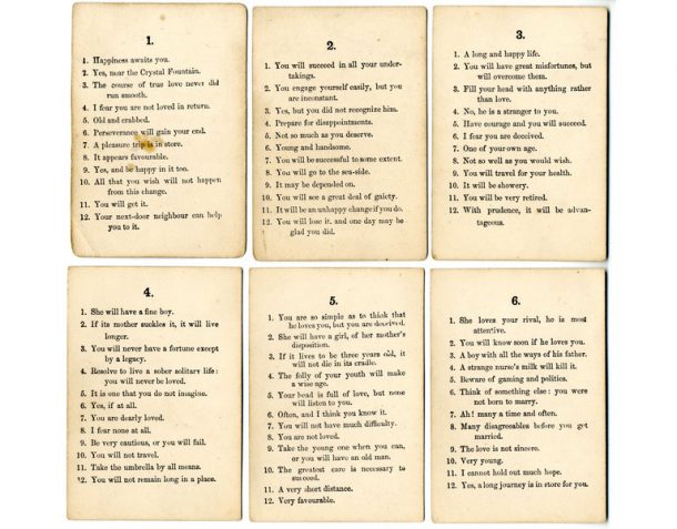
Merlin’s Casket Card Game, 1850-1899 (B.537:1 to 52-2016)