Recently the V&A updated the wayfinding across the museum to make it easier for visitors to find their way around. That change meant we wanted to update the online map to create a consistent experience across the physical and digital spaces. We brought Error agency on board to work with us, and as we get ready for launch I caught up with them about the project.
Can you tell us briefly about yourselves and the project?
We are Error, a digital agency specialising in human-centered design and development for arts, culture and academia clients.
We’ve become known as an agency that does good things with digital maps. So naturally, the chance to work with the V&A on their new wayfinding for South Kensington was a really interesting project for us!
What interested you about this project?
It’s a map of the inside, not the outside – something we’ve done less of! And it came with some really interesting challenges compared to bigger ‘outdoor’ maps. The museum is a really special building that needs careful consideration when dealing with directions.
Can you describe the approach you took to working on the project?
We were very hands-on at the beginning. Most of the Error team were on-site for the first week, workshopping and iterating on prototypes to eventually test with visitors in the museum.
What kind of insights did you use to inform the development?
The V&A have excellent resource material when it comes to insights, they really know their audience well. That research was a good starting point.
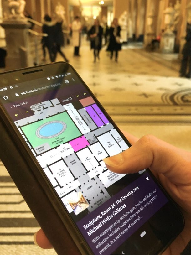
However, as mentioned above, we needed to test the initial prototype ideas and subsequent design proposal with visitors in the building. The insights we gained spending a few days doing this were really interesting. For example, there was a clear split between people who prefer to scroll around a map (with their finger) and orientate themselves visually; and those who prefer to use labels and text searches. Prior to the testing, there was natural assumption that a user would happily use both tactics. But upon observation, with a few exceptions, participants lent heavily on using the digital map prototype in only one of these two ways.
Additionally, it was important to ensure users were tested on a device they would normally use themselves (such as their own mobile phone), and, in the manner that they would naturally use it (i.e. walking around). We started out by setting the phones on a platform or seat, but quickly realised that this wasn’t a natural way for users to interact with their phones – and could skew results slightly.
How will the new map benefit visitors?
There are two ways that we think the digital map will be beneficial for visitors. The first is obviously when they are in the building and need to orientate themselves or find a location or facility, such as the café or exits. The second is for users who want to plan ahead of their visit and to get a sense of the scale and size of the venue. We felt this was important for tourist-family user types, or those visiting for a specific exhibition or display.
What was the most challenging thing about working on it?
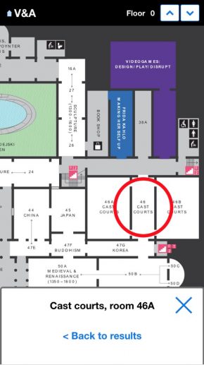
There were some very important technical challenges to overcome. Helping users locate themselves was the main one… The V&A’s walls are very thick stone and not helpful when trying to get a good WiFi or roaming signal! This made geolocation via their mobile device impossible. Relying on visual cues within rooms as well as the room numbers will help to provide users with a way to find where they were, and where they need to get to.
What did you enjoy most about working the project?
Obviously the V&A digital team are a joy to work with – it’s a pleasure to spend time with a client-side team who are focused on their offering and technically very knowledgeable too. Equally, the problem-solving aspect I’ve mentioned above was an enjoyable challenge. Oh, and regular visits to the new V&A Photography Centre!
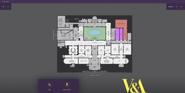
You can explore the new map now.

Thanks Sarah, that was a helpful intro to the new map version, and good to hear an external designer’s perspective for a change on these blog pages.
It’s great to finally access an online map for V&A that mirrors the printed and PDF leaflet, and the interactive version is easy to use. I do miss slightly the sample of object images and descriptions for each gallery from the old version, but it’s a price worth paying for a more user-friendly tool.
I forgot to add – it would be even better if the room headings, eg. Architecture, had hyperlinks to their associated page in the Collections section of the website. That would encourage people to explore some of the objects they can encounter before or after a visit.
Thanks for the feedback – I’m really glad you like the blog and are finding the map easy to use! We’re currently working on Explore the Collections and as part of that we will improve the way it works with the map to make it easier to find what’s on display and find specific objects in the museum.