One small step within the V&A’s giant leap of a collection is an astronaut’s helmet. This object, created in 1969, wasn’t made by NASA using space-age materials, and it didn’t reach the moon. It was made, instead, with paper mâché by Richard Blundel, an eight year old boy, and his mum at their home in Maidenhead, Berkshire. Richard remembers an ‘an optimistic, techno-centric vision of what the future would hold’. The helmet, however, later lived at the top of a cupboard for 40 years before it was donated to the V&A Museum of Childhood in 2016.
This home-made costume is one of my favourite (and more unusual), items in the collection. But how might we, the Digital Media team at the V&A, help everyone more easily discover not just this one, but many more of the V&A’s objects and the stories behind them? This is the question we asked ourselves when we started an ambitious redesign of the collections online. With over 1.2 million objects spanning 5,000 years and the breadth of art, design and performance, this isn’t a straightforward task.
More than a year on we’ve launched Explore the Collections, which, for the first time, brings together object data and our stories about those objects. The site is currently in beta, meaning we’re looking for feedback to make it even better.
In order to meet our ambitions we needed to be focused on who we’re designing for – our users. We’ve made sure to involve users throughout process – from discovery research to evaluating and then iterating designs. In this post I’ll give an overview of the different ways users engage with the collection, and then how this understanding has informed some of the changes we’ve made to help people browse and search the vast variety of objects available.
Starting with users
Over half of the traffic to the collections online arrive via search engines like Google. Whether they’re looking for information on William Morris, Mary Quant’s Georgie dress, photographs of the Great Exhibition, or examples of Chinoiserie sauce boats, all these users arrive with some kind of intent in mind. We wanted to design a structure that not only enabled users to find what they want, but also to provide opportunities to discover something new or unintended along the way.
As part of our research we explored the different modes people may be in when engaging with the collections online. Within these modes visitors will have different motivations, behaviours and content needs. Some users might want to gain a better understanding of the collections and the V&A. Some might start with a specific intent but as they explore they may switch mode. These modes range from needing depth of information on something specific, to exploring content across a subject domain, to actively seeking out inspiration and new ideas.
We don’t think that there is one interface that will support the needs of users across all these modes equally. Different types of navigation, content and functionality will serve some modes better than others. We want to make the collections easily discoverable for as many people as possible, so it was important that we were strategic, and kept a clear view of which modes we were prioritising at different stages of the design.
Make sure you’re connected
The online visitor experience is not like a trip to the museum in real life. Rather than arriving through the entrance hall, most visitors to the collections online arrive and leave via one of the 1.2 million object pages. They’re teleporting into the fourth floor, missing the nice people with maps and carefully arranged wayfinding. Discovery starts from the first object they see. More often than not they won’t see the homepage or collections landing page at all.
Before the relaunch, object pages lived on their own website, Search the Collections. It provided a huge amount of rich information about the objects, provided by the V&A’s internal Collections Management System, that catered well for users looking for specific information but – for many users – it didn’t offer clear routes to continue further exploration. The ‘main’ V&A website and Search the Collections weren’t connected together. A core part of our strategy was to integrate objects pages into the wider V&A website, to create a more coherent and seamless experience of the V&A collections and the stories behind them.
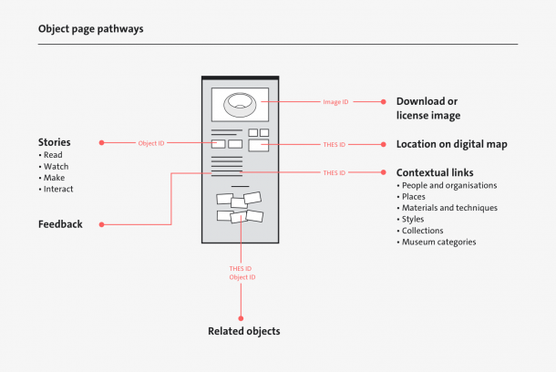
The controlled vocabularies and identifiers that underpin the Collections Management System are the key to creating connections between objects and editorial content. By using those same identifiers on the website’s content management system (affectionately known as Tycho after Sir Henry Cole’s faithful dog) we can make a link between the two. The newly designed object pages show the benefits of this for users:
- For users who need more guidance and curation we show related articles, videos, interactives, trails and make-at-home content
- For those who want to know what’s available to see on a visit, public display information is displayed and, for objects at South Kensington, the room is directly linked to on the digital map
- For users exploring the collections who might be looking for new ideas and inspiration we have a visual way to explore other related objects (we’ll be writing more about this soon)
- We have also now made clearer the contextual links that enable users to discover more objects made by the same person, or in the same place, or with the same materials, or through a range of other facets that offer different routes across the collection.

Outside of objects pages we’ve also started using identifiers in Tycho to link imagery of objects elsewhere on the website to the objects they depict. Connecting them in this way not only creates resilient links for the website, but also allow us to pull in content from the Collections Management System that might be relevant at different points on the website .
Improving search
With over a million objects in the V&A’s collections, search is always going to be an essential part of providing access to the collections. For the most part this happens off-site, via search engines, but site search (search that happens on the V&A website) is a really important feature as well. Take for example the V&A’s vast collection of chairs, many with the self-explanatory (but not so distinguishable) title of ‘chair’. For someone with a specific interest, we need to help them sort armchairs from deckchairs, aluminium chairs from fibreglass chairs, and Modernist from Neo-classical chairs.
We designed the new search interface primarily for people in this information-seeking mode. Using familiar design patterns, like suggestions and filtering, you can now refine and expand the results and get visual feedback as you do so. This incremental and iterative approach to displaying results is designed to build a user’s understanding – they can see how their refinements to search criteria change their results.
However, the user experience of search isn’t defined by the interface alone. Search is dependent on a number of different systems and people:
- The Collections and Digital Asset Management Systems that provide the data that powers search. The content within these records have been created by V&A staff past and present. Sometimes the language and structure of content used internally might not meet the mental models that our users have while searching. So, we’re working closely with the teams who manage the systems to try and help bridge these differences on the website.
- The search engine takes, stores and indexes the data from the internal systems and then makes it retrievable on the website. This engine is tuned to calculate relevancy based on the user’s query (a more detailed blog post on this is also coming soon). This is a delicate balance to get right as we don’t want to bias certain objects and collections.
- The search interface is the users’ view onto the collections. The engine enables powerful and complex search queries. The interface needs to work intuitively with the user to understand their intent and to help them find relevant results.
Moving the object pages into the wider V&A website brings benefits for discoverability but the move has to be managed carefully. It changes the context of the content and how people find it both externally and within the site. Over the coming year we will be focusing more broadly on how users search within the V&A website for different tasks and goals.
What next?
Our approach to improving discoverability of the V&A’s collections online has been to better understand our users’ behaviours and to support their needs by opening journeys that were previously closed. It meant that for the initial beta launch we prioritised improvements to object pages, search and connecting collections content across the website. But this is just the start. We’re now working on designing new page types that provide starting points for exploration of the people, organisations, places (and other themes) that provide a wider context for the V&A’s collection.
We’re also listening to feedback from our users on the beta and designing improvements for our next release. So, go explore and tell us what you think using the survey.


