Matt Somerville is an architect at Feilden Clegg Bradley Studios, and led the Raphael Court project
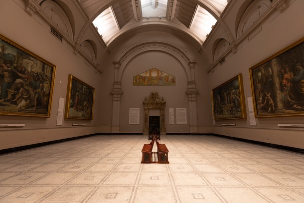
The V&A is an incredibly stimulating place. Its galleries brim with cultural treasures, presenting visitors with something new at every turn. In this context, the Raphael Court offers a very different experience. Suddenly, clear space opens up and, for one of the larger galleries in the museum, the number of artefacts on display is relatively small.
This was once the western half of Aston Webb’s ‘West Court’, completed in 1909 as part of his major expansion of the museum. The character of the space is reminiscent of a chapel, and this is no accident: the Raphael Court replicates with considerable accuracy the floor plan of the Sistine Chapel in the Vatican, for which the Raphael Cartoons – on loan to the V&A from the Royal Collection by Her Majesty The Queen – were commissioned by Pope Leo X as designs for tapestries.
The chapel-like context within which the Cartoons are placed is therefore entirely appropriate. In part, the comparative spareness of their presentation is driven by the sheer physical scale of Raphael’s Cartoons but, more tangibly, it is about giving these extraordinary artefacts the space and attention they deserve. The Raphael Court is a space generous enough to allow for contemplation.
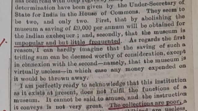
However, achieving this is first dependent on the visibility of the Cartoons. The gallery had last been refurbished in the early 1990s and, since then, it had become unfeasible to maintain the outdated technology of the lighting. As a result, the artworks were poorly illuminated. This was exacerbated by the pale colour of the walls being several shades lighter than the overriding palette of Raphael’s work, with the effect that the Cartoons were pushed back visually. They read almost as the darkest surfaces in the room.
A critical objective of the project was that we should reverse this relationship. The Raphael Court is a beautiful space with fine architectural detail and this could once more be brought out, but the room should nonetheless be a vessel for its contents rather than a dominating presence.
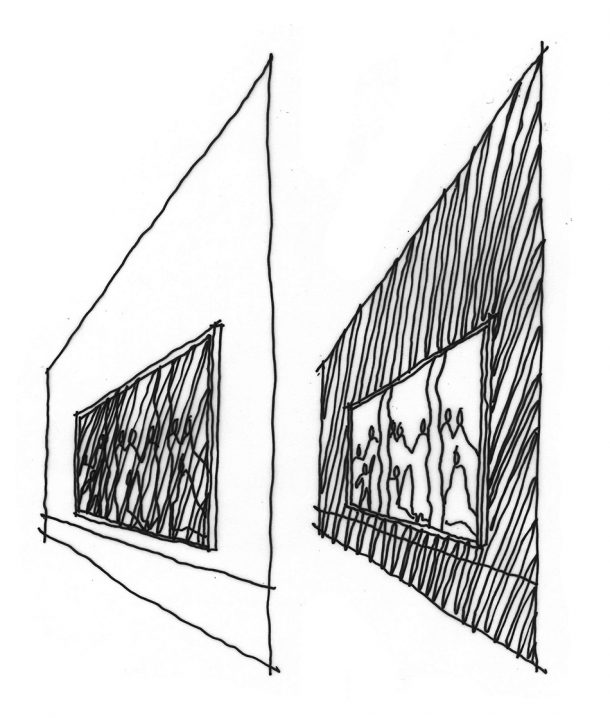
In a space that is all about the artworks, it is the Cartoons that should appear to be the brightest surfaces even though the level of illumination, for conservation reasons, needs to be kept relatively low. Our response relied on two key interventions: state of the art lighting, and a change to the colour of the walls against which the Cartoons are displayed.
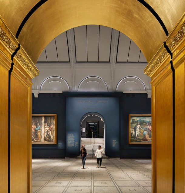
A key decision was to make the walls darker, rather than lighter, than the artworks. Against a dark backdrop with finely tuned lighting, the Cartoons could be given a “light box” quality, appearing almost to glow. A clue to this approach lay in the gallery that Christopher Wren built to display the Cartoons at Hampton Court Palace, a sombre room of dark wood panelling, offsetting the vibrant palette of the artworks.
A critical question, then, was what colour we should use, if any at all? For the answer, we looked to the Cartoons themselves, specifically to the backgrounds of scenes that Raphael had painted. Broadly, these are either architectural or landscape. Architectural backgrounds, largely to interior scenes such as The Healing of the Lame Man and The Death of Ananias have a palette of warm or stone-coloured greys. Sky and landscape backgrounds, as in Christ’s Charge to Peter and The Conversion of the Proconsul recede to blue-greens. While the gallery walls should be read as backdrop, it is the presence of a deep colour, as opposed to the neutrality of dark grey, that can hold and unify the contents of the room. For this reason we investigated dark blues and green, similar in hue to the landscape backgrounds but, to bring the artworks forward, deeper in tone.
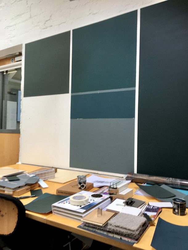
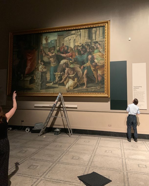
We trialled colours from different paint manufacturers, initially as painted samples in our studio, since the thumbnail-sized paint chips in colour charts might be accurate but will never convey the real impact that a colour will have. Drawing on Raphael’s colour palette, these ranged from dark, saturated blues to dark green, but we found that the most successful colours lay somewhere between the two. Apart from the colour hue, the depth or saturation of the colour was also of critical importance. A very deep colour, even though dark in tone, would exert too strong a presence and begin to overpower the artworks. Again, the Cartoons provided an answer: after 500 years the colours are surprisingly vivid, but they are not intense. Having narrowed our selection, we moved on to colour trials within the Raphael Court using painted plywood panels that could be placed alongside the Cartoons. Through this process the colour we selected was ‘Hague Blue’ (by Farrow & Ball) which harmonises with the greenish-blues of the skies and the bluish-greens of the landscape background. It is darker in tone, so recedes visually, while having a comparable colour saturation. It is vivid but not overpowering.
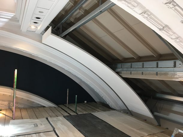
Beyond the lighting and décor, other changes to the gallery itself were needed. The main physical intervention to the fabric of the museum has been the insertion of curved acoustic panels at ceiling level. These follow the profile of the arches that span the space, obscuring from view a glazed roof that was infilled with solid panels in the 1990s refurbishment. What remained – an echo of the glazing system but without the glass – was a detail that drew the attention away from the artworks. The new curved panels sit directly beneath the formerly glazed roof, leaving the central ‘lantern’ clear.
These panels are formed of acoustically absorbent plaster and have a second function: reducing reverberation in the space, improving speech intelligibility so that visitors can talk to and understand each other better, further reducing distraction and creating a calmer environment in which the artworks can be experienced.
Most visitors approach the Raphael Court from the adjoining South-East Asia gallery, but there is little or no ‘event’ to mark their arrival into the presence of works of such great cultural significance. The threshold to the space represents a change of pace in the museum and, as such, it should have a clear architectural presence. Visitors should be aware of having crossed it. The arched entrance has therefore become a moment of exuberance – as Raphael’s Cartoons are set within gold frames so, as visitors enter it, the Raphael Court is framed by gold leaf applied to the arch’s deep reveal. This reflects light within the archway, lifting it out of relative obscurity and allowing it to hold its own against the grander entrance to the Fashion Gallery opposite.
Although these changes are relatively subtle as physical interventions into the architecture of Aston Webb’s interior, cumulatively the character of the space and the presentation of the artworks is transformed as a setting that supports, but does not dominate, the presentation of the Raphael Cartoons.
Brilliant blog post I like the link to the Aston Webbs interior . I liked learning more about how Raphael was renovated in the 1990s and the dark blue paint.
Thanks Matt for sharing those fascinating insights. There has understandably been much attention paid on this website to the conservation and scanning work performed on these amazing paintings, so it’s helpful to understand the equally impressive efforts made to the gallery itself.
Having visited this renewed space for the first time last weekend, I thank you and the team for achieving such fantastic results. The cartoons certainly look more vivid, the space is more inviting and comfortable (partly from elegant new seating), and the atmosphere was more conducive to contemplation.