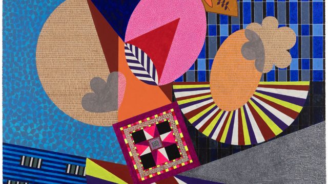
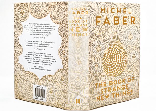
Yehrin Tong‘s entrancing illustrations follow a detailed exploration of mathematical abstractions and typographic illusions. Her highly accomplished design for the cover of Michel Faber’s The Book of Strange New Things impressed the 2015 competition judges Mary Portas, Steve Pill and the late Moira Gemmill. The design features a single teardrop that embodies the book’s central theme of love, loss and the fluidity of relationships.
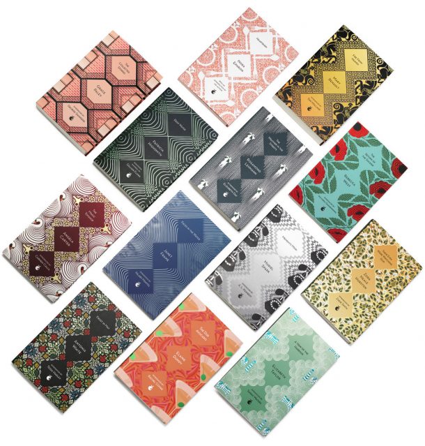
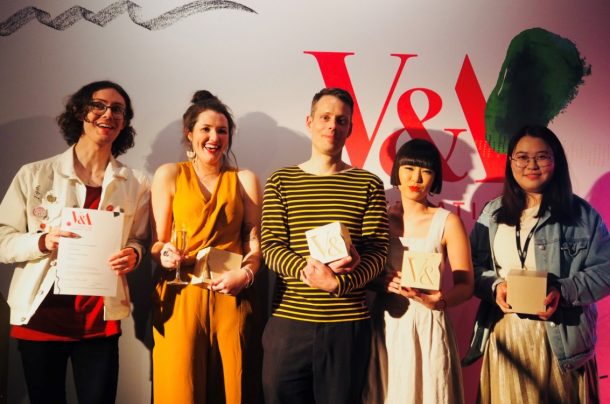
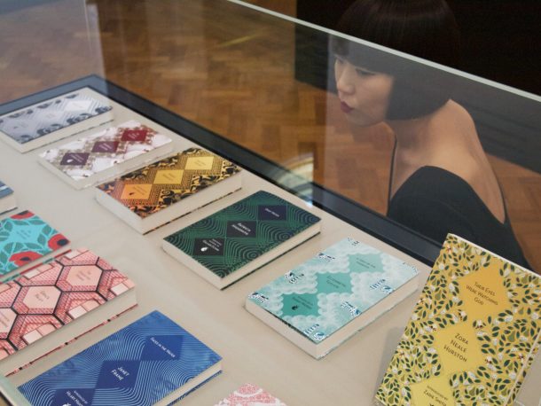
This year, Yehrin enthralled the judges (Nicholas Coleridge CBE, Olivia Ahmad and Jessica Voorsanger) with her deluxe book covers for Virago’s Modern Classics 40th Anniversary Series. Designed in collaboration with Art Director Hannah Wood, Yehrin created a set of 13 unique patterns that each repeat around a strict diamond-shaped grid and Virago’s iconic green spine.
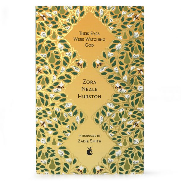
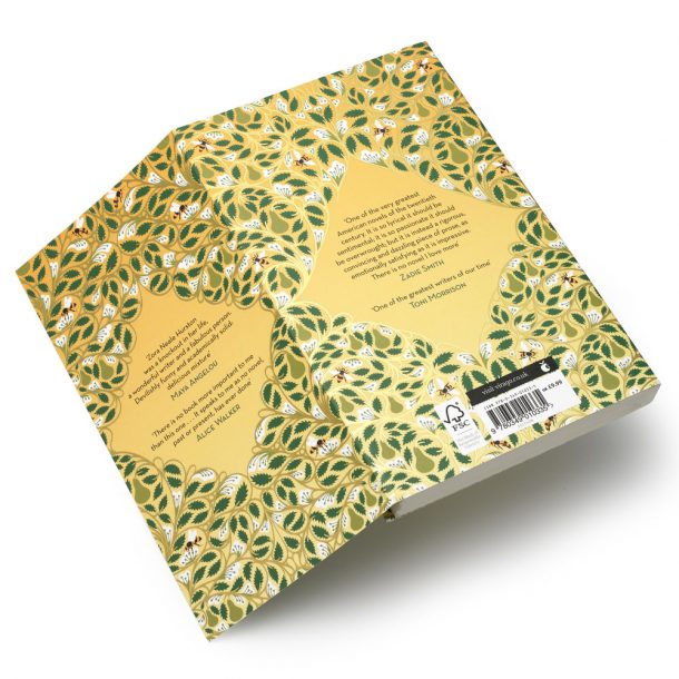
The judges were particularly enchanted by her cover for Zara Neale Hurston’s Their Eyes were Watching God, commenting that the contemporary style appealed to new audiences whilst showing respect to the original text. The luscious imagery evokes the main character’s contrasting experience of love; pear blossoms represent her idealised view and the encircling gold foil branches act like a gilded cage, alluding to her oppressive relationships.
We caught up with Yehrin to find out more about her practice and how it feels to have won a second V&A Illustration Award.
What inspired you to become an illustrator?
I loved album covers. I was drawn to the hype surrounding the artwork when new music was released, how the narrative in the visuals sparked my imagination alongside the music. It was a powerful part of the experience. I also loved fashion illustration and fabric patterns. But it was the initial sketched ideas phase that interested me the most. I think the love of aesthetic beauty still shows in my work.
Disappointingly, my dream of studying illustration was dashed during the Central St Martins Graphic Design course. My tutor thought illustration was a dying industry and presuming I wouldn’t be able to cope with the hardship, he redirected me to study web design.
After graduating, I started from scratch, building up an illustration portfolio by producing artwork for friends that were part of the Electroclash club scene in London. It was a short-lived and wild time with no constraints that gave me the inspiring, eccentric art school experience I was looking for. Young club kids were forming bands, making their own music and creating their own looks. The more ridiculous and outrageous you were the better. Everyone was able to live out dreams of performing on stage and being famous for fifteen minutes. Within it, I was able to live out my small fantasy of producing album covers and posters. As naive as the work was, it was enough to get the ball rolling quickly into professional commissions. My images were picked up by magazines which in turn gave me the editorial work I needed to be signed by an illustration agency.
You have a very distinct style, how did this develop? Who are your influences?
I draw a lot on references from my childhood. I love the contrast of old and new. I grew up in a home jam packed with items my parents picked up from auctions: intricately carved antiques, tapestries, sculptures and paintings from different eras. I loved the haphazard unstructured way textures and patterns were placed next to each other. This was juxtaposed with science journals and medical books that also had a big presence in our home. The form and structure of anatomical drawings and the abstract nature of scientific diagrams mesmerised me.
It was this clash of old and new mashed up with a hundred other influences I picked up down the line that formed my style. From the flair of arabic art, to psychedelic artists such as Pablo Amaringo, aboriginal dotillism to legendary designers like Barbara Hulanicki and the list goes on…
I’ve also been fortunate enough to work with some brilliant art directors that have helped shape my style. My favourite clients are the ones that push me out of my comfort zone and make me discover new ways of thinking. I’m constantly inspired by the creative people I work with.
Congratulations on winning the V&A Illustration Awards for a second time! What impact did winning the award in 2015 have on your practice?
Thank you so much for the honour of winning it a second time! I’m still ecstatic and buzzing from the awards night. I’m forever grateful to the V&A for giving artists like me the opportunity to showcase our work in the most prestigious and beautiful museum in the world. I’m still pinching myself that I’ve been awarded a second time.
When I was put forward in 2015 for the cover of ‘The Book of Strange New Things’ by the wonderful art director Rafi Romaya from Canongate, I had only worked on a handful of book covers and I had minimal understanding of the industry. After the awards, my work garnered a lot of attention from publishing houses. I had the pleasure of collaborating on five more Michel Faber covers with Rafi and the book projects I’ve worked on since have come directly from the exposure of the awards, possibly including the Virago series that won this year’s award. I found the publishing industry to be a warm, close knit community that knows how to keep an eye out for you and support new talent. Best of all, they know how to have fun.
The exposure has had such positive effects on my career with interest in my work coming from all different sectors of design. After this year’s award, I’ve already had an amazing opportunity which I won’t disclose yet, but hopefully I’ll have something great to show soon.
Your series of book covers for Virago Press are all worked around a strict diamond grid and the publisher’s iconic green spine, yet each design is beautifully unique. Can you tell us more about this 40th Anniversary series?
This was my first experience working on a complete series and it was a dream job in many respects, to produce 13 full book cover pattern designs for the feminist publishing company Virago, celebrating the Virago Modern Classics 40th anniversary.
I’d seen the stunning covers for the 30th anniversary editions which used patterns from iconic female designers such as Barbara Hulanicki, Celia Birtwell and Lucienne Day. So I was blown away when they asked me to work on the entire collection for the 40th anniversary editions. The project happened during my maternity leave so the project was comparable to keeping 13 plates spinning. I felt incredibly lucky that the client was willing to trust me with the project during this period.
The amazing art director Hannah Wood really understood the way I worked and wanted to use this as a platform for me to show my strengths. She wanted an eclectic feel to the series with each cover representing different moods and eras and thought my versatile style would be ideal for the project. I had to illustrate different scenarios from legendary writers, ranging from the Flora Everglades in Zora Neale Hurston’s ‘Their Eyes Were Watching God’ to the mechanical Neo-Victorian swan featured in Angela Carter’s ‘The Magic Toyshop’. The strict diamond template that she designed gave the covers continuity despite them all having a unique approach. As tricky as it was to figure out a way to repeat a pattern within this template, it gave me the freedom to be as diverse as I wanted with the patterns. The iconic Virago green used on the spine was also incorporated into most of the covers to reinforce the identity of the series.
When brainstorming for this project, the V&A was actually my first port of call. The museum has always been an endless source of inspiration for me, especially so with this project where I was able to draw on the many historical design references. Studying the extensive V&A archives was key in building the patterns. Everything I needed was under one roof: Stained glass windows, Art Nouveau, Baroque silverware, ancient Greek pottery and fabric patterns from the 50s and 60s to name but a few. Even the Moroccan tile patterns were a brilliant source to use for the structure of the patterns.
This project came at a very happy time when I felt energised. I wanted more colour, vibrancy and life brought into my work too and I hope that shows in the series.
Your previous clients include Apple, the New York Times and the Prado Museum. What advice would you give to student and emerging illustrators?
It might be an obvious piece of advice but make sure you’re feeling inspired by your work, by the people that represent you and by the people around you while you’re working. You need to feel passionate about your work for other people to love it too. Once you’re earning money and working with big brands it’s easy to become complacent. For there to be longevity in your career, remember to keep things fresh for yourself. If it’s something that you’re passionate about it will show in your work and people will pick up on that.
Looking ahead, what are your plans and ambitions for your practice?
I’d like to get back to basics. Working on the computer, as fast and foolproof as it is, can send most designers into a state of analysis paralysis. I’d like to loosen up and get back to embracing the flaws that comes with not having “apple z” at my fingertips. I have a child now and I’d like to set a healthier work-life balance example for him, working in a way that motivated me to become an illustrator in the first place, moving away from screens and being more hands on in sketchbooks with pencil, pen and ink. I think it will be a welcome and refreshing change.
See the winning book cover design at the V&A Illustration Awards 2019 display, on until Sunday 25 August 2019 in Gallery 88a.
The V&A Illustration Awards is the UK’s most prestigious annual illustration competition. Free to enter, the 2020 awards will open later this year.
