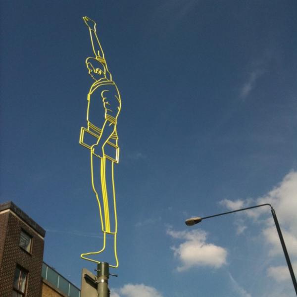
On top of a road sign near Brick Lane in London last week an unofficial street art tribute was erected to Tommie Smith – one of two black American athletes who famously used an Olympic podium at the Mexico City Games in 1968 to stage a demonstration against racial discrimination in the United States. As the American national anthem played, Smith and John Carlos (gold and bronze medallists in the 200m respectively) silently made the black power salute – creating an iconic image of dignified protest that was broadcast around the globe. Capturing the media attention honed-in on the Olympics, Smith and Carlos got a message out into the world that cut across the official narrative of the Games. The sculpture of Tommie Smith appearing in East London is a poignant reminder of a historic moment of civil rights protest (the photographer who took the image below described how encountering it raised goosebumps). As an unsanctioned piece of art on the streets of the Olympic host city it is also an example of current visual interventions in the Games – of which more below.
Photograph by @HeardinLondon
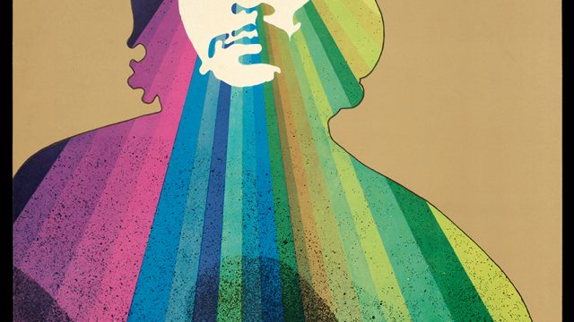
Posters and graphics produced in various forms of opposition to the Games provide an important counter-history to those commissioned and distributed by Olympic organising committees. The Mexico City Games are widely regarded as a high point in Olympic graphic design, but were also an occasion for an out-pouring of improvised student protest posters. Mexican students demonstrated against their government in the weeks before the Games began, protesting against spending on the Olympics instead of basic social needs. While the official Olympic designers were creating a dazzling visual identity for modern Mexico based on indigenous pattern-making and contemporary Op art, the students drew on Mexico’s tradition of political print-making and took inspiration from the Atelier Populaire in Paris by setting up make-shift printing presses and distributing their message in poster form.
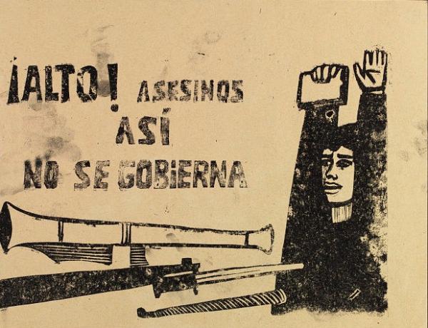
The Mexican Government, determined not to let social unrest sully the image of the Games, used police and army units to brutally quell the protestors – hundreds were killed and the poster workshop was raided and smashed up. The poster below is one of the student designs on the theme of Government repression. The rough printing and finger smudges capture something of the urgent energy of its production, but you can still see how the lino-cut lettering references the parallel lines of official Mexico ’68 logotype. During a lecture in 2006 graphic designer Lance Wyman, who designed the logo, recalled a certain unease at having been a young man working for the Mexican establishment on the Olympic programme at the time of the student uprising. He was somewhat reassured in 1985 when one of the students involved thanked him for ‘creating a language’ that they were able adapt to their own purpose.
Anonymous student protest poster, ‘Stop Murderers, This Isn’t the Way to Govern’, Mexico 1968
The Munich 1972 Games are remembered for the inspired graphic design of Otl Aicher, but also for a terror attack in which members of the Israeli Olympic team were taken hostage and killed by Palestinian group ‘Black September’. In an extraordinary new book, Alexander Negrelli pulls the imagery of the Munich Games together. Interweaving the stories of the official and terrorist visual identities he shows how Aicher’s modernist belief in effecting positive social change through design and communication encountered the fluid guerrilla imagery of the terrorists. (See Paul Gorman’s review of Negrelli’s book ‘Kommando Otl Aicher’ here). For both the Mexico City and Munich Games a consideration of the darker side of the Olympic visual archive reveals a complex and fractured relationship between the idealism that informs Olympic design and the political realities within which the Games take place.
In the run up to the Beijing 2008 Games protests focussed on human rights and press freedom in China. Paris-based organisation Reporters Without Borders staged protests around the world and their ‘Beijing 2008’ graphic showing the Olympic rings as handcuffs was seen on posters, t-shirts and banners. It was even smuggled into the Olympic flame-lighting ceremony in Olympia and unfurled before the press cameras.
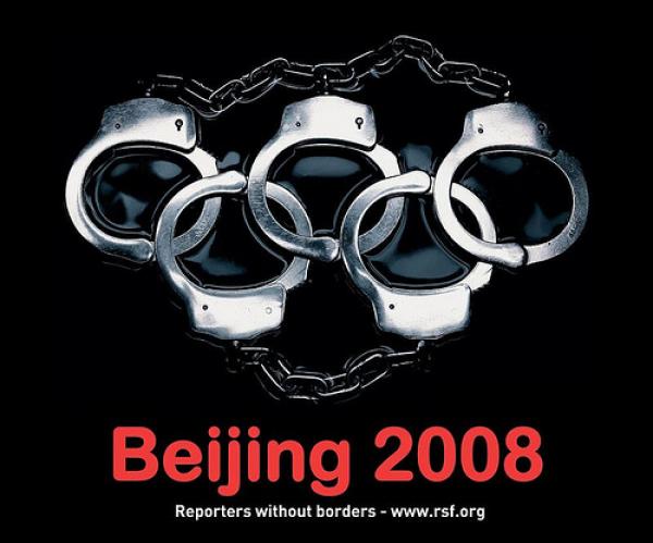
Poster published by Reporters Without Borders, 2007
Protests against the Olympics rarely take issue with the Games as a sporting event and a source enjoyment and inspiration. There are however many who see reason to challenge how the Games are organised, financed and controlled in contemporary times. In the poster below political graphic artist Klaus Staeck subverted the Olympic rings into corporate logos as a comment on the increasing commercialisation of the Games through corporate sponsorship in the 1980s.
Klaus Staeck, ‘We Call the Youth of the World’, Germany, 1988
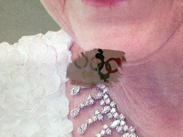
The commercialisation of the Games continues to be a cause for protest with arguments that the values of the Olympics are damaged by close association with ethically questionable multi-national sponsors. Today there are also questions about the investment of public funds and who benefits; issues of regeneration and legacy versus social exclusion and the privatisation of public space; concerns about security versus civil liberties. Passages of Danny Boyle’s popular opening ceremony for London 2012 Games featured Suffragettes and Jarrow Marchers celebrating a positive tradition of political agitation. Beyond the historical pageantry in the stadium the London Games have been the subject of a variety of creative protests ranging in scale from stickers on the Underground to ambitious feats of subvertising pasted over billboards and projected onto buildings.
A sticker strategically placed over an image of the Queen on a poster promoting the ‘Diamonds’ exhibition at the Royal Collecion. Photograph by Catherine Flood
Olympic sponsors have been a target. Environmental activist group Climate Rush have taken British Airways to task for their ‘Home Advantage’ campaign (which magnanimously appears to encourage Britons to avoid flying and stay at home to support the Games) by changing the words on posters from ‘Support Team GB’ to ‘Support Team Climate’. A series of spoof MacDonald’s posters have been fly posted around the East End in which images of obesity are seemingly endorsed by 2012 branding. The War on Want pressure group, meanwhile, projected a 65ft image onto a tower block overlooking the Olympic Park, combining the text ‘exploitation – not OK here, not OK anywhere’ with the logo of London 2012’s official sportswear partner, Adidas, in reference to allegations of sweatshop labour. It was timed to be seen by visitors leaving the stadium after watching Usain Bolt win the men’s 200m. For a round up of protest commentary on London 2012 sponsors and a selection of subversive Olympic street art, see spoof newspaper ‘London Late – the Big Money Games’. The Occupied Times has also produced issues themed around the Olympics.
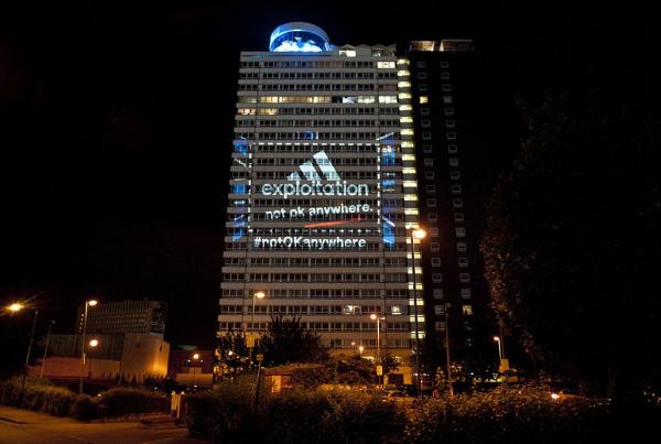
Photograph by Guy Smallman
Policing of the Olympic brand and laws brought in to prevent non-sponsors from aligning themselves with the 2012 Games have caused an outcry. Design studio Rizon produced a series of three ‘Underground Supporter’ posters carefully designed to allow businesses to show a defiant support for the Games while avoiding actually infringing the strict Olympic marketing guidelines. Rizon’s managing director Dave Collins explained to Dezeen Magazine that “total control for sponsors is not the Olympic spirit and certainly not in the spirit of British fair play”. The anarchist/situationist group the Space Hijackers have made an ingenious parody of the legal controls and exclusivity governing all forms of association with the 2012 Games by designating themselves the ‘Official Protestors of the London 2012 Olympic Games’ and issuing LOCOG with a legal agreement setting out exclusive rights to protest the London Games. As a spokesperson for the Hijackers commented “They had official chocolate bars, official fast food outlets, official logistics companies – official everything – associated with the Olympic Games. So why not have official protestors?” The campaign received a major publicity boost when Twitter controversially closed their account following complaints from LOCOG. The billboard below (bottom right) has been co-opted by a Space Hijacker design listing all the Olympic-related words (printed in the official London 2012 font) that non-sponsors have been told they must not use. The tone of the billboard captures the group’s signature blend of incisive comment and humorous mischief. It was pasted up illegally as part of a Brandalism UK project.

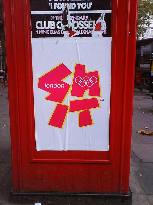


Poster by Rizon (top left); anonymous poster fly-posted on a London telephone box (top right); Space Hijacker t-shirt (below left); Space Hijacker/Brandalism UK billboard (below right)
Graphic design has itself been a cause of contention in the run-up to the 2012 Games. The London 2012 logo design by Wolff Olins received an extraordinarily stormy reaction when it was unveiled in 2007 and has been the subject of much discussion an many irreverent re-workings (although there are signs that there has been a thawing of attitudes towards in during the past few weeks). Within the creative industries there is a feeling the British graphic design talent has been overlooked by the London 2012 organisers – especially since all the twelve of official 2012 poster designs were commissioned from fine artists. As a constructive response to the collective complaining Jonathan Barnbrook and Vaughan Oliver have co-curated an exhibition of alternative 2012 posters: ‘FIT: London 2012 posters by Contemporary British Graphic Designers‘ at Central St Martins College of Art and Design. The exhibition aims to ‘fly the flag for British Graphic design’ and includes submissions from a group of leading designers who were invited to create the posters they might have designed for an Olympic brief. All were done for free and money raised from their sale will go towards student bursaries at CSM (see here).
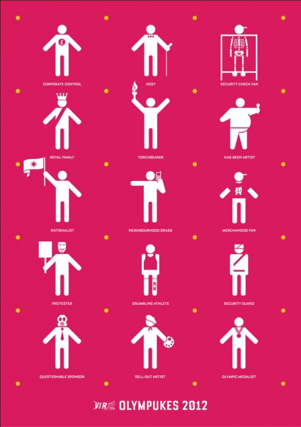
In a second project for the London Games Barnbrook’s Virus Fonts has released a new 2012 version of the Olympukes – a subversive reworking of the Olympic pictograms. It was at the last London Games in 1948 that Olympic pictograms were used for the first time and they went on to become one of the most revered infographics commissions in the business – a project that seemed to embody Olympic aspirations of universalism. The concept behind the Olympukes is that while official sets of Olympic pictograms create the illusion of being a clear and neutral system for understanding the scope of the Games, they fail in honestly representing the nature of the Olympics today. The Olympukes are a witty, iconoclastic commentary – but one based on careful research into some of the key stories and controversies of the current Games. Available opensource they provide people with a font they can use to describe London 2012 in all its complexity and contradictions.
Barnbrook have released two downloadable type specimen posters demonstrating how the Olympuke characters can be used.
In collecting graphics from London 2012, we are looking across the full spectrum of officially approved, ad hoc and oppositional designs. This goes for both printed objects and our Collect London 2012 Flickr project which aims to build up an archive of photographs of Olympic graphics in-situ in order to capture and preserve something of the graphic environment of the Games. Have a look at the great range of photographs that have been submitted so far – and keep adding to it.
You can browse more Olympic posters from the V&A collection here. For further reading, see Margaret Timmers A Century of Olympic Posters (V&A Publishing). The Free Word website has a wealth of information on politics and the Olympics.
