Continuing our Constable theme (the post on our examination and recent discovery of a previously unknown Constable oil sketch is here), guest blogger and Freelance Paper Conservator Melissa Lewis, who recently carried out a professional work placement in the V&A Paper Conservation studio, talks about her experience working with Constable sketches that she recently prepared for loan to Petworth House…
Whenever I’ve thought of Constable (1776-1837), I’ve always thought of a long tradition, starting with Dutch landscape painters, where you could walk straight into the scene and join the horses wading through the river or sit under a bow of a tree and gaze at the view of Salisbury Cathedral: to me, he was one of the great English landscape artists painting England in its perfect bucolic idyll.
. © Victoria and Albert Museum, London.")
My favourite type of painting is Modernism, Expressionist in outlook, where paint flies across the page and crashes with charcoal, and crayon twists, turns and dances into ink to express lyrical emotion, spirit and humanism. I like painting to be alive and free and to express all the things that make us human in a positive way. I always wonder where Modernism in Britain began. People who look back for it’s seeds often look to Turner, but looking at his technique, I wonder if Constable has been overlooked in this regard.
One of the joys of being a conservator is that you can look at art all day long and you can look at it really, really, closely, from a number of different perspectives. If you look at a painting from the side (raking light), you can see how the layers are created and from the top (upside down) gives you a better idea of composition; from the back may reveal more about the piece (other sketches, provenance) and with a magnifying glass or microscope you can see far beyond.
. © Victoria and Albert Museum, London.")
The pieces in question here are watercolours, gouache and drawings by Constable, mostly executed in 1834 and donated to the museum by Isabel Constable (daughter of the artist) in 1888. I was reporting their condition and remounting them, before they went on loan to an exhibition at Petworth House where they will be on view until March 2014.
Constable was said to be a man wholly engrossed in practising art, which he loved. The 1834 sketchbook was part of his late work, after his wife had died and he had the responsibility of raising seven children alone. He had just recovered from two months of illness. He’s intensely saddened, but resolute and determined.
To me, these paintings feel like the sharing of a moment, after a time of mourning and strain, (almost) as if the weight has been lifted from his heart and joy and warmth had crept back. John was visiting his friend, George Constable, at Arundel and went to paint the surrounding area including, Findon Wood and Petworth by invitation of Lord Egremont.
. © Victoria and Albert Museum, London.")
In his letter of 16 July 1834 to Leslie, Constable says of the scenery he encountered on his visit: “The Castle is the chief ornament of this place-but all here sinks to insignificance in comparison with the woods, and hills. The woods hang from excessive steeps, and precipices, and the trees are beyond everything beautifull [sic]: I never saw such beauty in natural landscape before. I wish it may influence what I do in future, for I have too much preferred the picturesque to the beautifull-which will I hope account for the broken ruggedness of my style …”
Traditionally, watercolour is made up of transparent pigments built up in gentle washes over light paper. By contrast, these pictures are vigorous and experimental. In ‘Cottages on a High Ground’ , Constable has started using opaque pigments. He experiments with different brushes, using a coarse-haired brush (made from hog hair or similar) to produce thick, shadowy details. He also uses the end of the handle of his brush to score and abrade the paper, removing paint and bringing fine touches of light to dark areas, as you can see below, on the roof of ‘A Farmhouse and Church at Houghton- Sussex’.
. © Victoria and Albert Museum, London.")
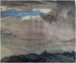
In other sketches, he draws over light blue washes of colour with grey pencil lines and plain water washes to create mood and shadow in the sky. In ‘View over Hilly Country, with a Stormy Sky’ as you can see below, he uses the side of a graphite stick to produce the effect of sheets of rain hitting the hill . ‘Cottages on a High Bank’ , shown above, has exploited a low horizon line, so you can feel the long climb up the hill to the cottages on the bank. The paint is thickly applied with a variety brushes, textures and tones. It is a quick energetic picture, yet he perfectly captures the feeling of warmth on the left hand field as the clouds open up and bathe the hill side in sun.
. © Victoria and Albert Museum, London.")
In ‘Fittleworth Mill and Bridge, on the Rother, Sussex’, Constable employs a technique that he may have found useful when painting with oil on paper. Here he applied a size, a thin coating of transparent gelatine, or possibly isinglas (a very pure version of traditional gelatine, but made using the dried swim bladder from a the sturgeon fish), which is painted over the top of the drawing with the addition of a mica (a silicate mineral ground to a powder) to add a definite sparkle. In ‘The Ruins of the Maison Dieu, Arundel’, below, he draws with thick graphite pencil, heavily worked all over the page, sometimes so forcefully that it has made an impression in the paper. The craggy stones and mossy roof feel visceral; this building feels ancient, alive and growing.
. © Victoria and Albert Museum, London.")
Much has been written about Turner’s watercolours, his painting techniques and mastery with paper, pigments and tools. From these sketches, I feel that Constable should be praised more for his contribution in breaking up traditional landscape painting, his exploration of the use of materials and finding a deeper understanding of our connection with the earth. These impressions of landscape were made before Monet was even born.
40 of Constable’s sketches from the V&A are on view at Petworth House until the 14th March. Constable: The Making of a Master opens at the V&A in September 2014.