We are currently redesigning and rebuilding our new collections site, which will hold over 1.2 million objects. Kati, our head of Digital Media, has written in detail about this. This is a challenging product with lots of moving parts – and many things to think about. We are also deep into lockdown, with the novelty of working in pajamas and unlimited cups of tea slowly wearing off. With all of us working out of our bedrooms, this adds another layer of complexity to an already very tricky project – and with no end in sight currently, we must adapt to find new ways of working together to keep our momentum.
So we decided to run a remote workshop for the design of the collections landing page to help get all our team on the same page, brainstorm some ideas and have a bit of fun together. Now running a workshop in person is pretty straightforward – you book a room, have some post-its, pretty coloured sharpies and maybe some snacks (actually definitely some snacks, people always seem to sketch better when there are snacks involved). It’s a little trickier remotely. We really wanted to recreate that same engagement, interaction, bouncing off each other and working together that you have in person. So we thought we’d share some top tips from what we learnt. We hope this helps.
1. Find the right tool
We spent some time researching Mural and Miro, two online collaborative tools that would allow us to all interact and sketch on a workspace at the same time. We ended up going with Miro for completely subjective reasons, but mainly because we preferred the simple, intuitive interface.
You have an infinite space to sketch, write, brainstorm and stick virtual post-its. Everyone loves a virtual post-it note. In Miro you are able to change the colour of them (surprisingly popular) and, unlike in real life, they don’t fall off the wall. You can see everyone’s mouse with their name on it moving around and interacting. There is something very sweet about seeing all your colleague’s little names whizzing around a virtual workspace. It also means you can see who is spying on whose board 👀. You are limited to three workspaces on the free account but this is fine as you only need one for a workshop.
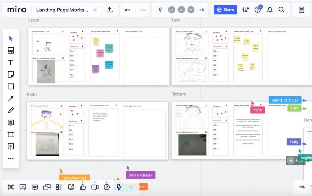
We created a board for everyone within the workspace, which is basically the equivalent of a school worksheet with a name at the top. Each board had allocated space for all the exercises we were going to do, the tool you would need for that exercise, and how long that exercise would take. A colleague told me after that this gave her a sense of security and reassurance – having their own board and knowing exactly what’s coming up creates something familiar in an unfamiliar space.
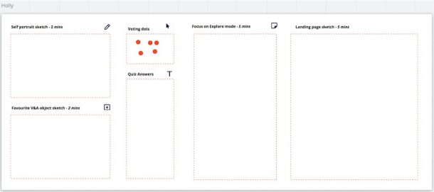
Along with Miro, we used Slack (as we already have this) for voice calling and screen sharing for when we presented.
2. Prepare everyone for what they will need
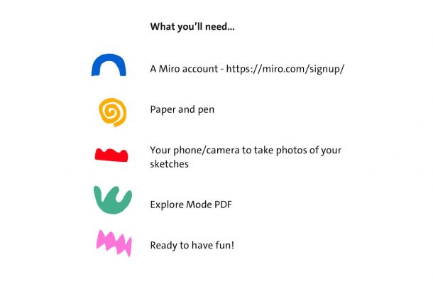
We let everyone know well in advance what we expected in terms of preparation and input. Along with our workshop calendar invite, we sent a checklist for what people would need. This helped set clear expectations. For us, these included paper and pen for sketching, a way to take photos of your sketches, a shared document to refer to for an exercise and a Miro account. The only slight niggle with using Miro, or any tool that your team hasn’t used before, is that everyone needs to create an account before the workshop. This is straightforward to do and even easier via Slack, so there are no excuses. However, people forget and have other things to do, so we sent a reminder the day before, bugging everyone to sign up.
3. Get creativity flowing
It should be said that this is a good principle for running a workshop regardless of whether it’s in-person or remote. However while it’s a lot easier to do in real life, the question is how do we achieve this virtually? It’s a big ask to get everyone to make a mental switch from what they are currently doing to start thinking creatively. They could be deep in code or writing a report and shifting gear is tricky, particularly when you’re all separate, working from your respective homes. Plus, sketching can be quite intimidating for people. We wanted everyone to loosen up, bond and not take it too seriously.
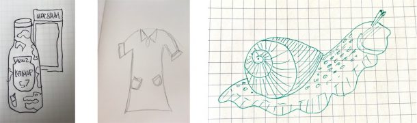
One of the exercises to help achieve this was to draw a favourite object from our collection in two minutes. Along with the first exercise which was to draw a self-portrait in one minute using the drawing capabilities of Miro, this exercise allowed everyone to sketch using pen and paper and then upload it to their board.
Both these exercises helped familiarise everyone with Miro and its tools, as well as getting everyone warmed up. The small timeframe for these meant people couldn’t agonise over it. As well as a way to loosen up, starting with small, short sketches that are entertaining and bit silly, it was a real insight into your colleagues’ minds and a chance to see some of our lovely objects from the collection. A beautiful jade snail from the jewellery department, Ed Sheeran’s infamous ketchup bottle and a very chic Mary Quant dress to name a few.
4. Understand why we’re here
It’s important to get everyone on board with why we’re actually here. Why have you dragged them from their work to sketch alone at their desk for a couple of hours? By being clear about the goal of the workshop, we reminded everyone of the bigger context.
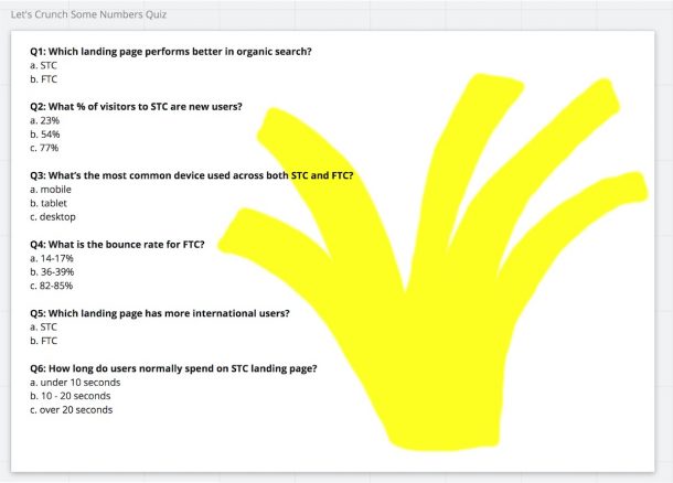
For us, the goal was to align on, and understand, who the collections landing page is for and what we want to achieve with it. We used a quiz (because our team love quizzes) as a vehicle for understanding the problems that we are trying to solve. We needed to remind everyone of the high bounce rate the current landing page has, and that we’re designing primarily for desktop.
5. Understand who we’re designing for
Once we were all warmed up, it was important to understand who we were designing for. After all, we are a user-led design team. Previously, we had developed four different interaction modes that define the different motivations that drive our users to explore our collections. Jack, our Design Lead, has gone into some detail about it.
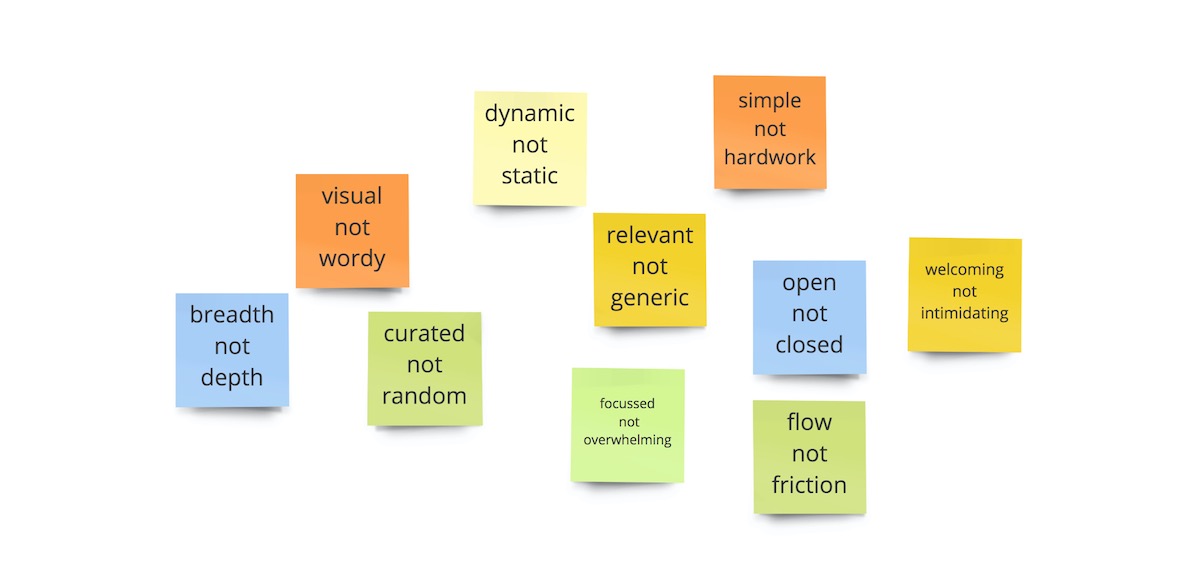
We used this research to define who the landing page would primarily be tailored for; users who want to explore. ‘Explore’ users are looking to get inspired, and want to be exposed to new ideas. They’re interested in a wide range of topics but they can feel overwhelmed by the choice, so they tend to expect guidance and curation. Using the information on this mode, we got everyone to write down values or attributes that they thought the new landing page should have for these users. And these values would be paired with an opposite. Basically a value that they believed the landing page should have, and one that it shouldn’t. Here are some examples of the most popular variations of pairs.

Visual not wordy – time and time again, it has come up that people really value (and respond well to) imagery over text-heavy content. Curated not random; having some guidance on what to look at and not being overwhelmed by random choice. Dynamic not static; the idea that this is an active page with new content being added that is current and relevant.
Interestingly, there was a lot of similar variations of pairs that came up, and it was reassuring that we are all aligned. From this, we grouped these into themes that have built up a set of key values to define the landing page – what it should and shouldn’t do. These values will inform our design decisions for people in this mode. How does the landing page fit with helping people to explore? How do we translate these values into features?
6. Over-communicate to the point that you become a little annoying
Body language. Subtle facial expressions. Intonation and pausing for effect. Hand gesturing. Over gesticulation to make a point. These are all cues that create a natural flow and order of conversation that we take for granted in person. When you’re just a voice, many of these factors get lost in the depths of cyberspace due to a bad connection/noisy neighbours/poor signal/small children/the fact that we are all little floating heads on a screen. This reduced quality and depth of communication can lead to misunderstandings or just plain awkwardness.
To ensure this doesn’t create a chaotic workshop when everyone is talking at the same time, or a bottomless void of silence when no one talks at all, we compensate for this with over-communication. State the obvious to make sure we all on the same page. Repeat information, and then repeat it again. Explicitly ask for agreement, rather than interpreting silence as agreement. Call on people by name to speak. Not only do people like hearing their own name, it keeps everyone engaged, encourages each person to have a turn to speak, and determines an order of speaking.
Attempt to make jokes – even if they’re not laughing at your joke, but how terrible it is, at least they’re laughing.
This workshop was really useful in getting the team together to understand who the landing page is for – and what we want it to achieve with it. It was a nice chance for us all to ‘get together’ and have a bit of fun in this uncertain time. We’ve had colleagues from other departments at the V&A approach us for advice for how to run their own remote workshops, so hopefully this shows how we made it work for us. Have fun!