I’m at the V&A Museum on a 3-month summer placement exploring data visualisation of their digitised collection. I’m a PhD candidate in Innovation Design Engineering at the Royal College of Art, supervised by Professor Stephen Boyd Davis.
My PhD topic is designing timeline visualisations that offer new ways to explore cultural data. As cultural institutions like the V&A digitise their physical holdings – images, objects, texts – the resulting volume of data can be difficult to make sense of, or present. Representing that data visually can make it more accessible, understandable and ultimately usable. The data around a museum collection comes with particular challenges; cultural datasets are very diverse and the data we have to work with can be heterogeneous, incomplete, imprecise and uncertain. The sheer number of objects and their variety can make life fairly complicated.
I’m thinking about the different ways that themes and connections across time can be brought out in collection data, and have previously done projects with Wellcome Library data, and at the Cooper Hewitt Smithsonian Design Museum.
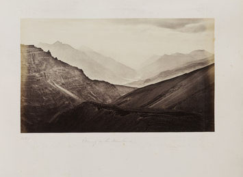
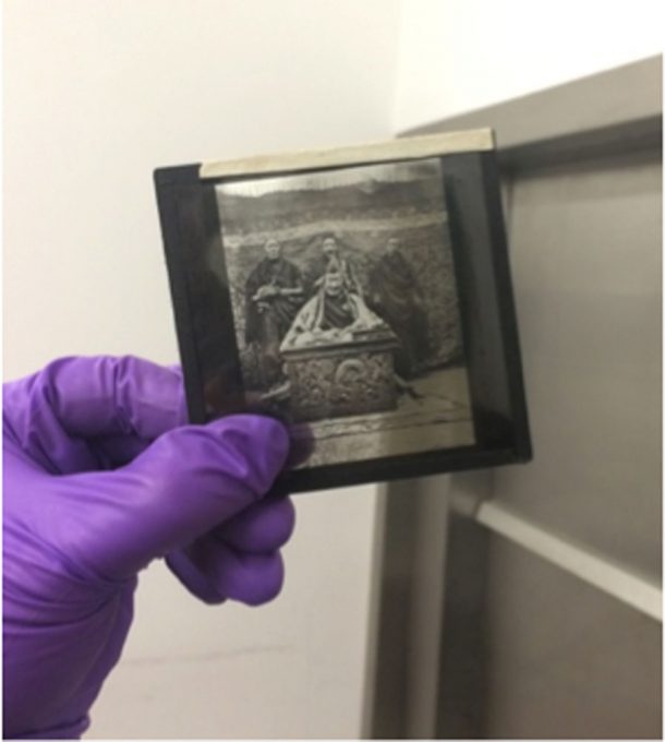
At the V&A, I’m sitting in with Digital Media and have been working with the (partly-)digitised Royal Photographic Society (RPS) collection. The RPS collection showcases the history of the art of photography, and includes over 270,000 photographs. The photographs are of varying forms (small and large prints, glass slides etc.) and were made using a range of techniques, including early experiments in the development of photographic technology. It’s a diverse collection including photographs made by important early pioneers as well as plentiful, widely-produced types.
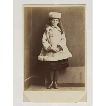
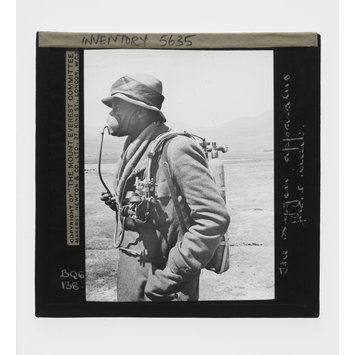
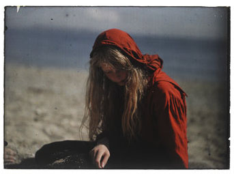
I haven’t worked with photography collection data before. The RPS collection also differs from other collection data I’ve worked with because it’s very much in the advent of its digitisation (2% at the time of writing). Images and cataloguing information are being added daily. At the time of building these visualisations there were 5,472 digitised RPS items, of which 2,155 had an image and a date (critical for mapping items by time!).
My initial steps during this placement were to familiarise myself with the digitised collection. I first started making some rough plots laying out the collection data to get a better sense of what the collection consists of, how it distributes in time, and what attributes may be interesting to visualise.
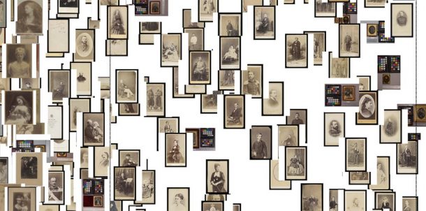
I started by very roughly plotting all the data by date (I’ve built all the visualisations discussed here in JavaScript and d3.js, a code library for creating interactive visualisations of data in web browsers).
In the V&A collection, date information for a record is available as a numerical date span (typically produced by translating a free-text date, like ‘19th century’ or ‘c. 1865’, into numbers, like ‘1800-1899’, using code). Dating can be complicated with photographs as there may be different dates associated with taking a photograph: the date the photograph was taken can be different from when a print was made from a negative. I’ve plotted the ‘photographed’ date here.
I plotted each item at a random position within its date span, using the images themselves as markers. Plotting the data this way, rather than at the end or middle of its date span, prevents misleading shapes forming in the visualisation (such as a column at 1850 for all the items dated 19th century).
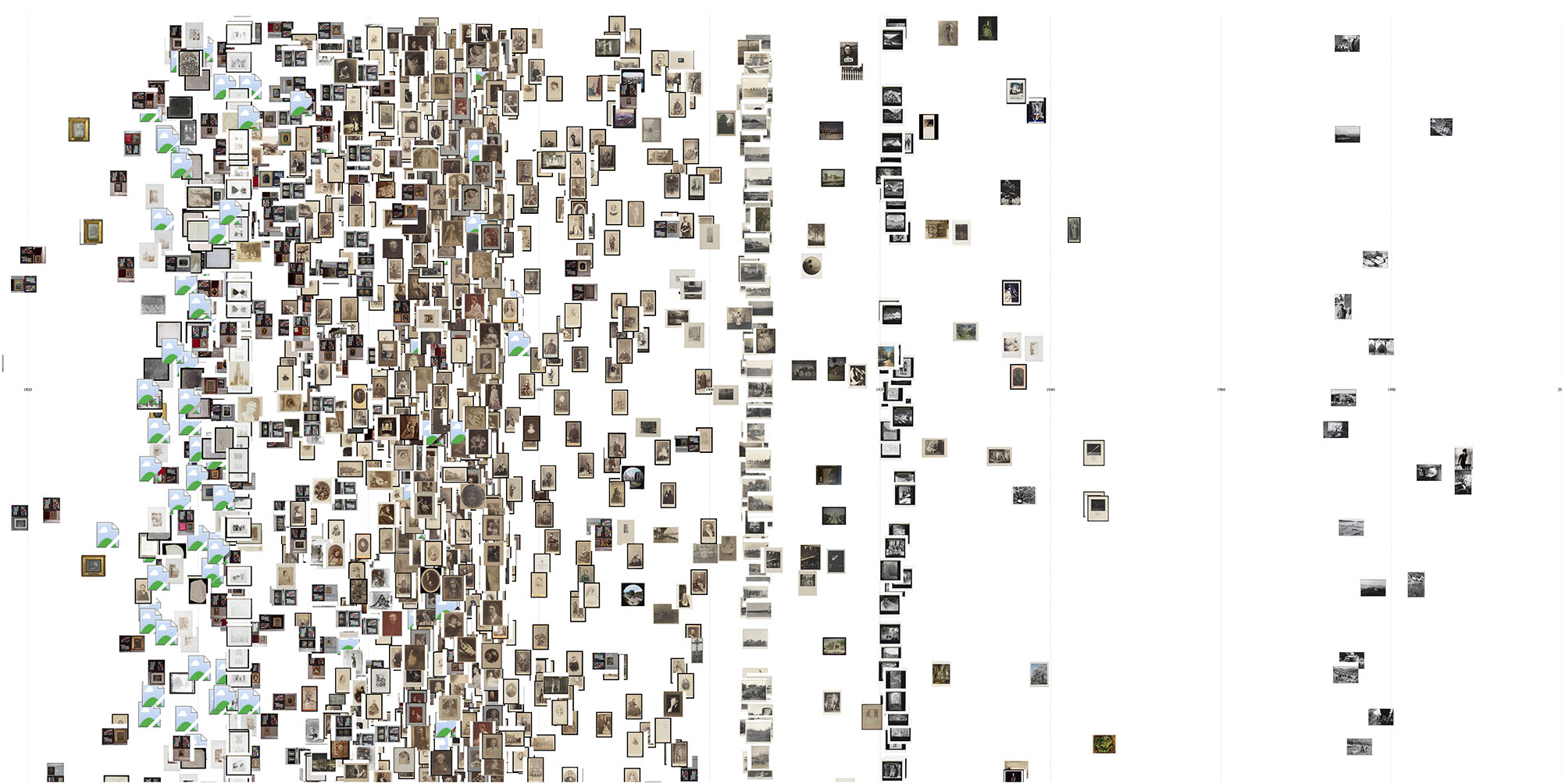
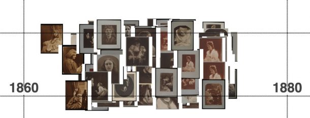
While the result is an expected mess, there is some sense of the photographs’ distribution in time and columns of similar images reveal photograph sets.
(Plotting this way also revealed some broken image links to the V&A server, which was useful to know internally!)
How to pull the data apart? My first thoughts were to explore segmenting the data by photographic technique. This great V&A page steps through a history of different photographic processes. Different techniques were introduced, and were popular at different times and I was interested to see if mapping the data this way would show popularity shifting over time from one technique to another.
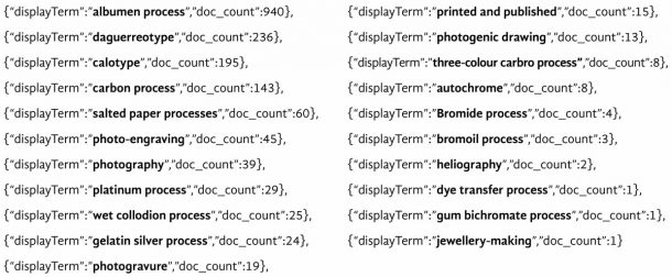
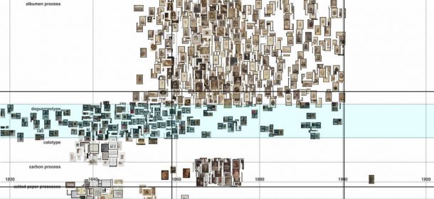
I mapped the data in horizontal bands for each technique. (I’ve scaled the height of the bands with a power scale to accommodate imbalance in the number of items for different techniques.)
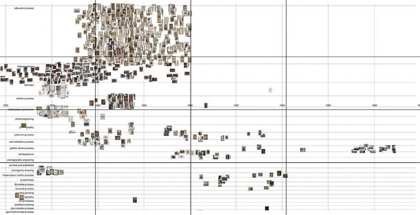
This plot gives a sense of the different aesthetics and image content typical for techniques, as well as hinting at the periods when techniques were used.
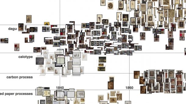
The main takeaway from this visualisation, though, is that it betrays the decisions made about what to prioritise for digitisation. In a collection where only 2% has so far been digitised, these biases are inevitable. The visualisation’s shape is dominated by albumen prints and daguerreotypes (the top 2 bands), which have been digitised first. And dense isolated clusters elsewhere often represent photographs by key figures, such as Julia Margaret Cameron.
Florian Kräutli has written about the tendency of collections visualisations to amplify curatorial decisions. He discovered for example that mapping artworks in the Tate by artist produces a visualisation swamped by the volume of Turner’s artworks, whose numbers are inflated by a decision to create a separate record for each individual page in all of Turner’s watercolour sketchbooks.
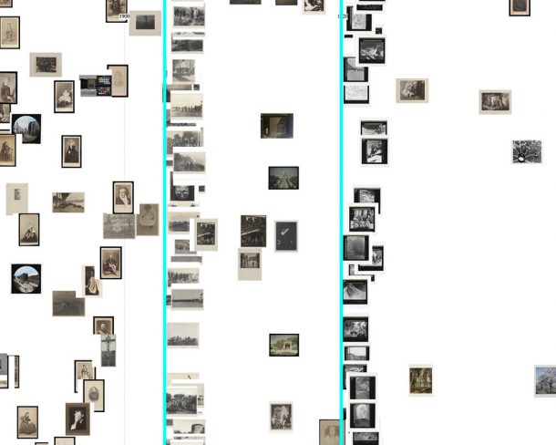
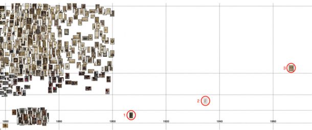
Aside from this, the basic plot is useful for spotting errors in the data. In the image below, an isolated albumen print (labelled 3) and calotype negative (2) are both positioned too late because of errors translating their textual date to a date-span expressed numerically. But, of course, not all anomalies are errors! The isolated carbon print (1) is correctly positioned for its record. Maybe further digitisation will fill in the gap, or maybe it was made by a photographer revisiting a technique popular in the past?
Similarly, the distribution of the daguerreotypes betrays an error with dates. Their distribution is most dense 1840–60, with a sparser scattering either side. Checking the records reveals many of the items are dated mid-19th century. The script translating this to numbers has tripped on the hyphen, converting the span to the full century: 1900–1999.
This technique for spotting errors has a shortcoming though. If an item’s date span has been erroneously widened, plotting it at random position within its span will only sometimes position it outside its correct date.
I next tried segmenting the data by ‘category’. ‘Category’ is used in the V&A data both to identify themes (for example ‘Landscapes’, ‘Children and Childhood’ or ‘Military’) and for institutional grouping ‘photography’ or ‘Royal Photographic Society’, perhaps. In this visualisation, I only looked at the thematic ‘categories’, manually excluding the others.
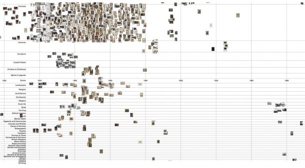
Multiple ‘categories’ can be applied to any record. At this stage of making rough plots, I chose simply to pull the data apart as much as possible and used a rule that an item will be plotted in the ‘category’ with the lowest total items – in effect, pulling all the data down as much as possible. (Actually, multiple photographic ‘techniques’ can also be applied, but with this dataset, only 2 records so far have more than 1 ‘technique’).
If taking these visualisations further, it might be better to adopt a filtering approach such as in the ‘Past Visions’ project.
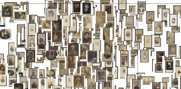
Mostly this visualisation reveals the many portraits in the RPS data.
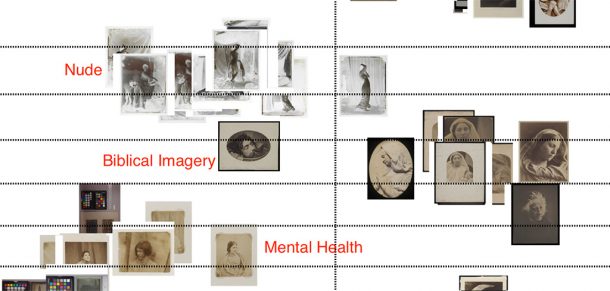
Some of the other ‘categories’ are beginning to make compelling groups around themes, but have not been so widely applied.
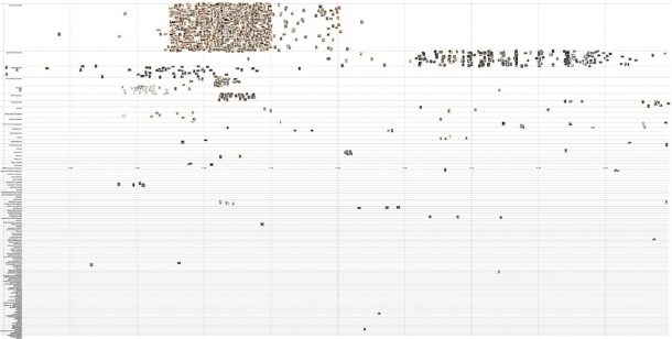
I was curious to see if I could extend my template to the wider V&A photography data and adjusted my query to return all photographs in the V&A Museum data (there are over 45,000 with an image and date). My program faltered as my browser refused to render more than 10,000 images. But even without plotting all the images, the plot shows there are scale limits to this approach. The number of ‘techniques’ in the data swells to 132 becoming an unwieldy long list, and likely the visualisation would remain mostly blank space even if the images rendered.
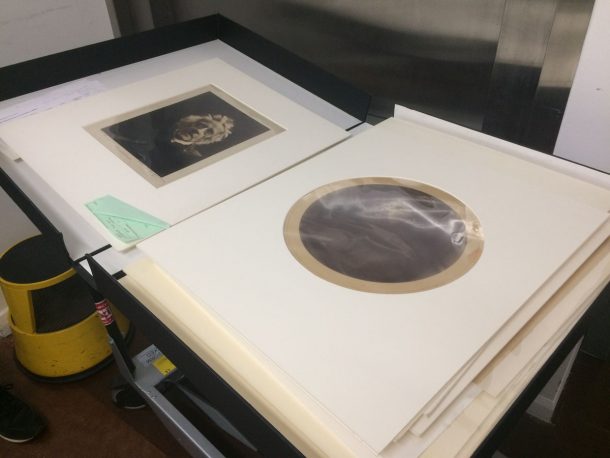
Since beginning to make these visualisations, I’ve had the pleasure to visit the physical RPS items with a curator and see some of the amazing photographs whose representations I’ve been working with. Seeing the physical items, though, hammers home how misleading my visualisations are in terms of object scale, as I came across items I recognised but whose size I’d completely misjudged. This is true more generally of looking at digested collections on the web.
So far, my exploration suggests that making rough, unpolished plots like these can be useful, particularly internally at an institution, for:
- Spotting errors in the data;
- Seeing the progress of a digitisation project unfold.
Problems I’m thinking about:
- There are some photographic types in the RPS data, such as carte de visites, that are very plentiful and have similar image content. This can overwhelm the visualisation in a date span. How might I design a visualisation that gives a taste of items like these without drowning out other context?
- In many ways, the most interesting part of this collection is the images themselves. It may be worth exploring approaches that combine focus and overview, so the images are discernible but the user can still see a wide temporal context.
- ‘Categories’ have not been widely applied across this dataset, but might there be other ways of tracing connections around the image content across these photographs?
Next steps to follow soon …