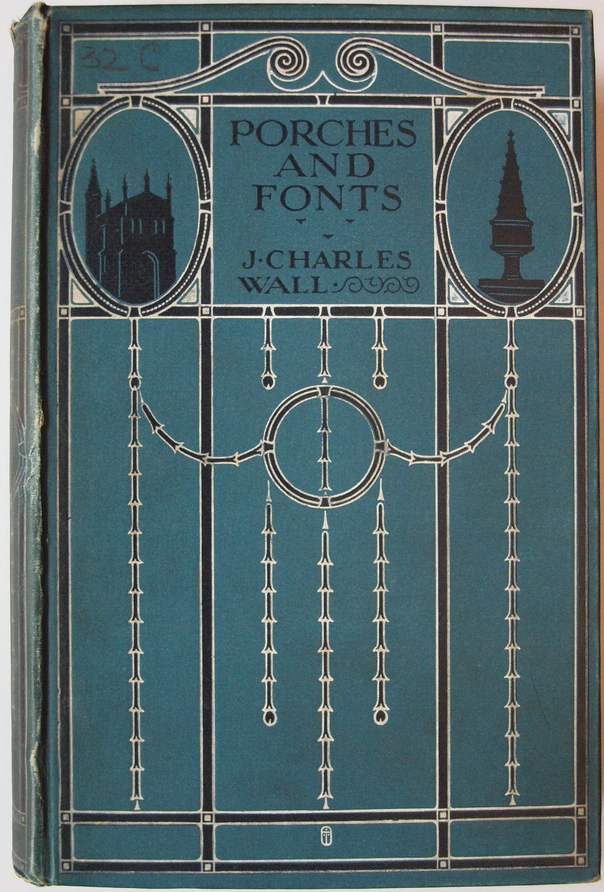
One of the pleasures of working with books is discovering eye-catching design in the most everyday of objects. The National Art Library has always acquired some books specifically for their artistic qualities (such as their illustration or binding), but there are many more hiding in our collection with the capacity to surprise and delight. I was looking for an 18th century guidebook to Windsor Castle, when I came across this delightful book on a shelf nearby:
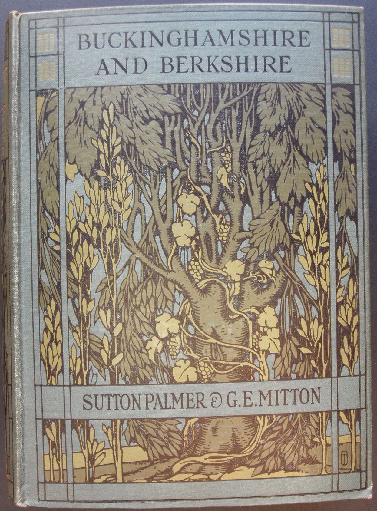
What was of particular interest was that whereas so many cover designs are unsigned, this incorporated what appeared to be the artist’s monogram.
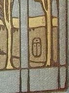
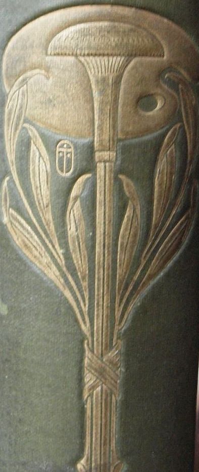
The symbol looked vaguely familiar, but I couldn’t place it. I showed it to a colleague, who also had a vague recollection of what she called the “scarab” symbol. Ah! I said. Turbayne!
A.A. Turbayne (1866-1940) was a successful designer of book covers from the 1890s until about 1920. Although born in Boston, Massachusetts, and living for some time in Canada, he spent most of his working life in England. His earliest work, which many consider his best, is very much in the art nouveau style. Although this is a later example, it clearly shows the influence of his art nouveau roots, with the typically sinuous plant forms, but here in a much more realistic style.
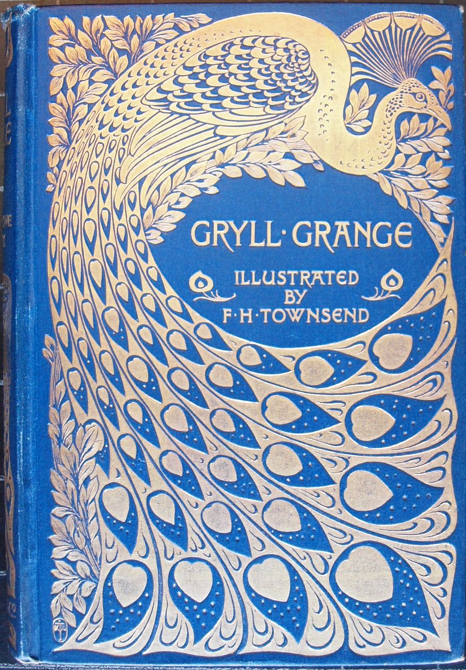
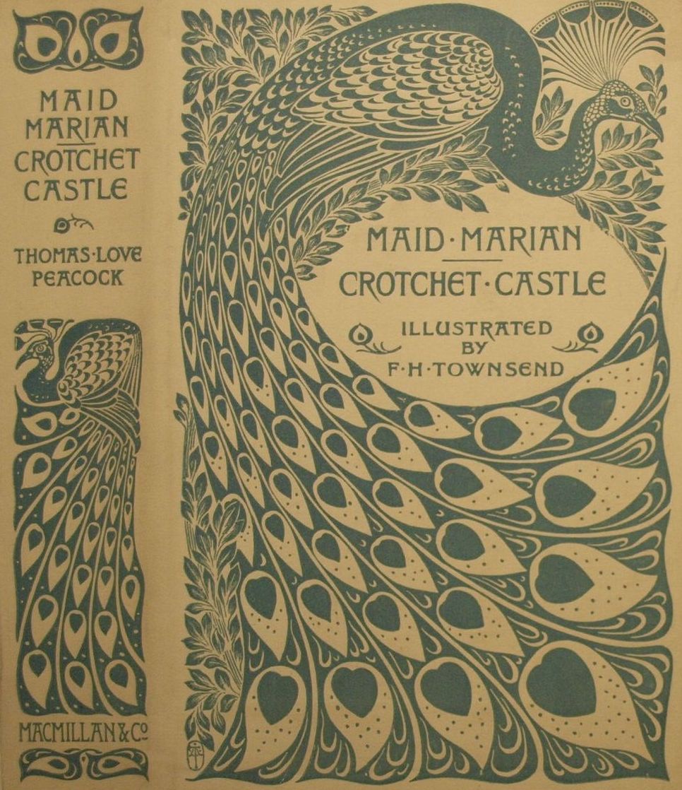
A search of our online catalogue showed 5 other items with bindings designed by Turbayne. These include an example of his most famous art nouveau design, which was used for the “Peacock” edition of illustrated novels published by Macmillan in the late 1890s. (If you look closely, you will see that the monogram he used on his early work is slightly more ornate.)
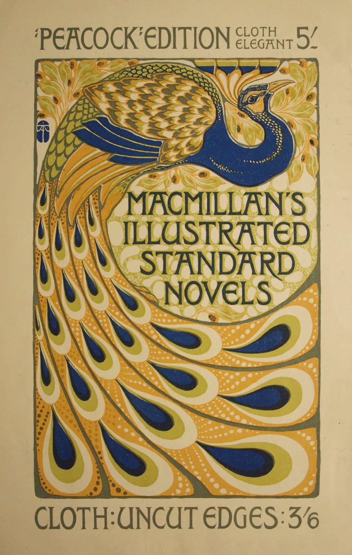
This is typical of the books that would have been issued in this type of binding. Intended for the gift market, a gold stamped binding gave a taste of luxury. Indeed, in this advertisement for the series (using a variation of Turbayne’s peacock motif), we see that the purchaser had a choice of bindings for the same illustrated edition. The deluxe version, described as “cloth elegant”, cost nearly half as much again as the plainer binding. The reverse of this leaflet actually names Turbayne as the designer of the covers, suggesting that he was well known at the time.
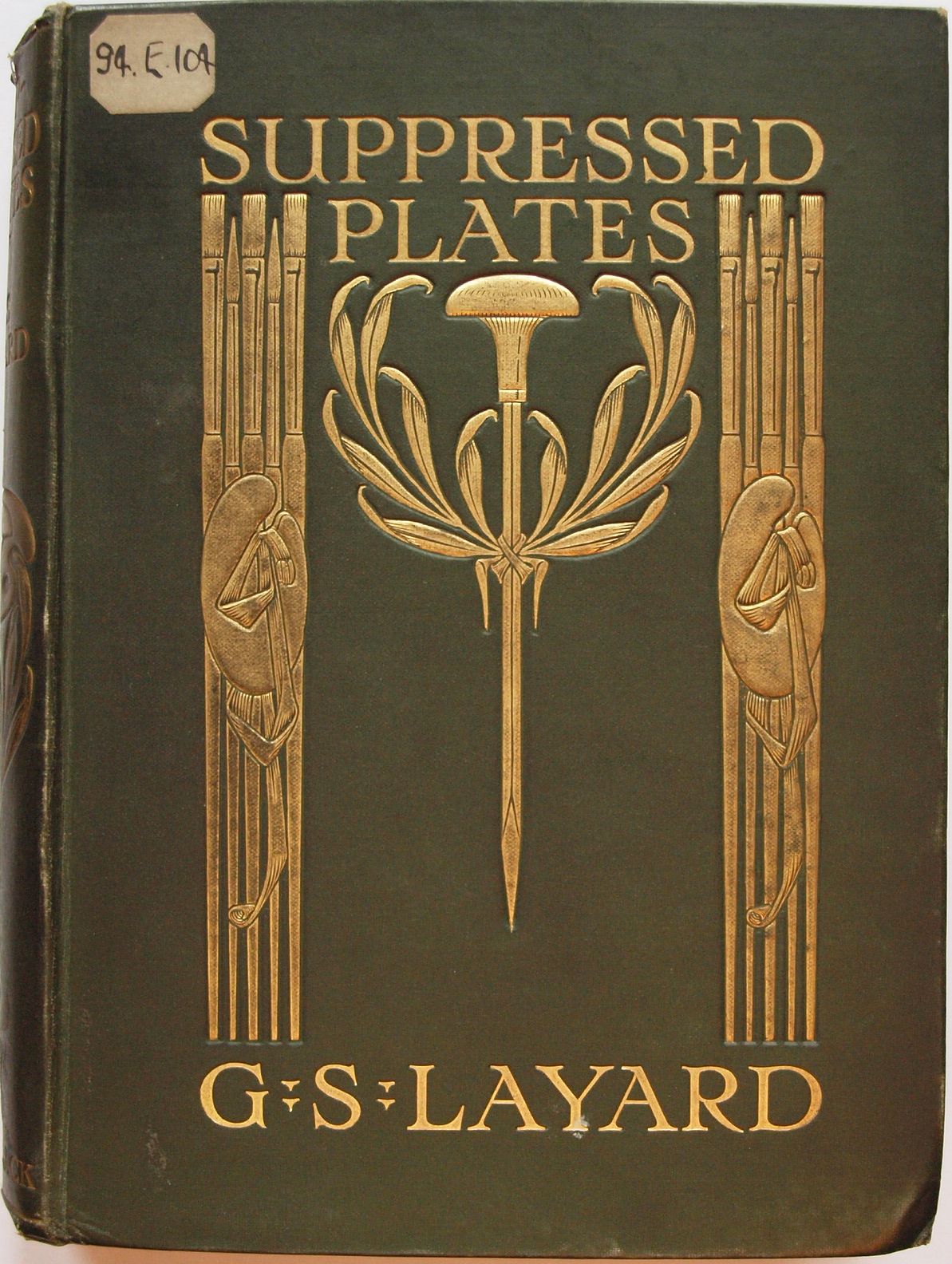
The book with which we started is slightly different. This is one of the publisher A. & C. Black’s “20 shilling series” of “Black’s beautiful books”. These were not classic novels, but illustrated works of non-fiction. Another example in our collection, with the same cover design, is a work on the painter George Morland by Sir Walter Gilbey. As we acquired these books for their content rather than their bindings, the designer was not identified in our catalogue. We would normally only give this level of description for items in our Special Collections, and even then, older catalogue records can be less full than those created more recently. This raises the question: how many other examples of this designer’s work are in our collection?
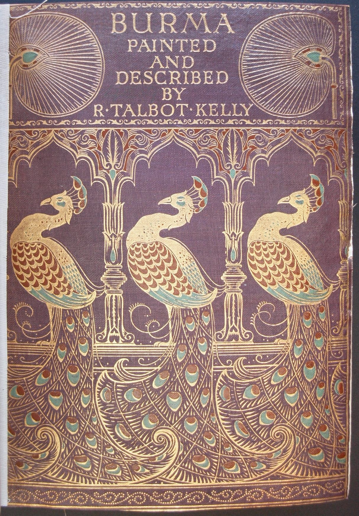
Another that was already identified in our catalogue is this nice art nouveau cover for a book on prints. I had been struck by this design a couple of years ago, which explains why the monogram was familiar to both myself and my colleague. We had the same conversation then! This provided an opportunity to enhance the catalogue record and name the designer.
A copy of this deluxe book on Westminster Abbey was acquired in 1997 as part of a collection of books in decorative cloth bindings from the late 19th and early 20th centuries

We already had a copy of both this and the earlier 1895 edition (in the same binding), but it was only with the later acquisition that we were able to research the binding and identify Turbayne’s monogram.
I mentioned earlier that even the most striking cover designs are not necessarily signed. Take this example from another book in the “20 shilling series”:
We have already seen that Turbayne was involved with this series, and we know that he had already used the peacock motif, yet this design is not signed, whereas most of his are. As yet, the designer is unidentified, but perhaps someone reading this blog can help shed some light on this. Whoever designed the cover, our predecessors in the NAL clearly saw some virtue in it. When the book was rebound in 1968, in sturdy but plain cloth covered boards, the front cover was retained. Other titles that we hold from the same series have been rebound without retaining the original covers. Whether this was because they were deemed to be of little interest or because they were too damaged, we cannot now say.
Here are two more designs by Turbayne that are now identified in our catalogue: an early example from the 1890s, and a later one from 1912
All the bindings illustrated so far have been in cloth, stamped with a design in gold or other colours. The print collections in the V&A include, as well as the printed advertisement shown above, five printed paper dust jackets. These repeat the design found in gold on the cloth covers. They may have been intended to protect the ornate cloth from damage, or perhaps they were issued with the cheaper, plainly bound edition. By their very nature ephemeral, it is not surprising that few of these survive.
When asked about contemporary book cover design, Turbayne showed a particular interest in lettering, believing it to be an often neglected aspect:
“in many cases, an excellent decorative scheme is marred by faulty lettering. The artist who essays book-cover work should bear in mind that a knowledge of the pure styles of lettering is absolutely as important as a mastery of the canons of ornament, and it is just there that many fail”
He published two pattern books that reflect this interest, one of “Alphabets & numerals”, the other “Monograms & ciphers”. These contained a variety of examples that artists and designers could use or adapt in their own work.
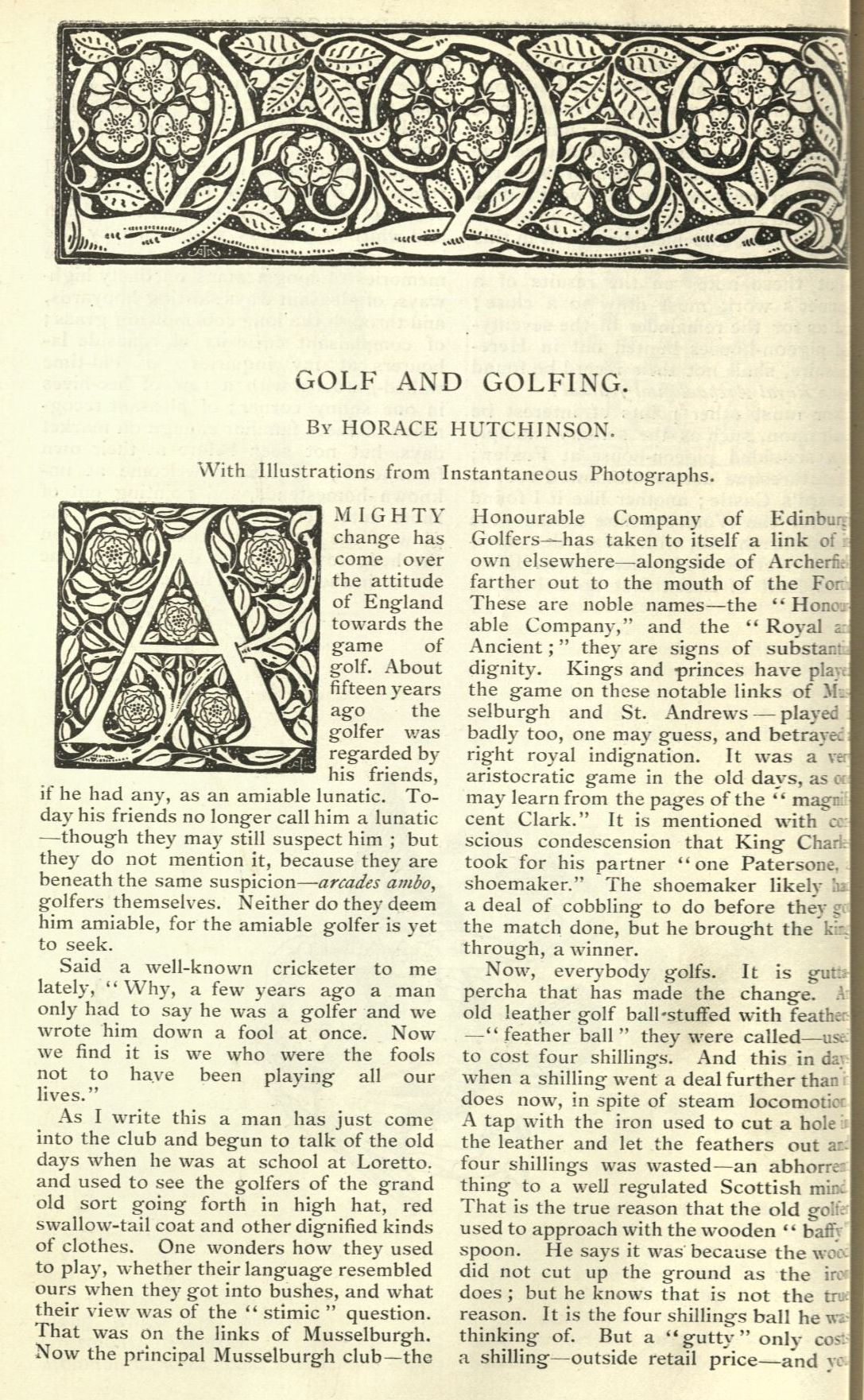
An early example of his work with lettering can be seen in this page from the English illustrated magazine, incorporating both an initial and decorative headpiece that he designed:
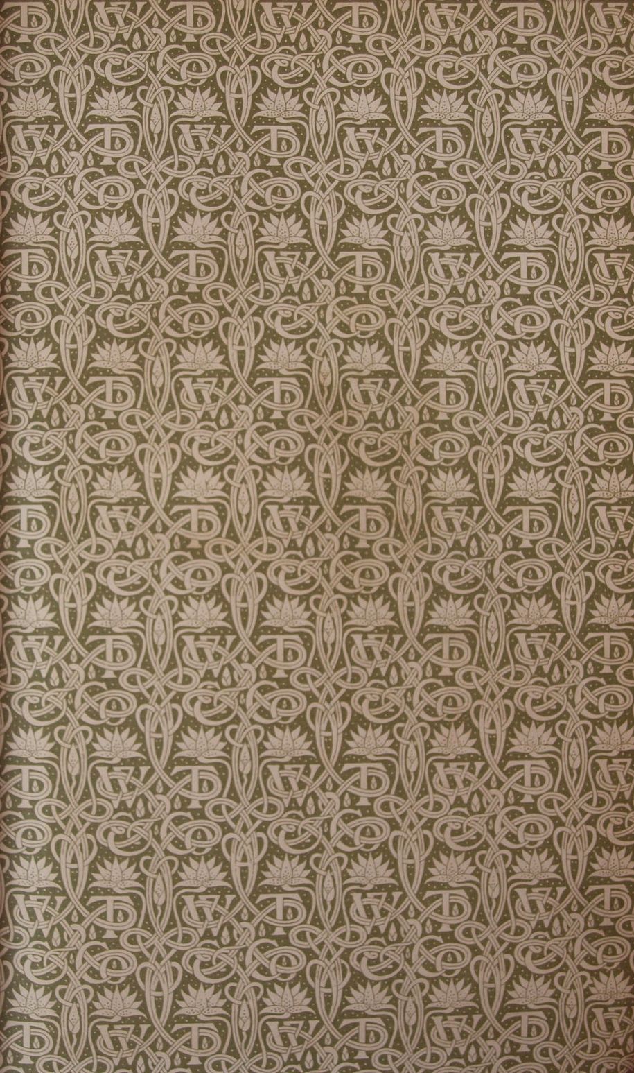
Finally we have an endpaper that Turbayne designed for the publisher W. Thacker and Co. of Bombay and London. It incorporates the publisher’s initials in a repeating pattern. A notice by “I.B.” in the periodical “The artist” of July 1900 praised the “unassuming dignity and quiet beauty” of this design.
Full details of all the books in our collection which have been identified so far as having Turbayne designs can be found in the National Art Library catalogue.
Further information on this interesting designer can be found in Simon Cooke’s entry on The Victorian Web.
It is nearly impossible to see, but Turbayne’s distinctive scarab signature can be found on the lower left of the spine on Burma.
Other scarab beetles, valued by ancient cultures such as the Egyptians for use as amulets which were sometimes wrapped in the bandages of mummies, are jewel-like green and blue colors. The vast majority of brightly-colored beetles tend to be green and do not reflect polarised light. ( American-writersdot]org ) The study of this jewel scarab not only by its striking metallic golden appearance but also by its ability to control a less obvious property of the reflected light: the polarisation.