Andrew McIlwraith is a PhD researcher in the Department of Typography & Graphic Communication at the University of Reading. His research is funded by the AHRC Design Star Centre for Doctoral Training of which the V&A is a partner.
It’s no secret that the V&A is a complicated building. Even regular visitors may struggle to find their way, and wonder why some staircases only go to some floors and not others. Of course, the V&A is a great place to get lost in, but most visitors still want some help finding particular displays – or even just the toilets or the café.
To help visitors plan their visit, the V&A has long produced guides with floorplans that explain the museum’s galleries and spaces, and how the building is laid out – something that most large museums around the world (and many smaller ones) also do.
As a PhD researcher looking into how museum maps can improve the visitor experience, I’ve been trawling the V&A’s archives, looking at the plans and maps that have been guiding visitors for around 140 years. There have been many different designs over the years showing a fascinating range of styles and approaches (sometimes it’s hard to believe they are of the same building). Not all are completely successful, but each is a genuine attempt to help visitors make the most of the museum
Here are some of the highlights from the archives.
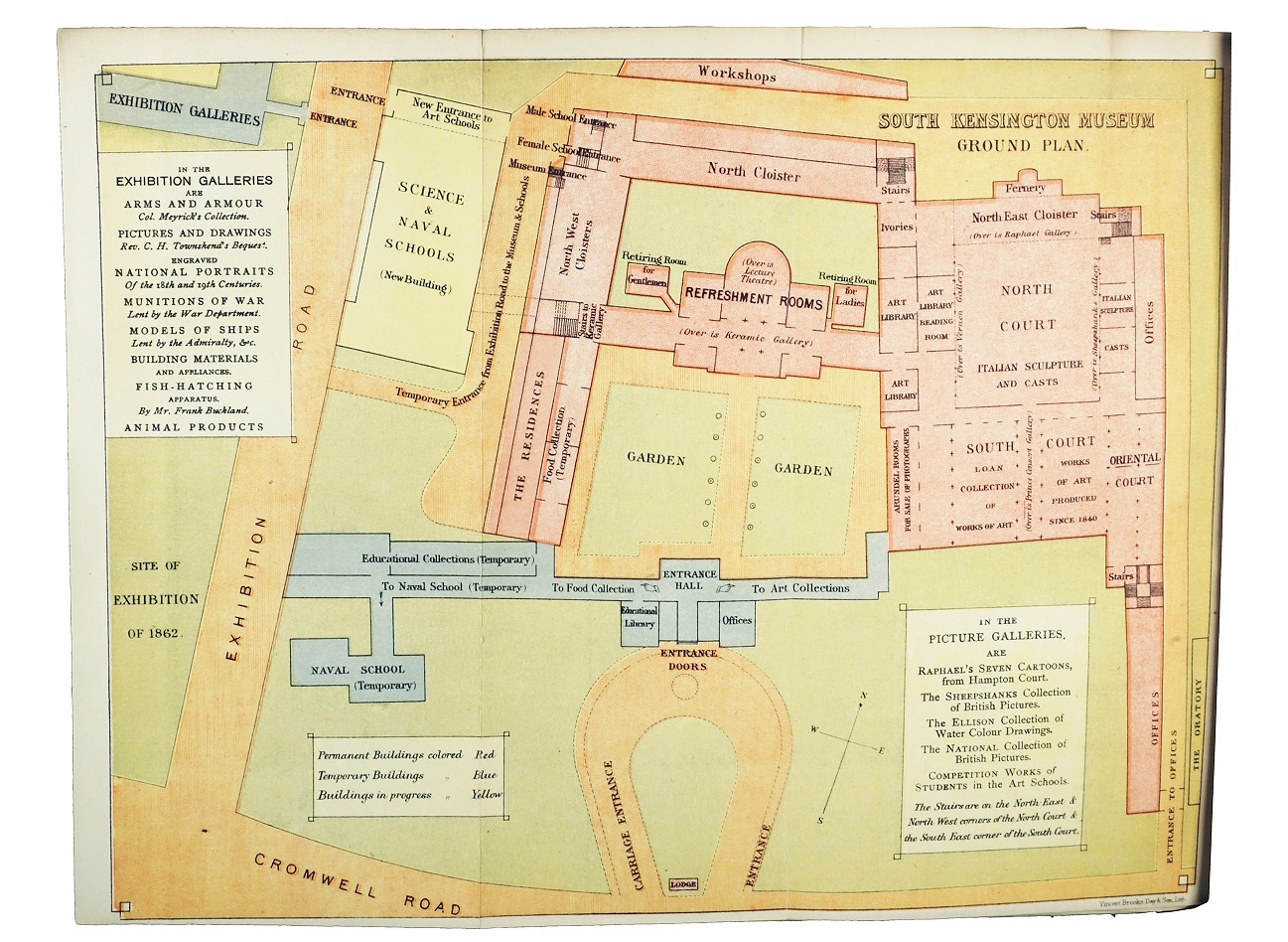
1. This is the earliest plan I found, from an 1871 guidebook of museum (at that time known as the South Kensington Museum). Despite the rather charming colours, there isn’t a great deal of information on this plan, compared with later plans – in those days, they tended to rely on text to explain things. So there are wordy explanations of the galleries and the collection in the 92-page book.
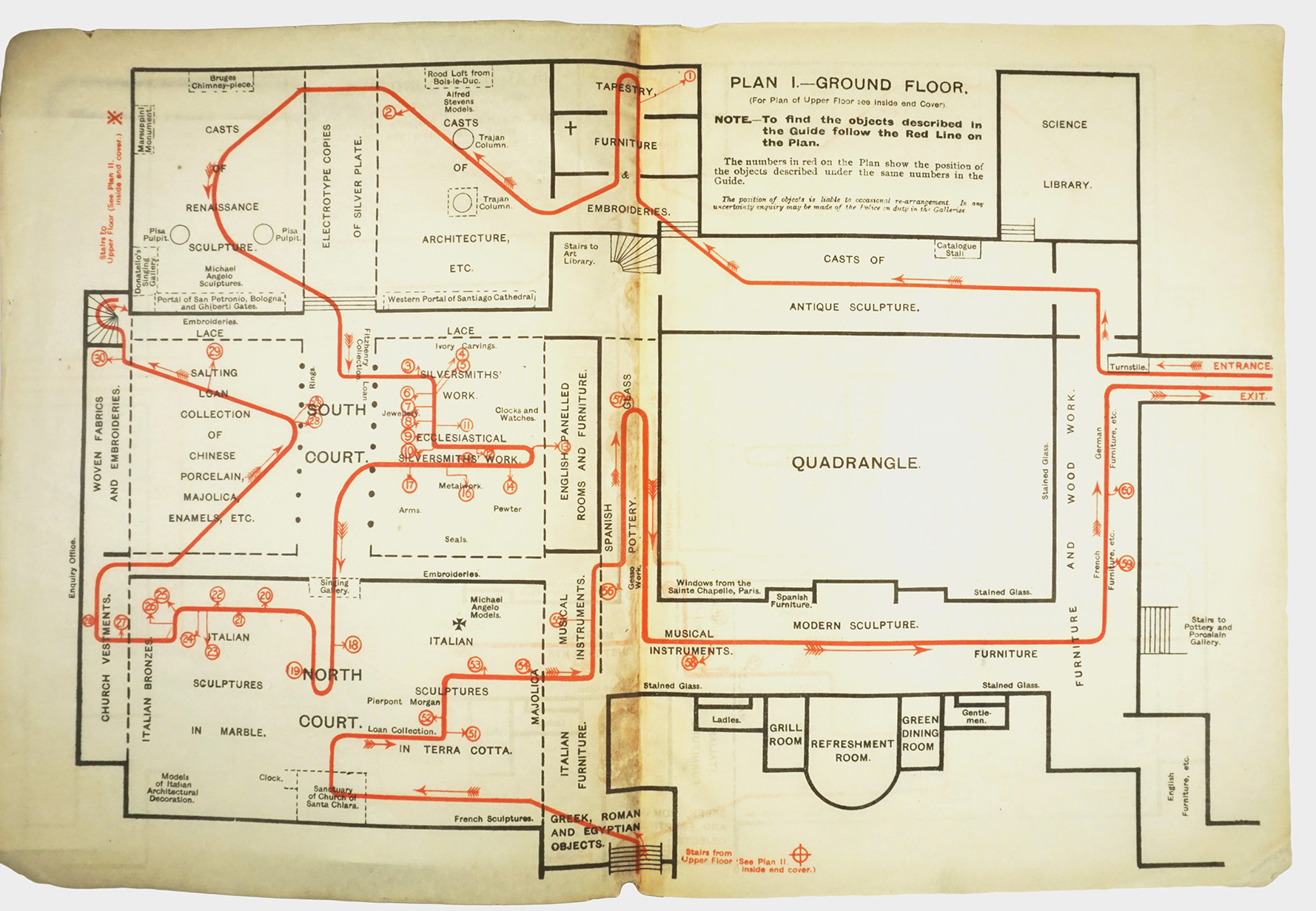
2. This plan, from 1906, is from a book called The Red-Line Guide to the Victoria & Albert Museum, for obvious reasons. Clearly, the main feature of this map is the recommended route through the museum with numbered highlights. This was very innovative for the time, though its ‘one size fits all’ approach is problematic. The person who devised the route appears to have been a fan of ‘ecclesiastical silversmiths’ work’ (11 highlighted works), but less so of ‘modern sculpture’ (no highlighted works).
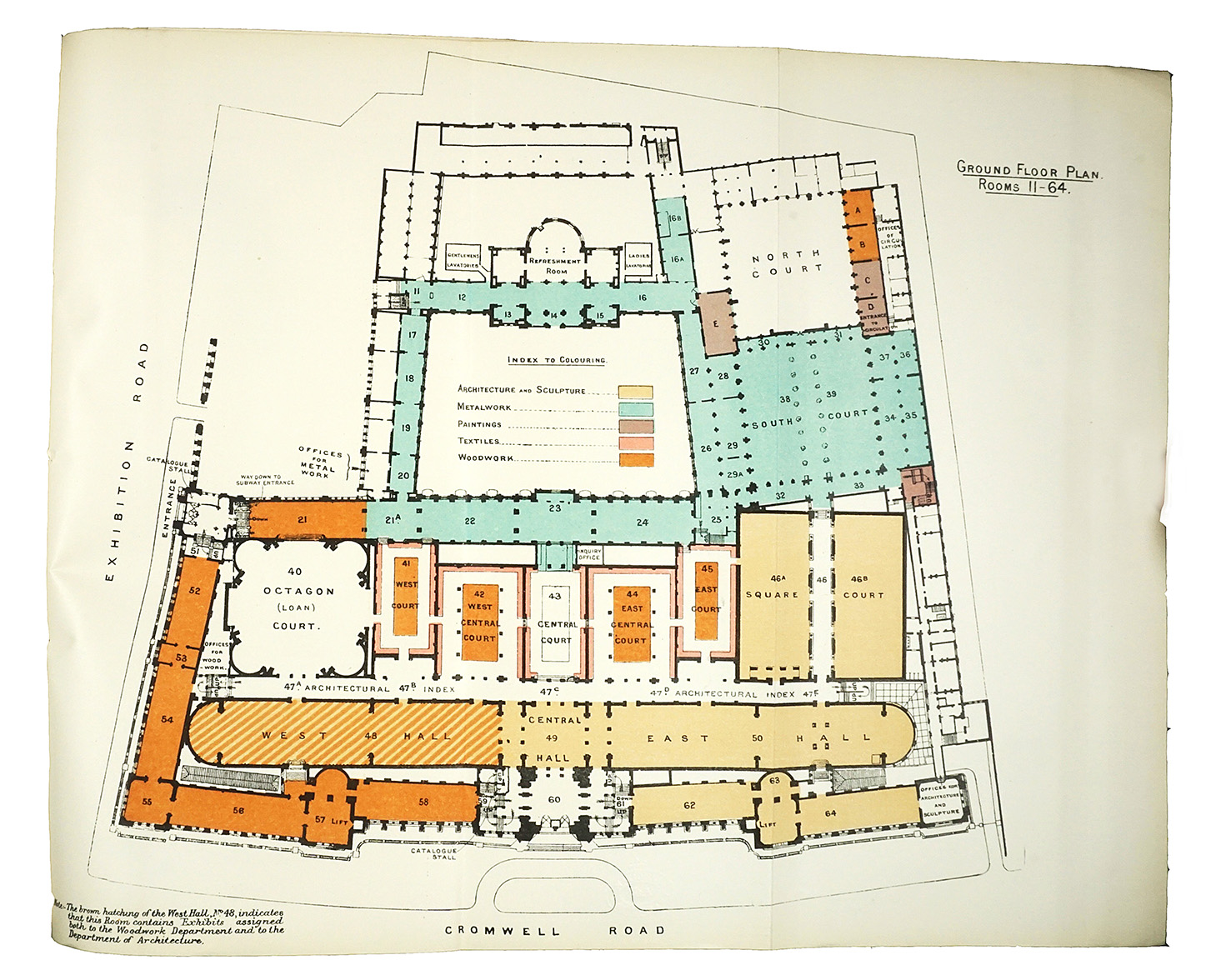
3. Plans became more sophisticated around 1914, with this example from a book, General Guide to the Collection: there are several maps (one for each floor), and they use colour coding to denote different types of object. These plans also uses the room numbering system, still used today, to help navigate the building and locate specific items.
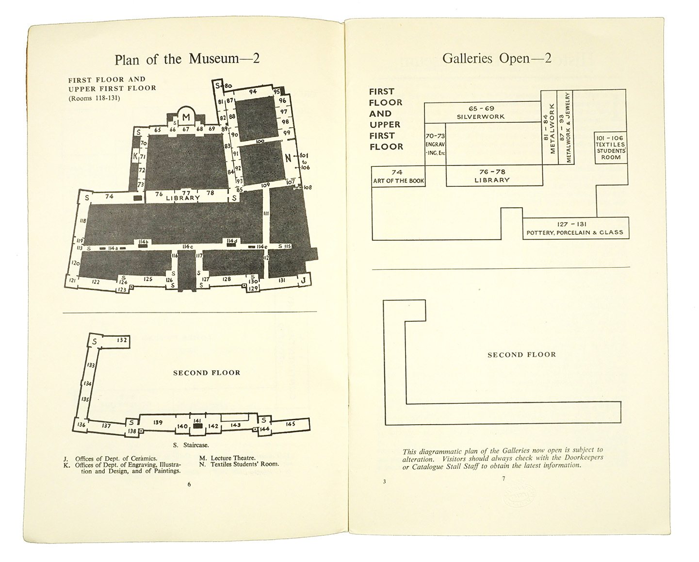
4. These simple, black-and-white maps were used in guides from the 1940s (this one from 1949). They have an unusual arrangement of a plan of the building (on the left-hand-side) and a corresponding schematic plan indicating those galleries and spaces that are open to the public (on the right-hand-side). The need to tell visitors which parts of the building were and weren’t open was likely due to the museum getting back on its feet after the Second World War (most of the collections were moved out of the museum during the war, and the buildings suffered bomb damage).
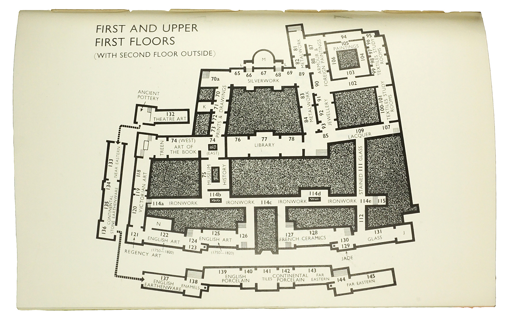
5. This 1963 plan demonstrates one significant challenge that the museum and its graphic designers have constantly faced: how to explain the complicated floor level arrangements. Here the upper floor galleries are depicted as sitting outside the building, and appear not to be directly connected.
6. A few years later, in 1969, the designers have used colour to denote the different floor levels, though the second floor, again not sited directly above the upper first floor, leads to an almost Escher-like staircase (shown in the top left corner of the building in this plan).
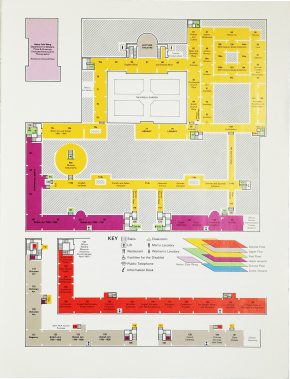
7. In 1986, the designers have made another attempt to help visitors understand how the building fits together. Colour is used to distinguish floor levels, rather than types of object or display (as, for example, in 1914, floorplan 3). There are seven colours, one for each level of the building. There is also a small 3D diagram showing how the floors fit together – but it is very schematic, and visitors may have difficulty relating it to the main (two-dimensional) plans.
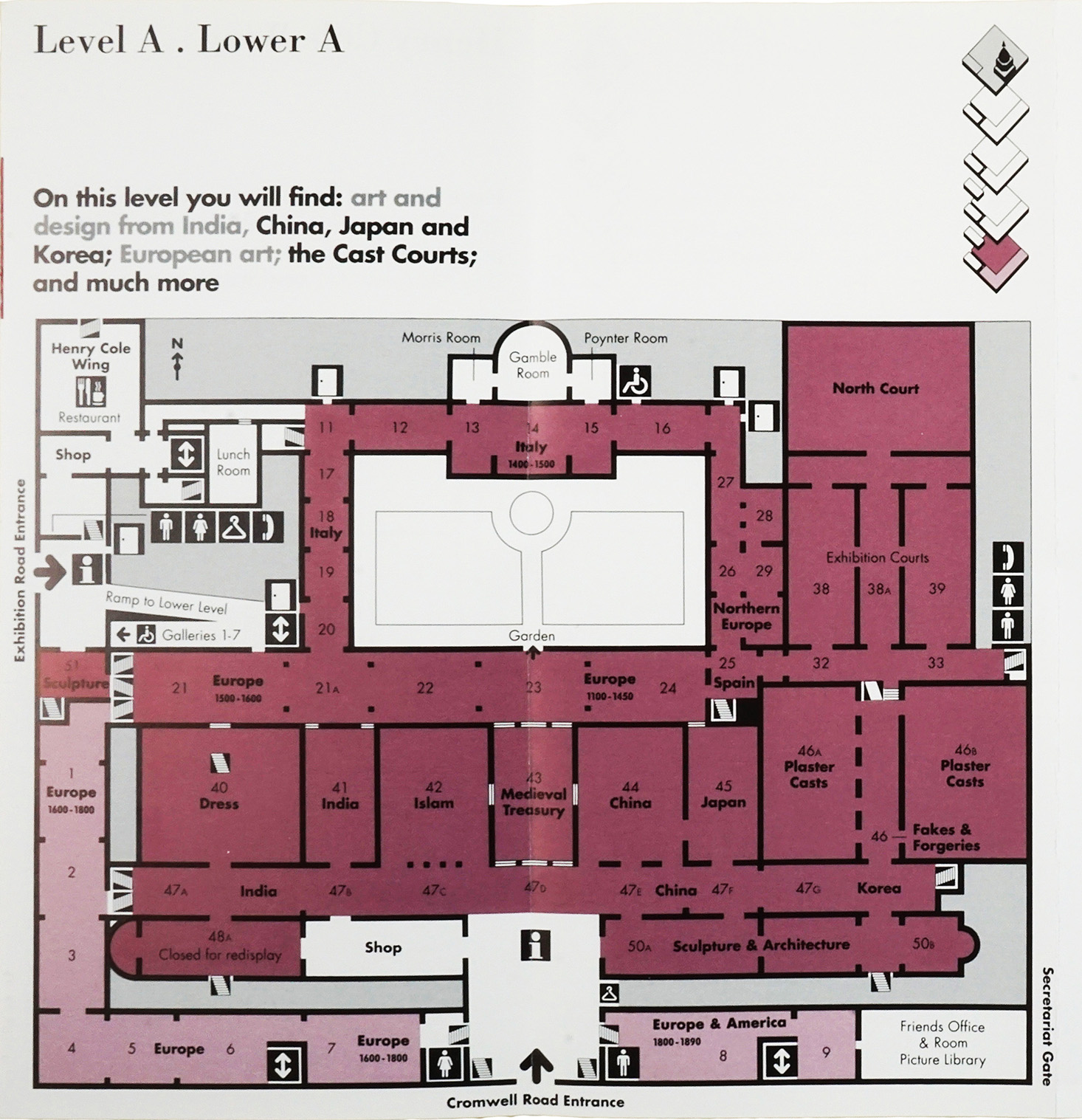
8. This plan was part of a guide to the museum produced by the design group, Pentagram in the 1990s, and uses few colours again to show different floor levels), along with a schematic 3D diagram that shows how the different floors levels work. These plans also mark a new way of describing the floor levels: as A, B, C, D. Earlier iterations tended ‘ground’, ‘first’, ‘second’ and so on, and later ones used a numbering system (1, 2, 3 and so on).
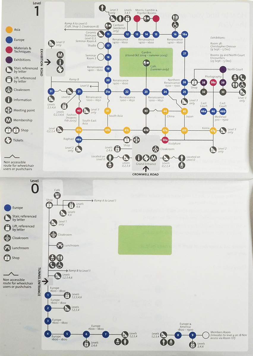
9. As part of a comprehensive review of the museum’s signage and description systems, a radical new map was developed in 2004, by the design consultancy Holmes Wood. Instead of trying to use conventional floorplans that represented the size and shape of the rooms and spaces within the building, Holmes Wood developed a schematic system. This system – described by some as a ‘tube map’ system – aimed to show the spaces as roundels (using the room numbers used throughout the building), and how they were connected. Just four colours denoted types of exhibition in broad terms, and there were pictograms and icons to show functions spaces, such as toilets, cafes, shops staircases and lifts. This brave attempt, however, was used for only two years, after which the map was revised, reintroducing more conventional plan elements.
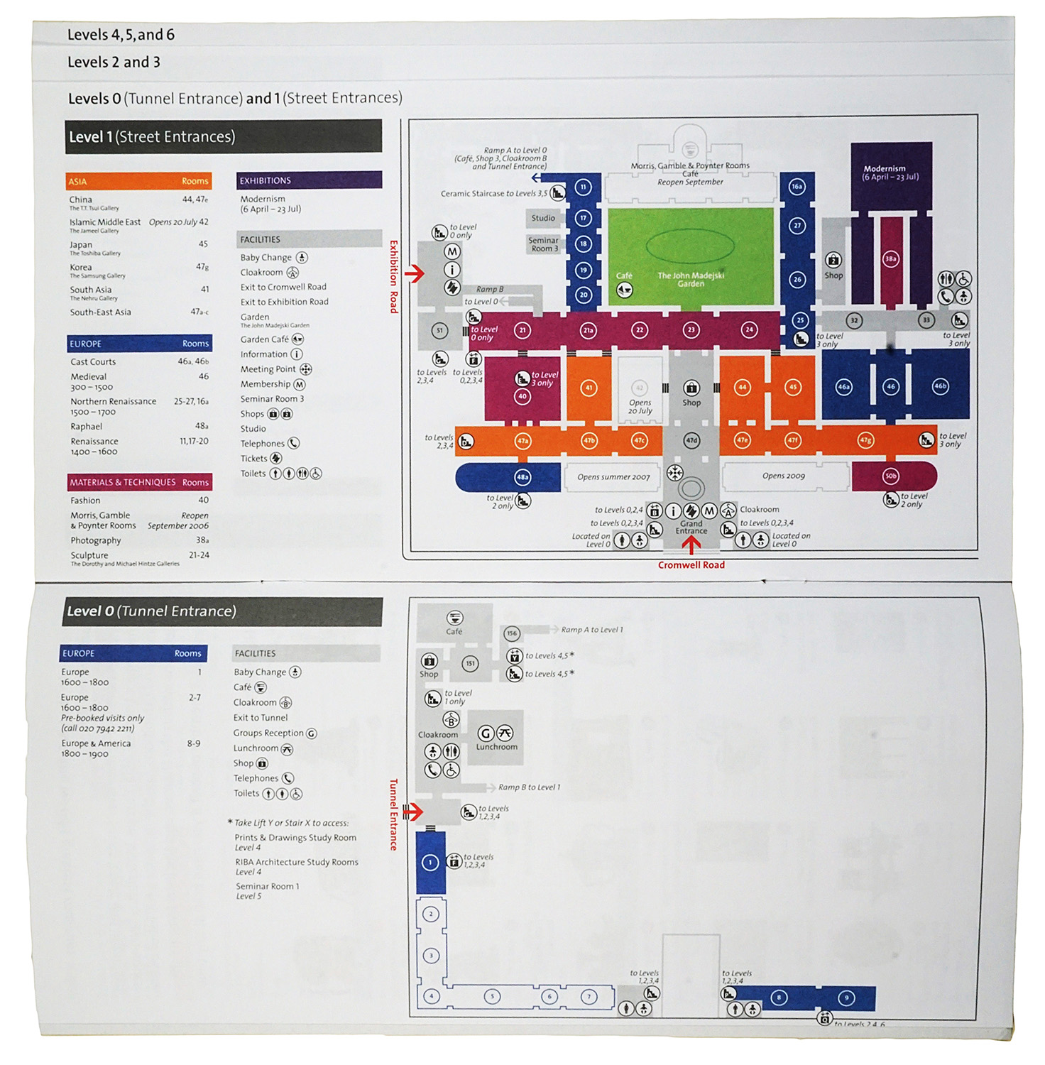
10. This 2006 map replaced the schematic one, and has been in place in much the same form until the present day. Instead of the ‘blobs-and-lines’ depiction of spaces, it uses a simplified floorplan, with rooms and spaces shown (mostly) as rectangles that people presumably could better relate to. These maps are contained in leaflets that include text with further explanation of the collections, special exhibitions and facilities of the museum.
All images courtesy the Victoria & Albert Museum Archive. © Victoria and Albert Museum, London.


A great typographer’s perspective on a tricky thing to get right. Fascinating
It would be interesting to hear what you make of the digital Explorer Map, which adds interaction and links data for objects and events.
http://www.vam.ac.uk/map
It must be so difficult to understand this constantly evolving building! I expect you knew about the development of the North Court in the 1950s and 1960s. It was then inhabited by Circ Dept. Because of the building of the mezzanine floor above it, we had to evacuate EVERYTHING to Room 45 (and some storage for objects to the bridge between the cast courts)and function as best we could there until the new mezzanine galleries were built. Then we had to move back again to Room 45!