I recently paid a visit to the graphic designer Vaughan Oliver, best known for his work over the years for the record label 4AD. As the producer of the Pixies, the Cocteau Twins, Red House Painters, and Modern English, 4AD helped to define the sound of British post-punk music; but Oliver defined the look. Founder Ivo Watts-Russell gave him free rein on developing the graphic identity of the label, and he responded with a body of work that is remarkable for its visual density and consistency, featuring quintessentially postmodern tactics like erratic typography, cut-and-paste visuals, and appropriated imagery.


Oliver now works from a lovely house in Epsom, and when I arrived there wasn’t much of the inspired chaos you might expect from his album covers. But then he started pulling stuff out of boxes – and pretty soon, his kitchen table looked a little like one of his designs, or at least the beginning stages of one.

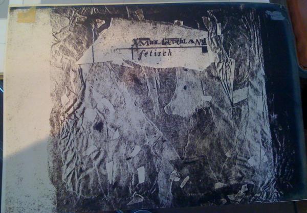
What gives Oliver’s work its distinctive feel is the combination of intuition and precision. He’ll take a seemingly random found image, and combine it with a bit of torn paper and hand-drawn lettering. That part of his approach is quite punk, even consciously referring to the blackmail-style typography and ‘rip it up’ style of Jamie Reid. But as graphics historian Rick Poynor has written in his terrific book Visceral Pleasures, Oliver brought a new perfectionism to the album cover. He would, for example, blow up a single letter – an ‘A’ or ‘D’ – with his camera until it was a foot high, then laboriously re-draw its edges to get them just right, before reducing it again and setting it into the type. If you compare his work (below, his sleeve for Xmal Deutschland’s album Fetisch) with Reid’s earlier designs for the Sex Pistols, you can see how he brought a new level of care, composition and craft to punk aesthetics.


It was fascinating to talk to Oliver about his techniques. He has never really become comfortable with digital design. As he puts it, ‘The technological revolution was my bête noire. In my opinion “they” took my tools away.’ He described to me with some enthusiasm the delicate process of inserting a single comma into a bit of lettering, using a scalpel and a tiny dab of glue. It’s a sort of exactness that you can sense in the below preparatory artwork – for a poster related to the above Xmal Deutschland cover.

Back in the 1980s, Oliver’s key mechanical tool was the PMT (Photo Mechanical Transfer) camera – a vertically mounted large format machine that produced a distinctive type of print, with a lovely tactile surface and seemingly endless visual depth. He was particularly interested in the ‘underexposed’ areas at the edge of the print, which had an atmosphere he liked. Here is the PMT print he used for the Fetisch sleeve shown above – a photo of ripped-up, taped-together Japanese rag paper he composed for the shot.
Perhaps surprisingly, Oliver says that he dislikes the way digital design brings everything under his control. He preferred the division of labor necessitated by analogue processes. Back in the ’80s, instead of producing everything on the computer, you worked with ‘origination houses’ which handled the colour work. This meant that when you got back your own design, there was a great chance for surprise and happy accidents. He also misses working with specialist typographers – a craft that has now almost completely disappeared.
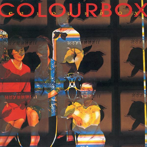
You can get a sense of Oliver’s engagement with old-school printing techniques from his 1985 sleeve for the band Colourbox, above. While it seems to be a piece of custom-made bricolage, the image is actually a Japanese printer’s ‘make-ready’ sheet – that is, a piece run through the press to absorb excess ink in advance of the production run. (For an inventive use of ‘make ready’ textiles in Africa, see this article by my friend and colleague David Doris.) In this case, there is a collision between two images: a fashion shoot and an advertisement for peaches. It was unusual for Oliver to leave his material completely untransformed in this way. Typically, he cut apart and layered his appropriated images into a suggestive palimpsest. But in this case the work seemed to have been done for him by happenstance. It was also appropriate to the band, which was one of the first in Britain to use sampling.
It’s not entirely surprising that Oliver would look back fondly on the good old days of the 1980s – after all, not only his working methods but his principle medium, the record sleeve, have been displaced by new technologies. Yet I found Oliver’s emphasis on the physicality of graphics to be more than just nostalgia. Here’s a guy who has worked with some of the most progressive musicians in the world, but what really gets him going is the careful assembly of images, painstakingly, all by hand. He feels that doing graphics that way resulted in a more sensual result: ‘the choices were fewer, yes. But because they were fewer you went deeper with it.’