
The decorative motif that has come to define much of Art Nouveau is the seemingly innocuous gesture of the whiplash. An ornamental S-curve that writhes and coils, the whiplash is a force of energy that drove the art world into a new Modern era. Derived from studies of the natural world, including deep-sea organisms and botanical gardens, it may seem nothing more than a flowing line, but the whiplash marked a break from the constraints of old-world traditional art forms and heralded the coming of modern design.
Art Nouveau's sinuous flowing line is considered a metaphor for artistic freedom. It can be seen in the architectural ironwork, decorative borders, textile patterns, glass, paintings and jewellery produced in turn-of-the-century Europe, and was even incorporated into American craft.

But what was the whiplash and why was its dynamic, undulating line so popular? This decadent and daring symbol existed in multiple forms, as can be seen in these highlights of the V&A's collection:
The Kiss of Death – The line-block prints of Aubrey Beardsley

At the tender age of 21, Aubrey Beardsley rocketed to fame when he produced drawings for Oscar Wilde's play Salome, published in 1893. His risqué subject and graceful drawings marked the beginning of a new era in the arts: these are commonly held to be the first works in a British Art Nouveau style.
In the play, Salome falls in love with Iokanaan (John the Baptist), but her wish to kiss him is only fulfilled when she receives his severed head on a platter. Beardsley drew the characters with Medusa-like tendrils, surrounded by abstract organic forms and creeping whiplash lines. It was an erotic, scandalous scene that cemented Beardsley's career, but also thrust the sensuous whiplash into the limelight.
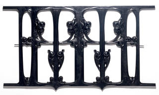
Tendrils of Iron – The architecture of Horta and Guimard
Two architect-designers, Victor Horta in Belgium and Hector Guimard in France, brought the whiplash into the physical realm with their unique use of exposed iron. Iron was a relatively new construction material in the second half of the 19th century. Gustav Eiffel had pioneered the use of exposed metal in building frameworks, but it was Horta and Guimard who radically broke ranks with tradition and expanded the possibilities of the material by moulding interior and exterior pillars, beams, banisters and grilles into curving, organic forms.
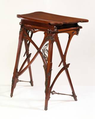
Horta received traditional academic training and began his career designing houses for bourgeois Belgian intellectuals. He soon expanded his remit to create a style without historical precedent and one that was aimed at the middle classes. He was interested in a fully integrated environment, and designed everything from the building's framework to its door handles. Stairs, light fittings, cast-iron beams and mosaic floor tiles were all treated to a flourish of vine-like tangles and exotic details.
Guimard is best known for his metalwork, especially the entrance arches that he designed for the Paris Métro. He studied at the Ecole des Beaux-Arts in Paris and was influenced by Gothic Revival and Japanese design. The manner in which he forged iron into restless, linear whiplash designs defined him as the greatest architectural practitioner of French Art Nouveau.
Both architects devoted themselves to the extreme styling of their sinuous asymmetrical whiplash curve, even when critics denounced the exaggerated ornament as excessive. Art Nouveau's most famous line may have been short-lived, but it would not be forgotten.
Long Flowing Hair – The posters of Alphonse Mucha
The posters of Alphonse Mucha show how the spread of Art Nouveau became a public phenomenon. Mucha was a Czech painter and illustrator who moved to Paris to continue his studies. In 1895 his lithograph poster advertising the great French actress Sarah Bernhardt in her role of Gismonda, was an overnight sensation. Collectors immediately prized the poster for its exotic, romantic vision of Bernhardt, its subtle pastels, graphic opulence and the novelty of its narrow format. Many were stripped from their advertising hoardings and reinstated adorning the walls of private homes. Bernhardt herself was so pleased with the image that she contracted Mucha to design more posters, sets and costumes for most of her productions as she toured the United States.

Portraits of lean, languid, glamorous women represented the peak of Art Nouveau graphic style. Women's bodies were transformed from stark, Victorian mistresses to elongated, sensually curved forms. Although Mucha resisted being labelled an Art Nouveau artist, his characteristic females became an ever-present and much-copied leitmotif.
The appeal of the whiplash in Art Nouveau reached saturation point very quickly. As the First World War encroached, opulence and ornament were shunned in favour of sleeker, mass-produced forms. But its avant-garde originality would still influence designers and artists for decades to come.


