Donatello: Sculpting the Renaissance is about to open. The reviews are coming out (they’re very good), the posters are up, and the catalogue is ready in the shops. Slightly unusually for a V&A book, the cover is a work from the collection – and here I have to express an interest, because it’s probably my favourite thing in the museum.
The process of choosing a cover for a book is often complicated. There are first choices, second choices, vested interests and complications. In the case of Donatello’s Ascension, that’s compounded by the fact that it is spectacularly hard to reproduce – what might look like a sheet of grey-white marble is pretty hard to get ‘right’ when using the four classic printing colours – cyan, magenta, yellow and black. Our production manager, Emma Woodiwiss, spent at least part of her Christmas holiday worrying that the version we were going to put into the shops might have a slight green tinge. Or red.
If you scroll through the different images we have of the Ascension on Explore the Collections, it becomes clear quite quickly that our perception of Donatello’s relief changes quite radically according to the light that is captured by the camera. Marble that in one photograph can be quite cold and stark, becomes almost cream in another. The current frame complicates things as well, casting a shadow across the top of the panel. Even when we know which object we’d like to use on the cover of a book, it’s a different thing to know which photograph of it is the best one to use. I’ve written about that here.
However, one of the things we get to do with our digital interpretation is let you see how much the Ascension changes under different light. Notably, this isn’t just a factor of the nature of the light (sunlight, candlelight, gallery spotlights…) – but also the direction from which the available light falls on to the panel. Using a technology called Reflectance Transformation Imaging (RTI), and collaborating with Federico Ponchio at Visual Computing Lab, CNR, we can put you in charge – in a way that wouldn’t be available to a visitor in front of the work itself.
Simplifying hugely, the RTI viewer allows you to see the Ascension as if it were lit from different directions. To make the effect, our Photography team took multiple images of it – keeping the camera in exactly the same place while moving the light around the panel (I hope that they will write in more detail about what they’ve done, and how, soon). This process sometimes uses a dome with integrated lighting, but the size of the marble panel made that difficult. We also had to ask very nicely if it might be taken out of its frame.
We can therefore now show that a work can appear very differently depending on the light – and let you explore how the changes can make the difference between night and day.
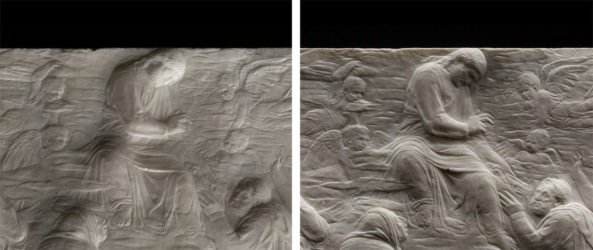
If you do take the time to explore, however, it’s worth remembering that what you’re seeing is a model – a composite of 72 high-resolution photographs that are combined and layered according the position of your mouse pointer or finger. Our digital reproduction, like our printed book cover, can’t ever be quite ‘right’. It’s worth seeing the panel in the exhibition.
Thank you
The work to create the RTI model required important contributions – and a lot of good will – from a number of V&A teams, and expertise from outside it. I’m grateful to Sarah Duncan and Kira Zumkley, Richard Ashbridge and Victor Borges, and the V&A teams in Conservation, Technical Services and Collections, and to Luca Carini, Holly Hyams and Richard Palmer in Digital Media and Publishing. A specific ‘thank you’ to Emma Woodiwiss in Publishing is also due – for humouring me about the colour on the book cover.

A excellent blog it gave us light into the new exhibition and how important the right light is for the relief. Thank you for writing the blog .
A fantastic blog, it illuminated the new exhibition and the significance of the proper lighting for the relief. I appreciate you creating the blog.