Earlier this year, with only two months until the new V&A Exhibition Road Quarter opened it’s doors to the public, I was given the rather urgent task of designing a digital interface, to allow visitors to buy tickets from self-service kiosks.
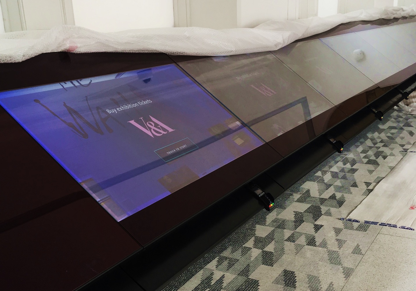
The starting point for the digital design aspect of this project was certainly unusual. The concept had been conceived some time ago, by A_LA, the architects of the new Exhibition Road Quarter. As part of that ambitious vision, 8 large 56″ display screens would be joined side by side, to form a continuous horizontal display. These would play a dual role: marketing events on a single screen, but also forming 8 individual kiosks. These are each equipped with chip and pin readers for payments and printers for tickets.
In this post I’ll focus on the first part of the design process for the ticketing screens and what we learnt.
Digital in the physical space
Unlike a typical web project – for which we’d consider the design and build of the interface – this project required us take into account the architectural space, the giant device size, the design of the housing that supports the screens, as well as the touchscreen capability.
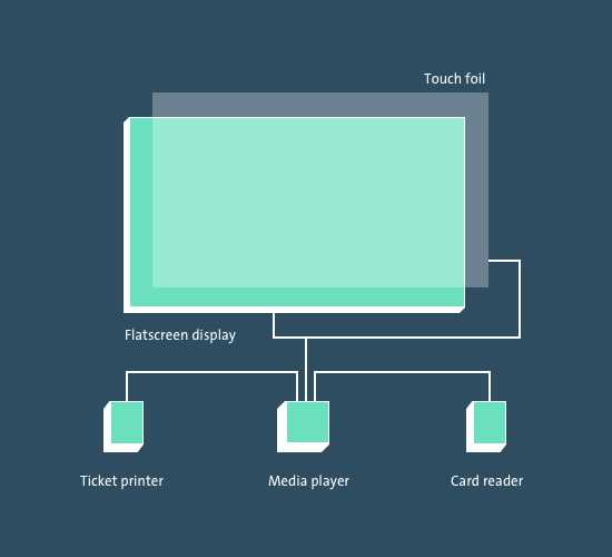
The screens are supported by a wall-mounted housing, meaning the screens float at around a 45 degree angle, with a protective glass laid on top. The underside of the glass is fitted with a touch sensitive ‘foil’ which communicates with a small, simple computer. The interface is driven by a chrome web browser with certain features disabled. Drawers below the screen housing hold the computer, ticket printer and card reader.
Starting point
Surprisingly, there seemed to be very little written on the subject of design for touchscreen interfaces beyond that of personal tablets. And to my knowledge, no other cultural institution had implemented self service ticketing. Kara Pernices’ article was by far the most authoritative I’ve found and provided a good level of insight to start out with.
Beyond that baseline of research, the most pressing need seemed simply to be able to start working with one of the screens for real. Having access to a functioning screen with a working touch foil was crucial for the development of this product, and proved absolutely invaluable for designing, prototyping and testing.
What’s On listings for the web
Having just redesigned and built the ticket purchase flow for our website, we had a good understanding of the mechanics of the process, and the behaviour of the underlying system that supports it, see Eva’s blogpost.
There were without doubt some key differences though:
1. the physicality of using a highly unusual devise in a public space to buy a ticket
and
2. already being in the Museum would presumably mean visitors would want tickets for a more immediate time slot than if they were planning a visit from home or elsewhere.
Statistics from ticket sales on the front desk supported this assumption – 98% of sales were for tickets for today vs. future dates.
Not only that but the stats also told us that those tickets were being purchased almost entirely for exhibitions, rather than other events (talks, courses etc.). Therefore the right approach seemed to be to serve this need and keep it simple – at least for a minimum viable product (MVP).
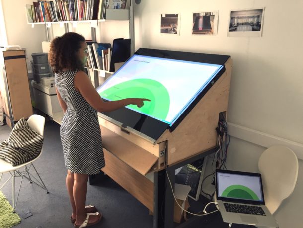
The hardware and physical prototype
Like designing for any other medium, being familiar with the format is critical. The arrival of the prototype in our office was hard to ignore for the overwhelming size of the screen and its housing. Despite the increasing prevalence of touchscreen interfaces in public spaces (train stations, cinemas, fast food restaurants etc.) this screen felt unique for its giant format. One thing became immediately apparent – despite a ‘touch-foil’ being applied to the entire screen, a large proportion of that area would be out of reach unless you were especially tall. Therefore the emerging challenge seemed to be how to benefit from the large screen format, whilst still serving the needs of the widest possible audience.
Understanding accessibility
The usual standards we apply to design for the web took on a whole new meaning when designing for screens used in a physical space. Not only did the screen design need to meet colour accessibility and text legibility standards, ergonomic concerns became central to the experience. Where we might ordinarily think and talk about ‘users’, instead we needed to consider the physical traits of ‘visitors’ such as height, arm length, right or left handers, wheelchair users or visitors with restricted upper body mobility, in order to create an optimal experience for all.
We were lucky enough to have the help of a young wheelchair user, who became an ad hoc consultant, giving us valuable insights into the potential frustrations of using these types of interfaces when in a wheelchair. He also helped validate assumptions on what area of the screen would be reachable and therefore usable.
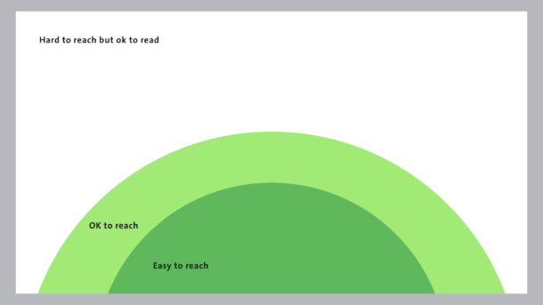
Validating a useable area
By testing the screen with people of varying heights, I was able to fairly accurately define what areas of the screen were in reach (for most people) and what areas were more of a stretch. Not surprisingly an arch at the bottom centre of the screen was where users could interact most effortlessly, while the extreme top corners were entirely out of reach for all but the tallest of individuals. An outer arch was comfortable for the majority, and a bit of a stretch for the rest, so wasn’t quite redundant, but probably shouldn’t be where you would need to interact a lot.
This exercise rather naturally helped define and structure the screen into:
A. areas that could be used for primary and secondary interactions,
and
B. areas that shouldn’t be used for interactions, but could still be used for context and instructions.
Although this was far from exhaustive research, it did give us enough confidence to proceed to what we believe is an inclusive and usable product. We knew there would always be visitor experience staff on hand to assist less able visitors.
Key learnings
In part two of this blogpost I will explain more about our design process, but below are my thoughts for designing for a very large screen, in a public space.
Understand the device
You can only really design well for a device by understanding its format and testing on it for real. This became all the more evident with a set-up where the physicality and ergonomics became fundamental to the design of the interface.
Understand your visitors’ or users’ behaviours
The scope of this project could have gone wildly out of control if it wasn’t for a couple of key figures which really focussed the needs of what these screens should do. Stats that reflected what our visitors were already doing when they visited the museum were hard to argue with.
Empathise with your visitors’ needs
It might sound obvious but throughout the design process, having a human in mind rather than a data-set created a very real reason to make an accessible product. Which again, becomes even more paramount when the product is situated in a public environment.

Hi Chris
Congratulations!
How refreshing to see how much thought went into considering how these touchscreens were going to be used by the general public and the focus on making the touch experience intuitive. I have watch visitors using these screens and your work has really paid off.
Visualplanet have been manufacturing and supplying our touchfoil™ since 2003, one of our biggest challenges has been evangelising the concept that designing content for a large format touchscreen requires a totally different approach to that of a smart phone or a touch tablet.
brilliant….
Regards Mike
Hi Mike,
I’m glad you appreciate the hard work!
Cheers, Chris