This post is part of a strand of research on the PiCoBoo project, hosted by Newcastle University, in partnership with Seven Stories, the National Centre for Children’s Books, with a secondment at the V&A Research Institute (VARI). This multidisciplinary project explores the ways in which colour started to appear in picturebooks for children in the nineteenth century, and assesses the significance of this editorial genre as a catalyst for major cultural and social changes.
As a Marie Skłodowska-Curie fellow, I have been able to survey large parts of the National Art Library’s children’s literature collections, researching colour-printed picturebooks of the nineteenth century. Insofar as the pandemic has allowed, one of the rewards of my work has been inclusion of many descriptions of books held by the V&A in the PiCoBoo project’s open-access database. These descriptions have been augmented with data derived from book-in-hand analysis that incorporates art historical, technological and bibliographical studies.
From a thousand possible subjects prompted by sustained study of the National Art Library, in this series of posts I will focus on the search for colour in picturebooks through a selection of some marginal ways in which it began to dominate the genre. The analysis will shed new light on how black-and-white books became obsolete for their audience and on what measures publishers took to ensure their older stock remained in demand.
The history of printing could be retold as an eternal search for colour, with the first sheets of the Gutenberg Bible being printed in black, with red ink for rubrication. The invention of lithography in Germany in 1796 opened new possibilities, with chromo-lithography being patented in France in 1837. Meanwhile, in Britain other techniques were developed to print colour, either combining intaglio and relief printing, or using woodblocks in register: techniques that were quickly perfected to produce sophisticated and iconic illustrations.
Children’s books – particularly when inexpensive – traditionally belong to a fairly humble corner of the publishing market, addressed to an audience that was easily pleased and anything but picky. This has traditionally made them the perfect testing ground for technical experimentation and field trials.
Browsing through the illustrated pages of children’s books therefore, one can often find snapshots of now-lost practices. Most frequently, these provisional conquests were superseded by more efficient technical achievements, but all the same they bear witness to a restless artisanal search for colour.
The very first step towards cheap colour was the use of a coloured paper (substrate) as a background for monochrome prints, so as to enhance the covers’ appearance on the shelves in the same way as railway novels or ‘yellow-backs’ did in railway bookstalls, designed expressly to catch the eye of the hurrying passenger. When cheap colour-printing became more extensively available, only covers were printed in colour, in just two tints, while inside illustrations remained monochrome.
Paper colour was sometimes changed when a title was reprinted, a shrewd expedient to distribute the same books anew under renovated faces.
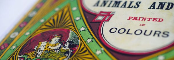
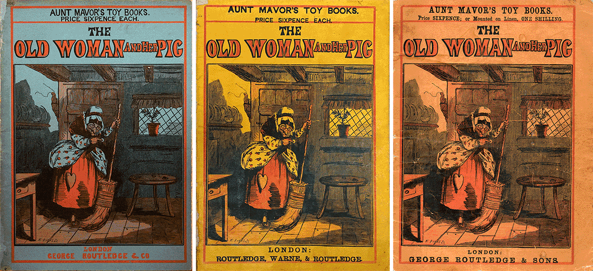
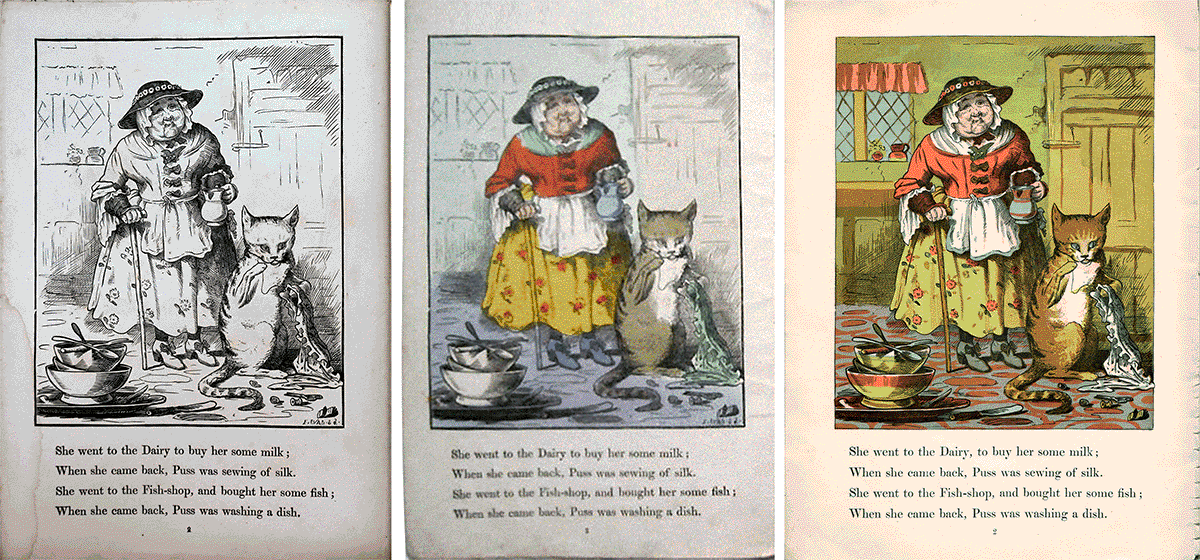
Below are two versions of the same book, The old woman and her pig, no. 40 of Routledge’s Aunt Mavor’s Toy Books series, the first in this series to have the cover printed in colour.
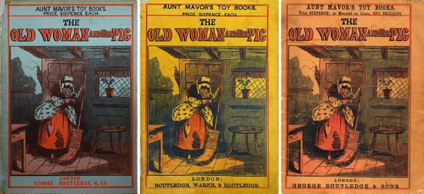
Right: Upper wrapper of The old woman and her pig, 1871 © Private collection
The version on the left has dark blue wrappers, the one on the right has yellow wrappers. Neither of them is dated, but the first has to be allocated to 1858, the second to 1864.
As a way of entertainment in these pandemic times, I here add some ‘puzzles’, as in children’s annuals: try to spot the differences between the covers – there are three main ones, apart from the paper colour – and find the answer at the end of the post.
The composite woodblock used on the cover (six blocks joined with nuts and bolts) repeats the illustration on page 1, with the engraver’s signature visible at foot of the image. The second one, however, shows much broader joins between the blocks, evidence of a sustained wear and tear, even more visible in an even later reprint, from 1871, on orange paper.
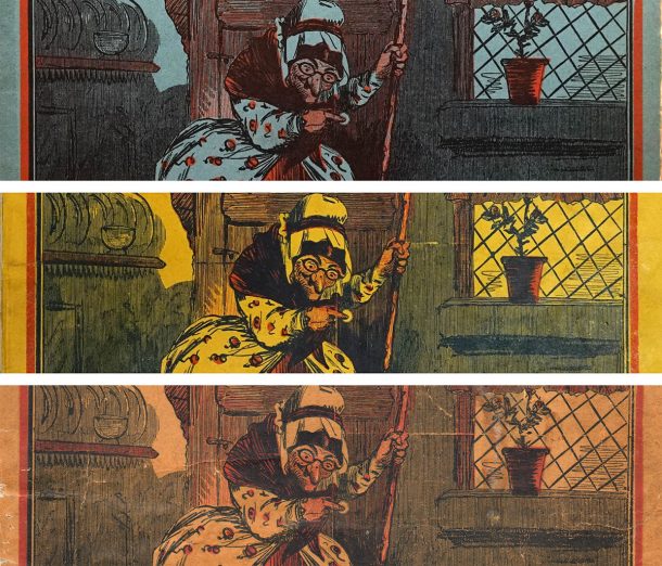
Bottom: Detail from the upper wrapper of The old woman and her pig, 1871 © Private collection
The book has a documented print run of 26,000 copies between 1858 and 1877. The cracks then come as no surprise, after seven years and at least 14,000 copies. For the whole duration of its editorial history, from 1858 until 1877, the inside illustrations were hand-coloured, even when it became affordable to print the inside illustrations in colour.
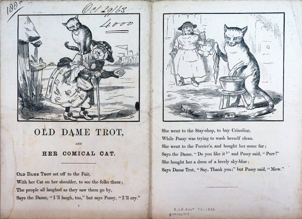
Other titles, at first issued in black, were later on given a more colourful appearance. This was the case of Old Dame Trot and her cat, published in 1863 (no. 49 of the same Routledge Aunt Mavor’s Toy Books series). This book was first issued in 1863 with the upper wrapper printed in red and black on yellow paper, and the inside illustrations printed in black only and hand-coloured.
The Renier Collection at the National Art Library holds the proofs of its first impression, bearing evidence of their provenance from the publishers’ archives, inscribed as they are with notes reporting date and print run: ‘Oct. 29/63, 4000’. This also allows a rare chance to see an uncoloured copy of a book that was available only in its hand-coloured version.
The publishers’ ledger at University College London (on loan to the National Archives) confirms this data and adds detail – including that drawing and engraving cost £40, that copyright was paid for this adaptation of a traditional story (£2 2s., albeit not disclosing the author’s name), that stereotypes were taken from the original woodblocks (£1 16s.), and that the colouring was included in the binding costs (£19 for 4,000 copies of the first edition in 1863, £9 15s. for 2,000 copies of the second printing in 1864).
The book was reprinted identical and hand-coloured in 1864, but in 1865 it was given a completely new face. Indeed, from September 1865 on, the cost of colouring is no longer listed, evidence that this expense no longer had to be borne. At this date, five new matrices (red, yellow, pink, blue, brown, in addition to the black) were produced for printing the inside illustrations in colour.
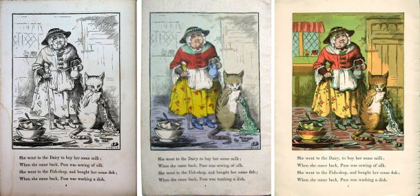
Plate 2 of Old Dame Trot and her comical cat, 1863 © Private collection / Right:
Plate 2 of Old Dame Trot and her comical cat, 1866 © Private collection
Again, new differences can be spotted between the versions – there are two main ones, apart from the colour-blocks. And again, the answer is at the end of the post.
It is not clear which printer undertook this operation. The first colour edition of the book credited the engraver and printer Edmund Evans on the lower wrapper. However, the engraving and printing style of the coloured version is not consistent with Evans’s production, as it shows the use of oil colours (betrayed by greasy stains on verso) and appears to have been realised in a different style and technique.
In 1866 the book underwent its second, identical printing. Yet, this time the Leighton Brothers are credited for the print on the lower wrapper.
Actually, the style and technique of both printings looks much closer to Leighton’s than to Evans’s so that the caption may well not have been updated in the first reprinting, but only in the second. It is no coincidence that Evans’s signature was gouged off from the stereotyped blocks – had a careful reader noticed it? – and is absent from all copies, whether credited to Evans in 1865 or credited to the Leighton Brothers as of 1866.
When Routledge launched their new series, Routledge’s New Sixpenny Toy Books, designed to take over from old Aunt Mavor, several titles from Aunt Mavor and elsewhere were selected for a second life in the brand-new, flagship collection. The goal was to have a series where the public could find colour everywhere, from upper to lower wrapper, a shiny selection of books designed for future generations.
Old Dame Trot and her comical cat was chosen and given new colours. On the contrary, The old woman and her pig, six years its senior, did not benefit from the same refurbishing campaign. For some unknown reason, Routledge did not expect their audience to like it or, more possibly, they wanted to detach theirs from other publishers’ stocks (a toy book with the same title had just been published by Routledge’s main competitor and former partner Frederick Warne, in October 1865).
To refuse The old woman and her pig a new colourful make-up meant rejecting it from the catalogue and leaving it aside and overshadowed, in the large pile of books still available, reprinted, sold, and yet not accorded a role for the future.
For more information about my research, please see the project website
Key to puzzles
Puzzle 1 – Three main differences, between the 1858, the 1864, and the 1871 versions of The old woman and her pig.
- Different series’ caption and price (1858 has it engraved on the block, reading: ‘AUNT MAVOR’S TOY BOOKS. | PRICE SIXPENCE EACH.’; 1864 has the same contents, type-set; 1871 has different contents, type-set, reading: ‘AUNT MAVOR’S TOY BOOKS. | Price SIXPENCE; or Mounted on Linen, ONE SHILLING.’)
- Different publishers’ imprint (1858 has it engraved on the block, printed in red, reading: ‘LONDON | GEORGE ROUTLEDGE & CO’; 1864 has it type-set, printed in black, reading: ‘LONDON: | GEORGE ROUTLEDGE & SONS.’)
- Illustration’s frame, particularly at foot (1858 has a thick frame; 1864 and 1871 have a narrower frame at foot, as if it has been trimmed and gouged off to accommodate type)
Puzzle 2 – Two main differences, between the 1863 and the 1866 versions of the Old Dame Trot and her comical cat.
- Evans’s signature (1863 reads ‘E. EVANS S.’ in the bottom right corner; 1866 has the signature gouged off the stereotyped block)
- Illustration frame (1863 has a thick frame; 1866 has a narrow frame, with details formerly overlapping the frame now protruding from it as in the cloth Puss is sewing)


It is always very interesting to follow how content and technology influence each other and the end results within the publishing industry.
Thank you for sharing.
It actually made me think about how games, old and new, are perfect for a little free relax time when you just want to unwind. These kinds of activities, whether in books or online, give your brain a gentle workout while keeping it fun and light. If you’re looking for more games to enjoy, you can check out https://aquawinau.com/en-au/ — they’ve got a bunch of options to relax and play without stress. Honestly, mixing a bit of playful challenge into your day is such a simple but satisfying way to brighten your mood.
If you’re curious about whether DuckDuckGo lives up to its privacy promises, check out this article: https://www.standsapp.org/blog/why-duckduckgo-is-bad/ — it highlights how DuckDuckGo’s reliance on other search indexes, past tracker-issues and technical limitations may affect your online anonymity. A thoughtful read before you fully commit to it.
Hi guys! I’ve recently been exploring more hi-tech software solutions and honestly — the future really doesn’t feel that far anymore. I tried something like this and the level of precision, automation, and custom possibilities is wild. It’s like when tech stops being just a tool and becomes a full creative partner in your product development. And the best part — when high complexity finally becomes user-friendly, it suddenly feels… effortless.
Si estás canalizando esa energía creativa en un cambio de carrera (quizá roles al aire libre que dejen volar tu imaginación libremente), Suiza tiene vacantes frescas para jardineros—trabajos estables con vistas alpinas y buen sueldo. Échale un vistazo aquí: https://layboard.es/vacantes/suiza/especialidad-jardinero para opciones fáciles de aplicar. ¿Cuál es tu detalle oculto favorito en el juego?
Interesting discussion! For anyone who is thinking about selling a car quickly and safely, I recommend checking out https://carito.com. It’s a platform where you can list your car — even if it’s old or has high mileage — and get offers from professional buyers. The process is straightforward, and you’re not obligated to accept any offer, which makes it convenient for sellers who want to explore their options.
There’s something timeless about quality craftsmanship, whether it appears in a 19th-century picturebook or in the spaces we live in today. For anyone thinking about transforming their home with that same dedication to detail: https://www.mbremodels.com/services/full-house-renovation/
What a fascinating look at the detail and craft that went into Victorian picture books — the color printing techniques of that era were genuinely remarkable. On a completely different note, just as those craftsmen took their work seriously, so does a reliable HVAC technician when your system fails at the worst possible moment. If you ever need emergency air conditioner repair in the Beaverton area, Conrad Oregon is worth keeping in your contacts.
Navigating through your favorite subreddits is much more enjoyable when your feed isn’t cluttered with promoted posts and banners. If you want to streamline your experience, learning how to block reddit ads is the best way to focus on the discussions and content that truly interest you without constant commercial distractions.
This was such a fun and nostalgic read — I love how Victorian picturebooks combined creativity with interactive elements like “spot the difference.” It really shows how engaging visual storytelling has always been.In a way, it reminds me of how modern hobbies also mix creativity and technology. For example, working with drone accessories today feels a bit like a contemporary version of hands-on exploration.
It got me thinking about how the same dedication to quality shows up in unexpected places today. We recently had our garage door replaced and the difference a properly installed, well-crafted door makes to the whole look of a home is honestly surprising. After a lot of research we went with Premium Overhead Garage Door and couldn’t be happier — solid workmanship and a team that clearly takes pride in what they do.
On a completely different but equally important topic, just as understanding the nuances behind these historical decisions matters, so does having access to clear, reliable health information when it comes to women’s reproductive health. A lot of people don’t realize how little accurate content is out there on this subject — if you’ve been researching signs of infertility after abortion this article covers the topic thoroughly and without judgment. Knowledge really is the first step to making informed decisions about your health.