It is rare to see instances of artists and writers experimenting with the conventional structure of the book before the 20th century, but one early outlier can be seen in the work of Laurence Sterne. In his novel The Life and Opinions of Tristram Shandy, Gentleman (1759 – 67), a colourful marbled paper, of the kind usually seen at the front or back of a book, suddenly interrupts the narrative, challenging the readers' assumptions about the book's structure. The early 20th century saw experiments with visual text and layout by Apollinaire, Marinetti and Picabia, among others, and Max Ernst's collage graphic novels. In the 1950s, recognised artists' books appeared by Guy Debord and Asger Jorn, and Dieter Roth's lifelong series began. But it was in the 1960s that persistent and wide-spread questioning of the book's conventions really accelerated and out of this activity, artists' books surfaced as a genre.
Since, for most purposes, it was a book's content that mattered most, it is perhaps unsurprising that the notion of books as an artistic medium appealed to conceptual artists who believed in ideas over aesthetics. Another attraction was that books could be democratic. Artists could publish their books in editions or even as mass-produced publications, making them potentially cheap to manufacture and inexpensive to buy. Through the book, the artist could communicate complex information to a wide audience via a medium that was familiar and accessible.
'Twentysix gasoline stations' by Ed Ruscha (1963)
The origins of artists' books is a complex and fragmented story but Ed Ruscha's Twentysix gasoline stations is often credited as a convenient starting point for the genre. Twentysix gasoline stations is a modest-looking publication containing 26 photos of petrol filling stations on the route between Ruscha's home in Los Angeles and his parents' place in Oklahoma. The black and white photos are resolutely plain and literal while the text below them indicates nothing but the name of the gasoline station and its location on the highway. Even the book's title is deliberately enigmatic, printed across an otherwise plain white cover in bold red text.

Ruscha described L.A. as "the ultimate cardboard cut-out town" and the form of the book, with its sequential pages, was the ideal medium for expressing this impression of repetitive flatness. The book is therefore not just a container for reproductions of Ruscha's photographs, its very form embodies his concept and communicates that concept to the reader.
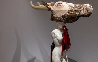
'Robin Redbreast's Territory: sculpture 1969' by Jan Dibbets (1970)
Ruscha, however, was not the only artist of the 1960s who was exploring notions of the book as an artwork, or the book as idea. After giving up painting in 1967, Dutch artist Jan Dibbets began making ephemeral installations in nature and taking photographs of them. His interest in ecology led him to investigate the habits of the common European robin and this research resulted in an artist's book, Robin Redbreast's Territory: sculpture 1969.

Dibbets erected a series of poles in an Amsterdam park in the knowledge that a robin would be tempted to perch on them to enforce its territory. By moving from one pole to another, the robin participated in what the artist called his 'Drawing in Space'. Dibbets's book contains a series of photographs, topographical surveys, handwritten notes and printed text (in three languages: English, French and German), which combine to give a full account of the project. The book's ability to carry both textual and visual elements allows the artist to communicate his concept, even though no physical trace of the 'Drawing in Space' remains. As Dibbets explains, "understanding the entirety of the work is only possible by means of the artist's book".
Ruscha and Dibbets exploited the traditional format of the book but this was not the case for all conceptual artists. As interrogators of art's meaning, it was inevitable that some also began to question and depart from the familiar structure of the book.
'Four titled abstracts' by Joseph Kosuth (1968)
Since the 1960s, American artist Joseph Kosuth has been one of the pioneers of conceptual art. Working in a wide variety of media from publications to installations and public commissions, Kosuth's practice focuses on notions of language and meaning in art. His Four titled abstracts is a hand-held work of text on paper, but it departs from the conventional codex structure of a stack of pages bound together.
Kosuth presents us with a black envelope containing four tightly folded sheets, each wrapped in a paper band. After removing these folded sheets from the envelope, the next stage for the reader is to unfold them, one by one, but the sheets are all very large and made of thin, delicate paper which makes them very difficult to handle. When the precarious process of unfolding them is complete, each one opens to reveal a different dictionary entry for the word 'abstract'. Having removed the entries from their original contexts, Kosuth presents them to us like found objects. He enlarges the text and inverts its colour (white text on black ground), an adjustment that serves to heighten the visual and lyrical qualities of the dictionary language. The four different entries for the single word 'abstract' – a word with strong associations to art – remind us that language, like art, is open to interpretation.
'Sky Never Stops' by Liliane Lijn (1965)
Another American exploring language in the sixties was sculptor, artist and performer Liliane Lijn. Sky never stops is part of her series of 'poem machines' – cylindrical or conical structures printed with text which she began to make in 1962. The forms are fixed to motorised turntables which, when made to rotate, cause the words to accelerate and dissolve into a blur of movement.
Lijn was inspired by Tibetan prayer wheels which traditionally contain printed prayers wrapped around a cylinder. Buddhists believe that when the cylinder is spun, the prayers are activated and fly out into the world. When spun, Lijn's texts lose their legibility but are invested with a new energy.
The new conception of the book was not something that was exclusive to artists. New typesetting technologies of the late 20th century allowed poets and small press publishers to adopt text design as part of authorship and as a result some began to expand their activities into the artworld. Private presses such as poet Ian Hamilton Finlay's Wild Hawthorn Press (founded in 1961) and Simon Cutts's Coracle Press (1975) were among the first in Britain to explore the visual capacities of printed text to convey meaning. This sculptural approach to language became known as visual poetry or Concrete Poetry and poets like Finlay and Cutts widened their vision to include the entire book-form as the metaphorical object of their poems.
'3/3's' by Ian Hamilton Finlay (1969)
Ian Hamilton Finlay's 3/3's contains three poems, each consisting of three lines with three words per line. Each poem is printed below a black-and-white photograph of a small boat floating on water, possibly at Little Sparta, Finlay's celebrated garden in the Pentland Hills near Edinburgh. Each of the three photographs shows the boat at a different position on the water and their page-by-page appearance creates a sense of the vessel's movement across the loch. Below the photographs, the words of the poems are repeated in different combinations and with varying gaps between them so that they appear to be bobbing around on the surface of the page. New meanings and associations are created as the words rearrange and recombine with one another from one line to the next. 3/3's is extremely modest in production and traditional in format but slight gestures, such as the placing of text and sequencing of images, make this book an active space to convey the poet's sense of a landscape.

'Mr. G. White, of Messrs. Green and White' by Simon Cutts (1984)
Landscape – or perhaps more specifically seascape – is also a theme for Simon Cutts in Mr. G. White, of Messrs. Green and White. The work consists of a green cloth-covered box containing a batch of white index cards separated by blue dividers: not the traditional codex structure but perhaps a humorous nod to historic library card cataloguing systems. In this box all the white cards are blank except two. Of these two, each is printed with just one line of an evocative couplet:
the name of a wave in a sea of waves
the wave of a name in a sea of names
The text, though incredibly minimal, is charged with meaning. After reading those two brief lines, the reader's interpretations of the object are activated as the blue tabs appear to take the form of waves rising from a sea of dividers.
Coracle's poetry books were conceived as art objects but also as exhibition spaces for poems. As a further expression of his interest in the relationship between the book and the exhibition, Cutts established Coracle Press Gallery in 1976 in a building adjacent to the press.
'Real fiction: an inquiry into the bookeresque' by Helen Douglas and Telfer Stokes (1987)
Artists' books are a viable medium for practitioners of various movements and disciplines who wish to explore the book's form. However, there are artists who specialise in the book as their main medium. Long-time collaborators Helen Douglas and Telfer Stokes produced a series of paperback books in the 1970s and 80s investigating imagery in relation to the page. In Real fiction: an inquiry into the bookeresque they investigate the book's form through photographs that move in and out of an incongruous space. In some openings, shadows appear to be cast by pages. These shadows are part of the printed image but they draw the reader's attention to the object they are holding in their hands and so the once familiar act of turning a book's pages becomes a strange exploration of space and perspective.

'Taking the Short Cut' by Stephen Willats (1994)
Stephen Willats is another artist who repeatedly returns to the medium of the book, but his objectives are entirely different to those of the artists mentioned so far. Willats could be described as part-artist, part-community worker. Committed to social investigation and enabling community inclusion, he engages directly with communities in projects that encourage them to think and talk about the environments in which they live.
In Taking the Short Cut, Willats recorded the opinions of residents and their use of a footpath running between the 'commuter-belt village' of Roydon in Essex and surrounding farmland. The book is presented as a walking guide, containing photographs of the residents and their own words, taken from interviews the artist conducted with them on the path. The non-stylistic photographs are reminiscent of Ruscha's gasoline stations but the artists' intentions are very different. For Willats, the book's purpose is as a tool for social engagement. It enables him to record in the present but he also sees it as a tool for future involvement. Once published, Taking the Short Cut was distributed through a newsagent on Roydon High Street as a call to others to participate in the walk.

'Textilene' by Dan Walsh (2008)
In the 21st century, the medium of the book continues to stimulate artists. Textilene by Dan Walsh is a series of mesh sheets bound like a traditional book by being hand-stitched down one edge. The binding implies a narrative but there is no text to be found inside and the opacity of the mesh means that the leaves can be seen through one another, challenging the conventional idea of the page as a framing device. Further optical effects are activated as the mesh sheets are lifted and turned.
Walsh's exploration of minimalist themes of sequence and variation harks back to earlier books by fellow American Sol LeWitt, who explored the same ideas in books such as Four basic kinds of lines & colour (first published by the Lisson Gallery in 1977). Similarly, the notion of being able to see through one page to the next relates back to the die-cut holes in artists' books made in the 1970s by Swiss artist Dieter Roth. Like his predecessors, Walsh sees the book not merely as a sequence of pages but as a sequence of spaces.
Though the ideas and intentions of artists mentioned here are wide-ranging, they are consistently self-conscious about the structure and meaning of the book's form. Unlike painting or sculpture, books are designed for one-to-one interactions with the reader. Through these interactions, the book – whatever physical shape it might take – is explored by the reader and in doing so, the artist's idea is 'read'. What made the 1960s onwards such an exciting time in the history of the book was that it was no longer a passive vessel for content but a specific visual medium with its own possibilities and limitations: a new space in which ideas could be activated.